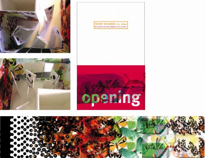
Moth Wallpaper/Gallery Opening - This proposal for a gallery opening was to connect the RISD community. Invitations were designed specifically to make the receiver feel welcomed to the event. The actual event was not stated on the invitation as to create mystery for the purpose of the opening. The opening was not for the showing of new artwork but for the attended to mingle. The actual gallery space was designed with an organic wallpaper. The design of the wallpaper was based on images of moths. Moths are spotted as to mimic two eyes, which connect with the fear of being stared at. The moths were used not as an unwelcoming element but instead to create patterns of color that soften the dark spots. Effects of color on a person’s mood was explored.
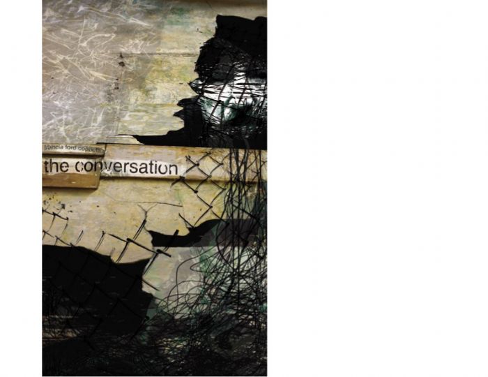
Conversation Poster - This poster was designed to bring out the tone in Francis Ford Coppola’s film The Conversation. The poster combines collaged images of plastic, stone, and wire. The main character of the film goes through a series of events that conceal hidden conversations, which then force the character is a state of neurosis. The hidden face in the background of the poster is not obvious but only when the viewer sees the poster from a distance. The scale of the poster, forty inches by seventy inches, was meant to show the actual size of the objects in the design.
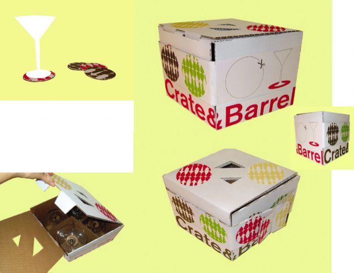
Reusable Crate&Barrel Package - The redesign of the Crate&Barrel package was to create a more environmentally friendly package by eliminating excess materials, and making the package reusable by the consumer. The design kept the existing colors of Crate&Barrel so that it was recognizable by their audience. Patterns were created from a variety of glasses sold at the store and used as a design element for the coasters. The form of the package was changed to a diamond shape so that the glasses could fit tightly inside the box. The existing package is uniform for all objects sold, but is much larger and uses excess paper to wrap fragile products. The new Crate&Barrel design eliminates materials not needed, including the extra plastic handle. The handle is now part of the box. By providing cutout coasters for the consumer, the package can be reusable to compliment the products inside.
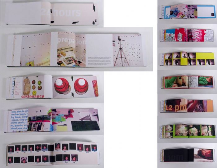
24 Hours - As a personal project this book was designed to document my experience as a creator and not a designer. An experiment was formed to test the limits of my energy and creativity. The preparation included one room cover with white paper, numerous art materials, a constant shuffle of music, food, and my camera. The goal was to stay in the room for 24 hours and purely create anything I wanted without sleeping. The music was used to stir my creativity while also keeping me awake. Three hours of film footage was recorded to later take stills of myself in the act of the experiment. A Polaroid was taken each hour to show the progression of my exhaustion. The experiment was then used to design a collection of the writing, work, and documentation of the act.
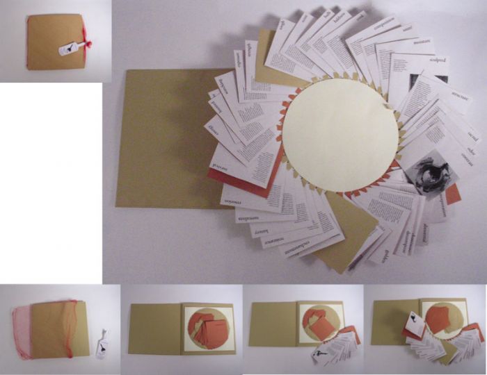
Deconstruction of the Onion - An icon for the onion was created only to then be altered formally and combined with related text to change its meaning. The onion was deconstructed through a series of words such as decompose, resistance, scent, and emotion. The construction of the book composes the series of deconstructions in a spiral of layers where each page must be peeled away from the center in order to be read.
gLike
RISD Portfolio