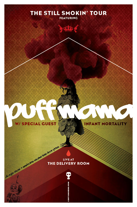
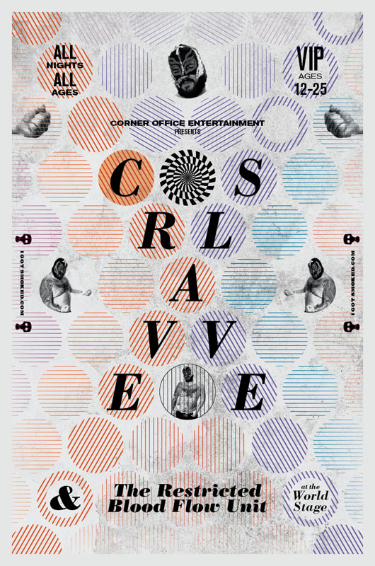
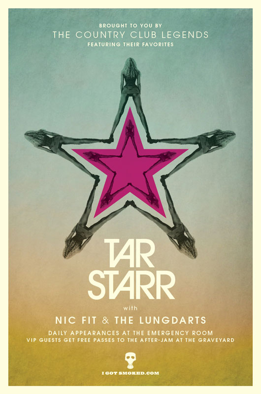
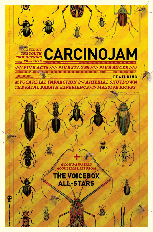
I'm usually involved in just about every aspect of the creative process, so it's not often that a writer just hands over some copy for me to layout, but that was pretty much the case here. I've been fortunate in my career to work with some great copywriters. Andy Corbett definitely falls into that category. We worked at the same place for a bit under Mike Martin, and during that time we looked to work together as much as possible, on and off the clock. So having worked together with solid results, and with much respect for him as a fellow creative, when he came to me with this idea, I was definitely game. Basically Andy sent me what he had written and explained his vision for them to have a concert poster look and feel, and told me to do my thing.