
This is supposed to be a sheet that is over a metal stand of some sort. As it's supposed to be that, I really don't like this one at all. But as far as what it looks like to me, I love it! To me, I see a mountain. I think it looks great with the shading that has been done on it. Gives it a natural nature feel. I tried to put a transparency on it, so you can see the stand beneath it. It didn't work out too well, in the center of the drawing you can see some sort of structure but you can't tell that it's supposed to be under neath.

The Pumpkin drawing.. Well, it was very challenging. I spent my time on the larger of the 3. Doing the indents down the pumpkin were very challenging to me, and I feel I mostly got it. Some of it just looks out of place though. Some of the shading is a bit dark or light. But working down from the darks to lights is what was learned in this piece. Charcoal is very workable and done right, erasable. Starting with the darks and working backwards is the best. You can get exactly the right tones from dark to light.
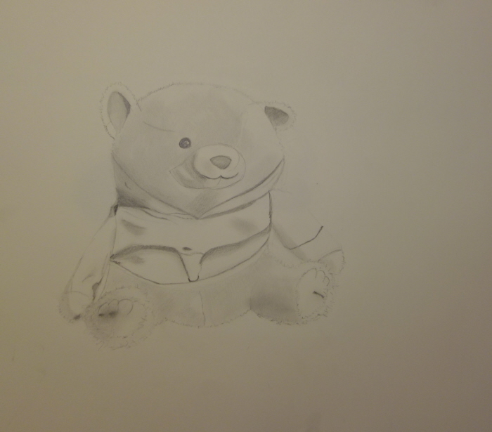
This is a teddy bear we drew in class. One of the first attempts with shading of an actual object besides a sphere or cube. Some of the proportions are incorrect, which is what i don't like about it and didn't work. But overall I like the drawing and believe it to be top 5 of my work. The shading is very good and works well with what i was drawing. The texture of the bear is done well, to give it that "Fur" look.

A later drawing from a statue in the class. This is when I realized I enjoy drawing with Charcoal more than Graphite. What didn't work was the angle it's supposed to be on. the base is turned, but the face itself isn't correctly placed to reflect that. Shading is great, the best I've done. Gives it depth. The mouth is a little spewonky, but everything else is reflective of what the statue looks like.
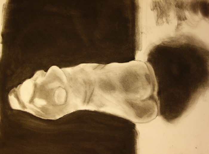
A model we had available to draw. The Mid to Lower section is too long, and makes some of the proportions off. Shading is great, give a more real look and depth to the drawing. Shadows on the table vs the background are the right darkness as apposed to the model itself.
gLike
SLCC Foundation Drawing
5 of my best drawings in the class.