
DDB
Swedbank Kartdrome
Invitation - Proposal
Brief: Create a fresh visual approach. Concept: Based on the aesthetic look of the racing helmet and it's function, three pictograms that sums up the race itself and a golden colour to give the invitation an exclusive feeling.
Copywriter: Ulrika Rupa
Account Manager: Egija Krisjane
DDB
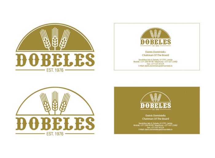
Dobeles
Corporate Identity - Pitch Proposal
Brief: Create a new company identity look and feel for the grain company
Dobeles Dzirnavnieks.
Concept: Based on the main product (grain) of the company, the golden
colour of the grain and a font that associates to baltic heritage and nostalgia.
Creative Director: Vairis Strazds
Account Director: Janis Rungulis
http://www.dzirnavnieks.lv
DDB
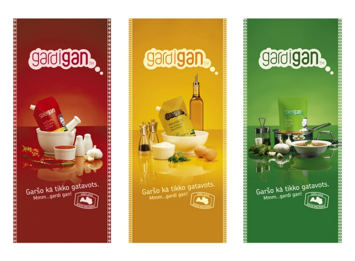
Gardigan
Outdoor Ads
Brief: Promote the Gardigan products in a tasty and colourful way.
Concept: To display the different products with a slight touch of latvian heritage
through graphic devices.
Creative Director: Vairis Strazds
Copywriter: Vairis Strazds
Co-Art Director: Armands Zelchs
Account Director: Toms Lembergs
Account Manager: Ilze Osane
http://www.gardigan.lv
DDB
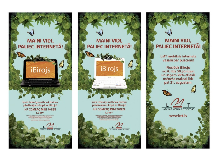
LMT iBirojs
Outdoor Ads - Original proposal
Brief: Create an interesting campaign approach for LMT iBirojs (Internet Office).
Concept: The idea is to communicate the message that you can change your everyday stressful city environment to a rural area, and still be able to be connected and work.
Creative Director: Vairis Strazds
Copywriter: Vairis Strazds
Account Manager: Liga Danilevica
http://www.lmt.lv

DDB
LMT iBirojs
Envelope - Original proposal
Brief: Create an interesting campaign approach for LMT iBirojs (Internet Office).
Concept: The idea is to communicate the message that you can change your everyday
stressful city environment to a rural area, and still be able to be connected and work.
Creative Director: Vairis Strazds
Copywriter: Vairis Strazds
Account Manager: Liga Danilevica
http://www.lmt.lv
DDB
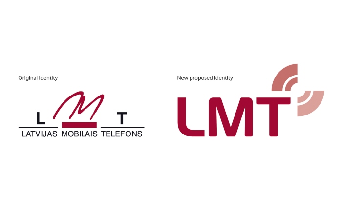
LMT
Corporate Identity - Proposal
Brief: Propose a new identity for Latvia's biggest telecom company LMT.
Concept: Based on forward movement, symmetry, dynamism, power and a corporate look.
The brand mark communicates sent and received signals. The brand mark symbolizes as
well, an abstract shape of a butterfly in flight, implying an industry in constant transformation.
Creative Director: Vairis Strazds
Account Director: Daina Palmbaha-Dziguna
http://www.lmt.lv
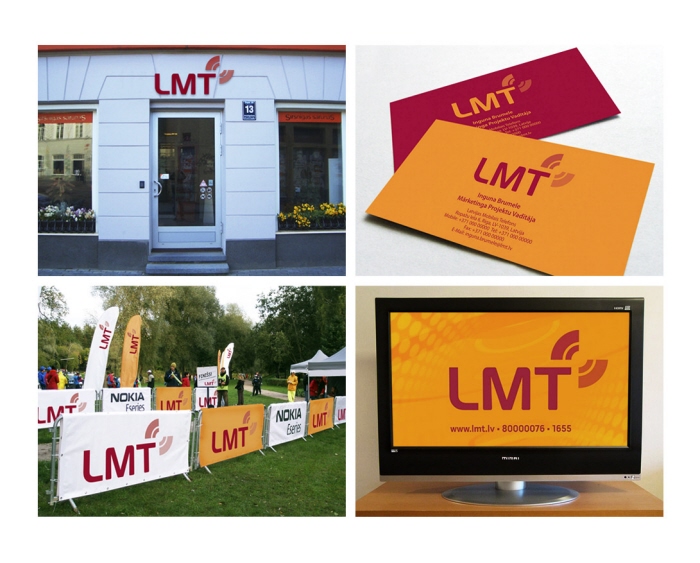
DDB
LMT
Corporate Identity - Proposal
Examples with the proposed new identity: Signage, sponsor event, business cards and packshot.
Here we see as well the use of the original company complimentary orange colour.
Creative Director: Vairis Strazds
Account Director: Daina Palmbaha-Dziguna
http://www.lmt.lv
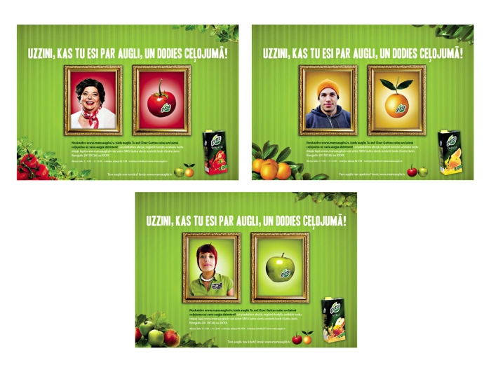
DDB
Gutta
Web - Pitch Proposal
Brief: Create a web design (a competition) for the juice company Gutta based on the idea
"What Kind Of Fruit Are You?".
Concept: Based on a funny portrait comparison, the Gutta colours and the fruit as the core.
Creative Director: Vairis Strazds
Account Director: Janis Rungulis
http://www.gutta.lv
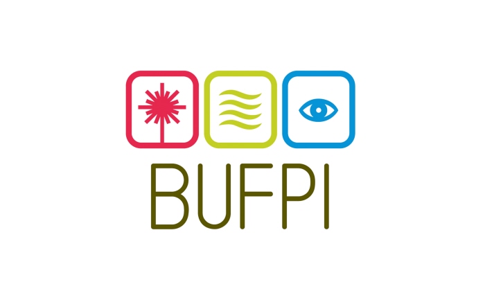
DDB
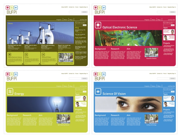
BUFPI
Corporate Identity
Brief: Create an identity for BUFPI (Biomehanikas Un Fizikalo Petijumu Instituts), an institute
consisting of young latvian scientists focused on three different directions: Optical electronical
science, energy and the science of vision.
Concept: Based on BUFPI's three directions, a modern soft font and a colour scheme that
follows the fundamental RGB structure.
Account Director: Janis Rungulis
Acknowledgement: Work of the Month (Oct 2009) at DDB Worldwide Latvia.
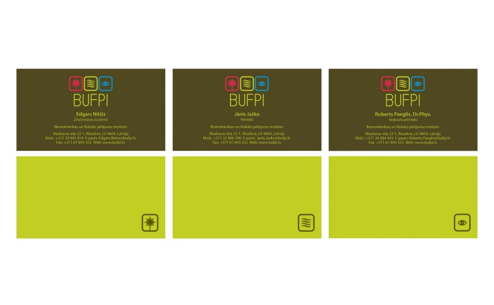
DDB
BUFPI
Corporate Identity - Business Cards
Brief: Create business cards for BUFPI (Biomehanikas un Fizikalo Petijumu Instituts), an institute
consisting of young latvian scientists focused on three different directions: Optical electronical
science, energy and the science of vision.
Concept: Based on the created identity for BUFPI with a structure where the different directions
will be on the flipside for each member.
Account Director: Janis Rungulis
DDB
BUFPI
Web - Proposal
Brief: Create a webpage idea for BUFPI (Biomehanikas Un Fizikalo Petijumu Instituts), an
institute consisting of young latvian scientists focused on three different directions: Optical
electronical science, energy and the science of vision.
Concept: Based on the created BUFPI identities colour scheme and the three different
directions.
Account Director: Janis Rungulis
DDB
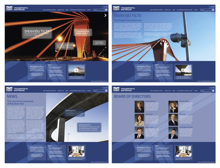
Transport Systems
Web - Proposal
Brief: Create a webpage idea for Transport Systems, an alliance of six well-known latvian
building companies.
Concept: Based on a strong visual approach and structure, where the opening page has
an interactive slideshow.
Account Director: Toms Lembergs
Account Manager: Ilze Osane
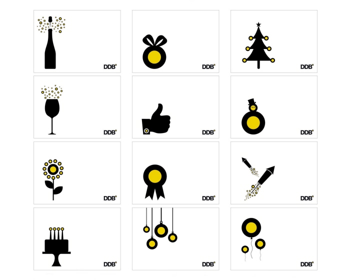
DDB
Promotional Design
Brief: Create greeting card designs for DDB.
Concept: Based on a play with the DDB degree symbol.
Acknowledgement: Design of the Month (June 2009) at DDB Worldwide Latvia.
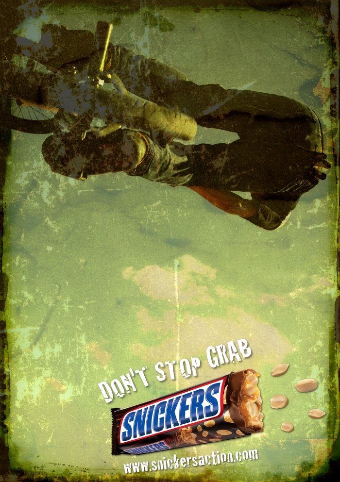
BBDO
Snickers
Publication - Print
Brief: Create an ad for the Estonian extreme sports magazine Sahtel.
Concept: To communicate the active Snickers experience that keeps you going.
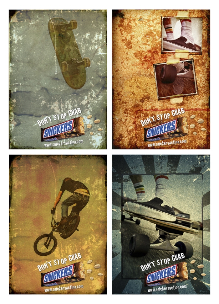
BBDO
Snickers
Publication - Print (Proposals)
Brief: Create an ad for the Estonian extreme sports magazine Sahtel.
Concept: To communicate the active Snickers experience that keeps you going.
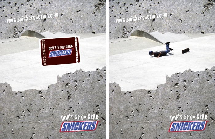
BBDO
Snickers
Publication - Print
Brief: Create an ad for the extreme sports magazine Triecienspeks.
Concept: To communicate the active Snickers experience that keeps you going,
a Snickers band aid was developed and used as an interactive part of the ad.
Copy/Idea: Ola Gillfelt - Kaspars Staskevics
Creative Director: Darlan Moraes Jr.
Awards: GOLDEN HAMMER International Advertising Festival 2008, Diploma (Shortlisted)
ADWARDS - Latvian Art Directors Club Award 2009, Diploma (Shortlisted)
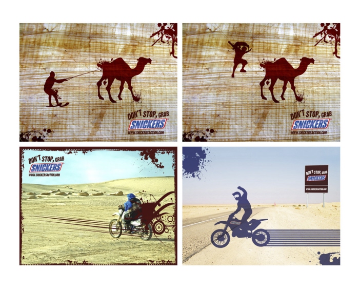
BBDO
Snickers
Web - Wallpaper
Brief: Create a set of wallpapers for the Snickers campaign "Conquer Sahara With Snickers".
Concept: To communicate the active Snickers experience and the feeling of being up for
anything when living life to the fullest.
Creative Director: Darlan Moraes Jr.
BBDO
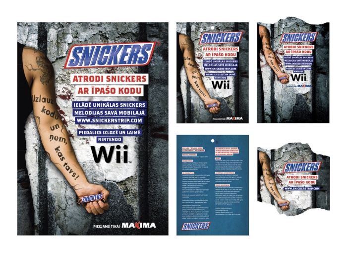
Snickers
Campaign (Poster, leaflet, backingcard, wobbler)
Brief: Conceptualize an idea for a cool and attractive Snickers trade campaign for
the Baltic States.
Concept: The tagline "Crack The Code!" is communicated visually through pop
cultural references to the tv show "Prison Break" and its environment.
Copywriter: Janis Freimanis
Creative Director: Darlan Moraes Jr.
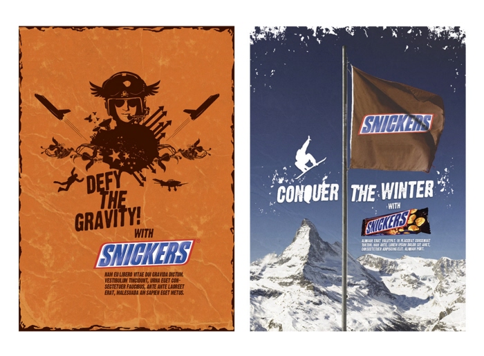
BBDO
Snickers
Campaign - Proposals
Brief: Visualize the concept ideas and key visuals for two campaign ideas "Defy The Gravity With Snickers/Conquer The Winter With Snickers" .
Concept: "Defy.." has its foundation in a clean , but funky vector based solution communicating
the feeling of defying gravity. "Conquer.." puts forward the feeling of having conquered a mountain
and putting the flag on the top, as the ultimate proof of the victory.
Copy/Concept: Janis Freimanis - Kristaps Rozitis
Creative Director: Darlan Moraes Jr.
BBDO
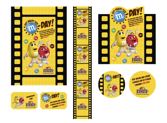
M&Ms - M-Day!
Campaign - Proposal (Key visual, banner, cutout, membership card, coaster etc for a conceptual M&Ms campaign idea)
Brief: Visualize the concept idea.
Concept: Based on the idea of buying M&Ms and winning a whole day at the cinema, and the colourful world of M&Ms.
Copy/Concept: Janis Freimanis - Kristaps Rozitis
Creative Director: Darlan Moraes Jr.
BBDO
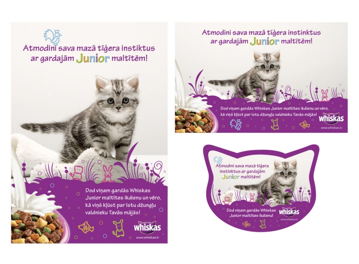
Whiskas Junior
Campaign (A4 poster, A2 poster, wobbler)
Brief: Create a trade/print campaign for Whiskas Junior.
Concept: The tagline "Awaken the instincts of your little tiger with tasty Junior meals!" is
communicated through a graphical wildlife environment that fits the brand.
Copy: Janis Freimanis
Creative Director: Darlan Moraes Jr.

BBDO
Sheba - Summer Activation/Lottery
Campaign (Poster, leaflet, folded giftcard, backingcard etc)
Brief: Conceptualize and visualize a summer activation/lottery Sheba trade campaign.
Concept: Based on the identity and the general feeling of the Sheba brand.
Copywriter: Elina Eglite
Creative Director: Darlan Moraes Jr.

BBDO
Lattelecom - Mazcenas Dators!
Campaign (Poster, A4 Ad, Bus Hanger, Web banner etc)
Brief: Visualize a lowprice computer campaign.
Concept: Based on simplicity and the core of first moments in life, such as
"Your first friend was unforgettable, so is your first computer."
Co-Art Director: Verners Timosko
Copywriters: Kaspars Staskevics - Dina Preisa
Creative Director: Darlan Moraes Jr.
BBDO
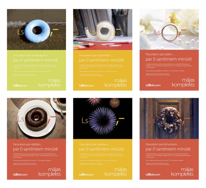
Lattelecom - 0 Santimi
Campaign - Print
Brief: Visualize the concept idea of "Zero Santimi" (Latvian currency) in print ads.
Concept: A set of chosen objects with natural holes in them, were shot in proper
environments to communicate the message.
Copywriter: Dina Preisa
Creative Director: Darlan Moraes Jr.
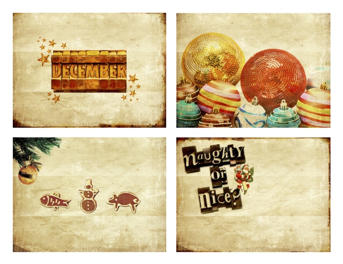
BBDO
Web - Wallpapers
Brief: Create designs for Christmas Wallpapers.
Concept: Based on the retro feeling of Christmas and its classic elements.

Avery Dennison
Helly Hansen
Packaging design
Brief: Re-design and re-brand the packaging design for Helly Hansen Workwear base layer boxes. The keywords were: Scandinavian minimalism, brand colours, consistency, masculinity, clarity and simplicity.
Concept: The new base layer box design is sprung from the original Stockholm Design Lab box design for the Sport segment, but with a new and highly improved Helly Hansen Workwear approach. The overall new design creates a stronger in-store communication and the Workwear identity becomes more clear and understandable through the re-brand. And in line with the HH sport segment the re-design created a synergy in the brand perception of Helly Hansen Workwear.
Art Direction/Graphic Design/Creative Lead: Ola Gillfelt
Packaging Design/Structural Engineering: Linus Löfkvist
Strategic Account Manager: Johan Månsson
http://www.hhworkwear.com

Avery Dennison
Helly Hansen
Packaging design
Brief: Re-design and re-brand the packaging design for Helly Hansen Workwear accessories. The keywords were: Scandinavian minimalism, brand colours, consistency, masculinity, clarity and simplicity.
Concept: The accessories packaging design has a new and highly improved Helly Hansen Workwear approach. The overall new design creates a stronger in-store communication and the Workwear identity becomes more clear and understandable through the re-brand.
Art Direction/Graphic Design/Creative Lead: Ola Gillfelt
Packaging Design/Structural Engineering: Linus Löfkvist
Strategic Account Manager: Johan Månsson
http://www.hhworkwear.com
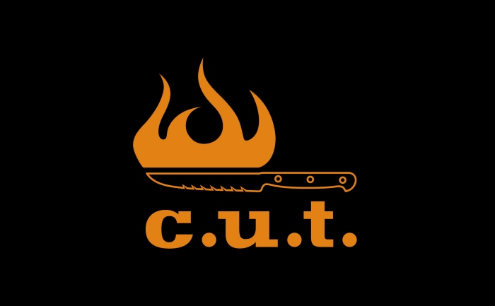
C.U.T. Restaurant & Bar
Corporate Identity
Brief: Create a modern and striking logo for C.U.T. Restaurant & Bar at the Reval Hotel
Elizabete in Riga/Latvia.
Concept: The burning steak knife is a combination of the two most important tools at a
grill restaurant. The flame and the knife. The flames contains of two meanings, the warmth
of a nice grill restaurant environment, but also being the actual tool that cooks the meat.
The steak knife is the second tool that is needed for a proper meat dish experience.
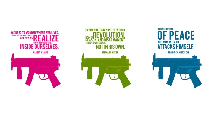
Guns Of Thought
Promotional Design
Brief: Own brief for a T-shirt design/Screenprint.
Concept: Based on my own graphical idea/approach in a combination with quotes
from chosen writer/philosophers.
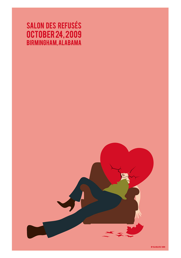
Rejected
Promotional Design
Brief: Create a poster with the theme "Rejection" for the Salon Des Refusés/AIGA
competition 2009.
Concept: Based on the true feeling of heartbreak...
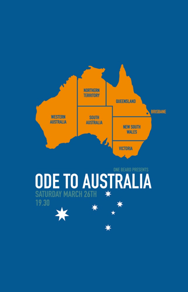
Ode To Australia
Promotional Design
Brief: Create a poster for a personal event.
Concept: Based on a simple, yet striking visual idea.
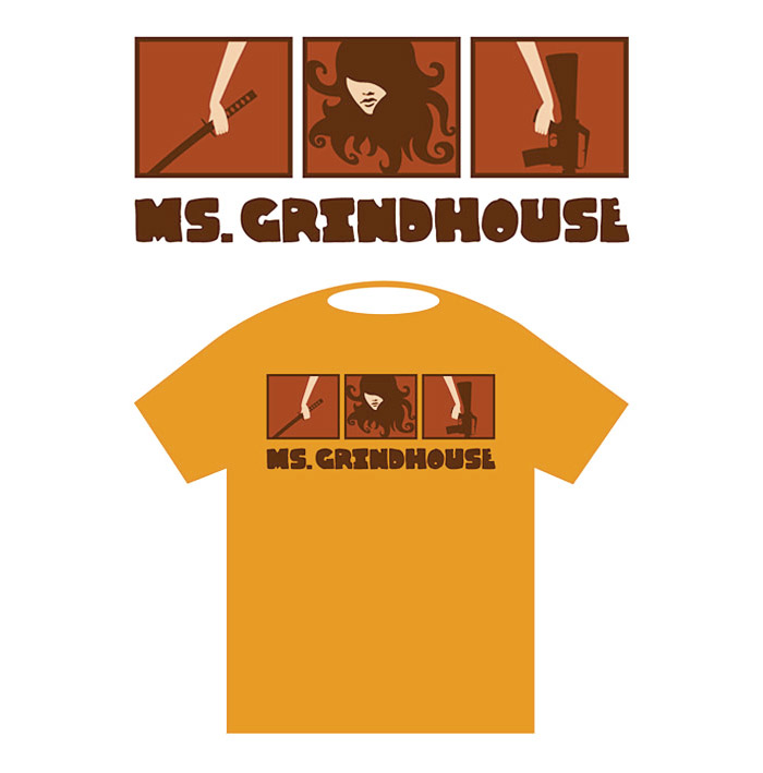
Ms. Grindhouse
Promotional Design
Brief: Own brief for a T-shirt design.
Concept: Based on the recently hyped Grindhouse cinema concept.

Nature & Environment
Promotional Design
Brief: Create a T-shirt design based on nature and environment for a competition,
created by the swedish clothing company Lager 157.
Concept: Based on the idea of the world being a heart and the nature its orbit.
www.lager157.com
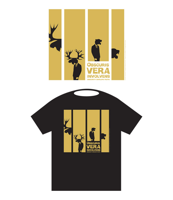
Obscuris Vera Involvens
Promotional Design
Brief: Create a t-shirt design for the Indonesian based company PropagandaKompanie.
Concept: Based on the swedish moose and the sumatran tiger and their cultural heritage, 60s filmposters and quotes for reflection. The text says "Obscuris Vera Involvens" = Obscurity Envelops Truth.
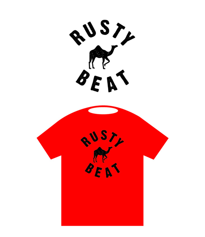
RustyBeat
Promotional Design
Brief: Refresh the existing logo for the neobeat band RustyBeat.
Concept: Based on the old band symbol (dromadary) in symbiosis
with a new striking font.
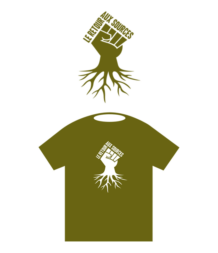
Le Retour Aux Sources
Promotional Design
Brief: Create a t-shirt design for the french publishing house
Les Retour Aux Sources.
Concept: Based on the slightly aggressive and political line
of the company, and the name "Return to the sources" implies
of going back to the soil/back to the roots, with a typography
that feels a bit "revolution".
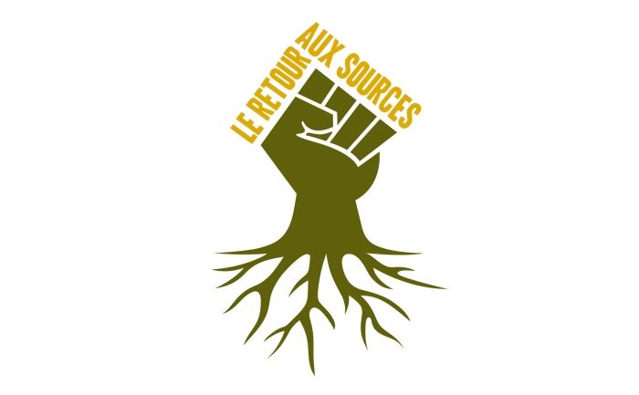
Le Retour Aux Sources
Corporate Identity
Brief: Create a corporate identity for the french publishing house
Les Retour Aux Sources.
Concept: Based on the slightly aggressive and political line of the
company, and the name "Return to the sources" implies of going
back to the soil/back to the roots, with a typography that feels a
bit "revolution".

Le Retour Aux Sources
Publication Design
Brief: Create a cover design for the book "Crise Ou Coup D'etat?". The book addresses the idea that the present crisis was planned by an oligarchy to take control of the world governance.
Concept: Based on 4 different attached brickwall images, showing a slightly
surreal construction, pointing out the absurd way of how we are trapped in
the world we know and how strange the world is becoming. The text says
"Mankind is trapped in a wall and you are a brick in that wall".

Le Retour Aux Sources
Publication Design
Brief: Create a cover design for the book "Eurocalypse". The story talks about a European collapse after a financial crisis and the war between the "Government" and "La Fraction".
Concept: Based on a cracked rock, representing the fight for land and as well a divided/falling apart Europe and the two sides. The torn EU flag (due to the crack), implies as well a divided Europe.

Le Retour Aux Sources
Publication Design
Brief: Create a cover design for the book "La Question Raciale". The book
makes a marxist -type analyse about the race question in western societies.
Concept: Based on an image of a man split in half, being both white and black,
and arrows that represent the decrease of work and the increase of capital in
this everlasting chaotic process where race is as well a part of if.

Le Retour Aux Sources
Publication Design
Brief: Create a cover design for the book "Manuel de L`heretique". The book presents several critical thoughts on political correctness. The book draws
parallels between pc and the burning of heretics in the past as a tool to
protect a social order from the danger of telling the truth to the people.
Concept: Based on an image of a burning ducktaped dollhead, to communicate how society/governments treats us as puppets to make sure that the truth is not coming out via pc.

Le Retour Aux Sources
Publication Design
Brief: Create a cover design for the book "Choc et Simulacre". The book provides evidence based facts concerning Western propaganda against Iran.
Concept: The eagle represents the Western world in attack mode and the top of the mosque represents Iran.

Le Retour Aux Sources
Publication Design
Brief: Create a cover design for the book "Crise Economique Ou Crise Du Sens?". The book is a philosophical and anthropological analysis of the crisis. The analysis is illustrated by concrete exemples and testimonials of people with an experience of crisis in different parts of the world.
Concept: Based on a brickwall that has caved in, thus a metaphor for the crisis. The bricks are the global building blocks of life/the infrastructure that needs to be rebuilt.

Le Retour Aux Sources
Publication Design
Brief: Create a cover design for the book "La Comédie Economique". The book is stating the theory in french author Michel Houellebecq's books, that the modern economy is a comedy where "playing a character" is more important than doing
the job.
Concept: The people behind the global financial structure are twofaced with one side being the joker. The cover shows a 50 dollar note (Ulysses S. Grant looking like a Joker) representing the global economy and it's people behind it.

Le Retour Aux Sources
Publication Design
Brief: Create a cover design for the book "Le Conflit Israélo-Palestinien". The book is about The Israel-Palestinian conflict, from the origins of Palestine to their demand of joining the UN.
Concept: The idea is based on the fact that Israel has been "blindfolding" Palestine in the conflict, and as well an ironic comment to the claim that justice is "blind". The blindfolding draws parallells as well to all the victims having faced their execution.

Le Retour Aux Sources
Publication Design
Brief: Create a cover design for the book "Mes Dix Jours De Jeûne". The book tells the true story of the author that decides to starve for 10 days and his impressions of this state of mind.
Concept: The idea is based on an image of a man with an open mouth and from it comes rays of light, this being the "higher state" or spiritual level the author reached with his starvation.

Le Retour Aux Sources
Publication Design
Brief: Create a cover design for the book "Les Secrets De La Reserve Federale". The book is about the plot of international bankers that led to the creation of The Federal Reserve in 1913 and the consequences of this: 2 world wars and a financial crisis.
Concept: The split up blood stained dollar bill shows how the world has been divided by the creation of The Federal Reserve and the consequences.

Le Retour Aux Sources
Publication Design
Brief: Create a cover design for the book "Le 11 Septembre N'a Pas Eu Lieu...". The book exposes facts about the official version of 9/11 and the following developments in the aftermath. The book talks as well about agressive international US policies and the change in the domestic policy with limitations of liberty and increase of control over the people.
Concept: The idea is based on USAs wish to maintain world control, acting like "Big Brother". They disguise themselves as a country and in this disguise USA takes all sorts of action both internationally and domestically. The flag and the eyes together looks also like a hood, thus to hide their true identity. The number 11 poses as the World Trade Center.

Le Retour Aux Sources
Publication Design
Brief: Create a cover design for the book "Manifeste Pour Briser Les chaines de l'usure". A book about the growth of the financial economy and its consequences.
Concept: The idea is based on an old torn book cover as the book was written in 1919. The safe represent the global economy that is broken into/blown up over and over like when a bank is robbed. On the safe there´s two arrows that shows a circular process, thus a metaphor for how history repeats itself.

Le Retour Aux Sources
Publication Design
Brief: Create a cover design for the book "Le Capitalisme - Un Génocide Structurel". In the wake of the global financial crisis and ongoing savage government cuts across the world, Garry Leech addresses a pressing and necessary topic: the nature of contemporary capitalism, and how it inherently generates inequality and structural violence.
Concept: The idea is based on a human skull and since the book makes a comparison with genocide and capitalism, a dollarsign as a representative of capitalism is put on the forehead of the skull like a caste mark, like being marked as belonging to the "religion" of capitalism. The image in a combination with some visual typography, makes a cover that stands out.

Le Retour Aux Sources
Publication Design
Brief: Create a cover design for the book "Le Vice Obscur De L'occident" & "La Démocratie Et Ses Sujets". The book criticizes the will of the west to impose the western "model" to the rest of the world, even through war and as well a critique towards western democracies.
Concept: The idea is based on anti-conformism and things like demonstrations, ralleys, political posters and leaflets. The cover is centred around a torn poster (pointing out the critique of conformism and the will to get rid of it and with some blood on it pointing towards the use of war to impose conformism) with a sort of logo for conformism (a hand holding the globe in a stronghold) with three powerwords (Obey - Conform - Consume). The titles and the authors name is in a font that looks like a stencil and implies that it has been sprayed on the wall.

Le Retour Aux Sources
Publication Design
Brief: Create a cover design for the book "Oliganarchy". The book is about William Bergman, a White House "spin-doctor" who works on a plan for a "new world order". Amongst his weapons are provoked crises and leadership through chaos/anarchy. Meanwhile a young depressed frenchman starts to understand why he feels so bad... and the world as well.
Concept: The idea is based on the address of the White House which is 1600 Pennsylvania Ave, but the number has been changed to 666, the number of the beast. And the street sign is merged with an image of The United States Capitol and the stripes of the american flag.

Le Retour Aux Sources
Publication Design
Brief: Create a cover design for the book "L'effondrement Des Sociétés Complexes". Joseph A. Tainter, an archaeologist explains (with examples from the past) when civilisations reach a certain complexity level they become very fragile and tend to collapse.
Concept: The idea is based on showing the collapse of a these complex societies with a broken piece of an image, in this case it´s the Colosseum, representing the Roman empire.

Le Retour Aux Sources
Publication Design
Brief: Create a cover design for the book "Chroniques du Mondialisme". The book is a collection of articles talking about a "new world order" and a global government.
Concept: The idea is based on an image of earth "branded" with the "All seeing eye", a direct connection to the so called "new world order" the book address. The cover has as well a bit of a retro sci-fi feeling which fits the content.

Le Retour Aux Sources
Publication Design
Brief: Create a cover design for the book "La Société de L´indécente - Publicité et Genèse de
La Société de Consommation". The book addresses the global manipulation of people through
advertising and its different channels.
Concept: The idea is based on a branded face with the 10 strongest power words in advertising
with a slightly "chaotic" background with a lot of advertising messages, as we are bombarded
with advertising messages every day.

Le Retour Aux Sources
Publication Design
Brief: Create a cover design for the book “La Voie Virile“. In “La Voie Virile“ aka “The Way Of Men”, Jack Donovan argues for a universal definition of masculinity based on what he calls the "tactical virtues" of the primal survival gang. Sam Sheridan, author of "A Fighter's Heart", called it "a thought-provoking treatise on the essential struggle of men" and Brett McKay cited it on Art of Manliness as an example of "the Nomad/Gen X view of manhood" which takes the position that " the only way to end the misandry and gender neutrality that we see in modern Western society is for society to collapse, as the tactical virtues of manliness are best demonstrated in a chaotic world.
Concept: The idea is an adaptation of Jack Donovan´s own illustration of the english book cover, but with a feeling of manhood being the angel of death ready to collapse the world.

Le Retour Aux Sources
Publication Design
Brief: Create a cover design for the book "Perspectives Libres No. 1". Issue
number one criticize EU and EU institutions, comparing them to prisons for
the people of the EU.
Concept: The cover shows a prison camp, relating to the main topic. To put
focus on the personal opinions/thoughts in the book, the masthead logo was
created with a handwritten font.

Le Retour Aux Sources
Publication Design
Brief: Create a cover design for the book "Perspectives Libres No. 2". Issue
number two puts the focus on Russia and hope vs risk concerning the development
of the country.
Concept: The cover shows an orthodox cross, as a symbol of Russia, the
main topic of the book.
Le Retour Aux Sources
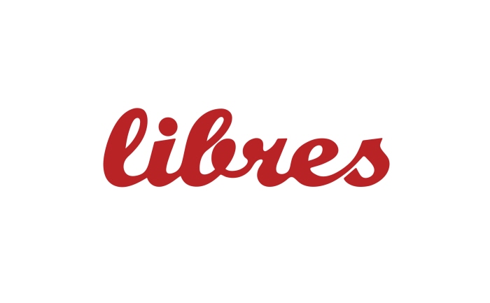
Corporate Identity
Brief: Create a new logo/header for the book/magazine Libres.
Concept: Based on the word itself, meaning "Free" in french, they idea was to find a font in a handwritten style to get the feeling of being upfront and personal in the visual communication. The font Buffalo Nickel was reworked to be smoother and have a proper flow between the letters. The colour of the logo carries a dynamic structure, thus it would change for each issue.

Avery Dennison
Corporate Identity - Proposal
Brief: Propose an identity for the new Lindex brand "New Born".
Concept: Based on playfulness, simplicity and a typographic solution
(Doctor Soos Bold, WhichWay and Spicy Rice) that fits the brand name
in a combination with a brandmark (a face of a toddler).
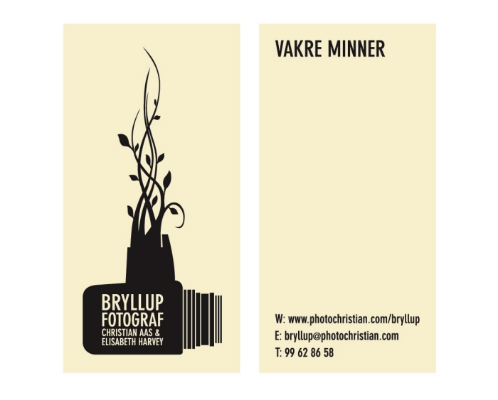
Bryllup Fotograf (Wedding Photographer)
Corporate Identity
Brief: Create a corporate identity for wedding photographer Christian Aas and Elisabeth Harvey.
Concept: Based on an old classic Hasselblad camera model and the growth/organic beauty that surrounds and follows a wedding.
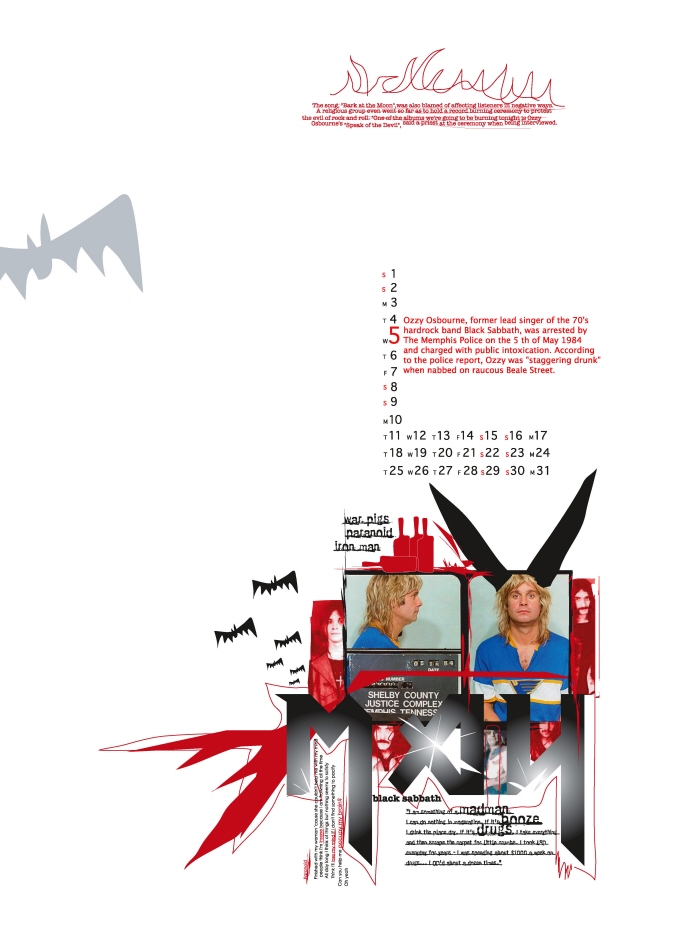
Queensland College of Art
It Is Only Rock N Roll.... Calendar 2004
Promotional Design
Brief: Create a calendar for 2004.
Concept: Based on 12 well known artists mug shots and their arrests in each month.

Spinning Wheel Films
Corporate Identity
Brief: Create a corporate identity for the small swedish independent film
production company Spinning Wheel Films, with storytelling, entertainment
and imagination in the focus.
Concept: Based on a spinning wheel transformed as a "fairytale animal" on
the move with a bit of filmstrip flying in the wind like a scarf. A soft green was
chosen to communicate a positive and joyful feeling.
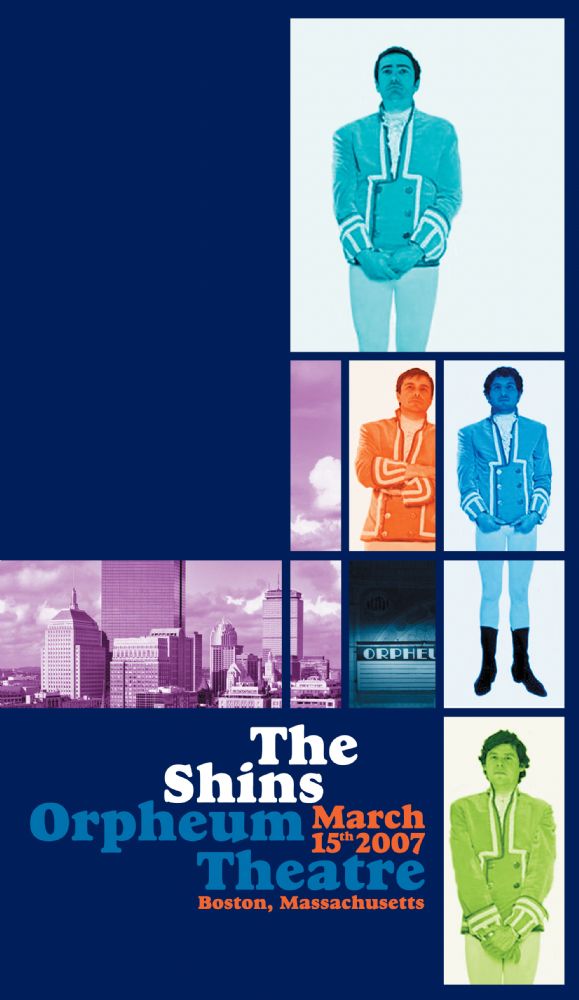
The Shins
Promotional Design
Brief: A competition to create a poster for the american band The Shins.
Concept: Based on the cultural heritage in the city of Boston, Paul Revere,
60s music and 60s filmposter design.
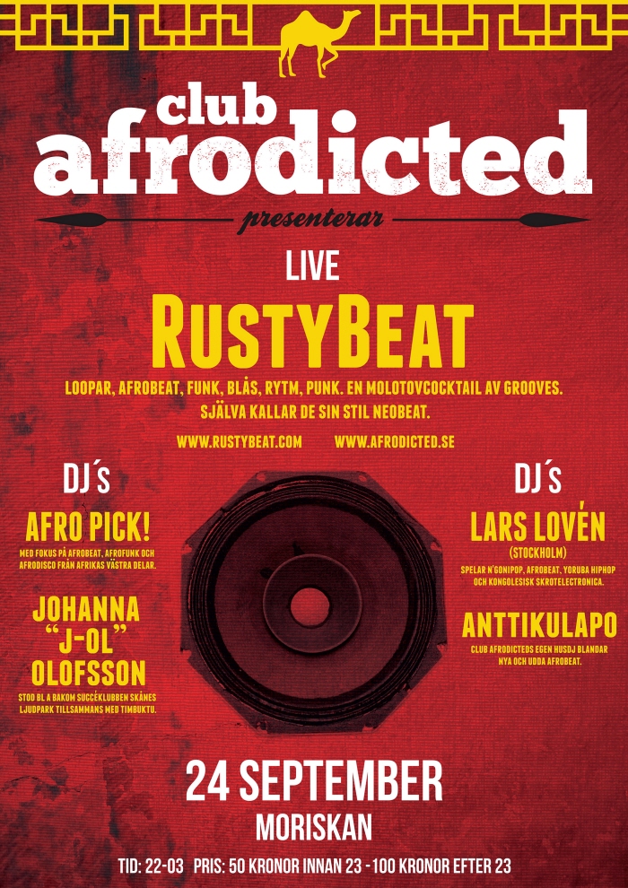
Club Afrodicted
Promotional Design
Brief: Create a poster and flyer for a club event.
Concept: Based on african/middle eastern vibes and symbols that represents
the band RustyBeat and the musicgenre Afrobeat/Neobeat in a combination
of striking typography and powerful colours.
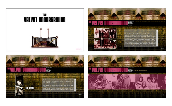
Queensland College of Art
Web Design
Brief: Create a Flash web site.
Concept: Based on The Velvet Undergrounds "Loaded" album cover, the New York subway and surrealism.
Queensland College of Art
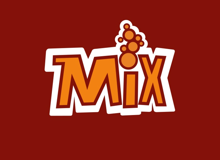
Corporate Identity/Packaging Design
Brief: Create an identity and packaging for a milkfruit drink.
Concept: Based on a playful typography, strong colours and milk bubbles.
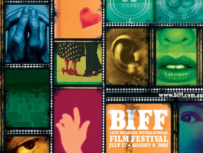
Queensland College of Art
Publication Design (Catalogue cover, contents page and spread)
Brief: Create a new look and feel for BIFFs (Brisbane International Film Festival)
publicity 2005.
Concept: Based on the five senses, that are activated during a filmfestival visit.

NEW YORK CITY 2012
Promotional Design
Brief: Own brief for posters.
Concept: Based on my own photography from a trip to New York in combination
with a typographic approach to communicate certain parts of the city.

"When Tears Have Fallen" ("När Tårarna Fallit")
Promotional Design (Poster, flyer and DVD cover)
Brief: Create a poster/visual for a small swedish independent short film,
that communicates the core of the movie in a selling way.
Concept: Based on the title, the graphic expression shows the dystopian
greyscaled futuristic environment the movie is set in and via a colour
element the importance of tears in the storyline.
gLike
Portfolio