Various Logotypes for Clients - Here is but a small sampling of logotypes I have developed for a cross section of clients in the past 15 years.
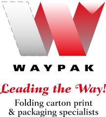
Waypak - Printing & Packaging - Logotype was designed to reflect the main components of the companies business being folding cartons, packaging and printing. The concept is to show process, and dimension.
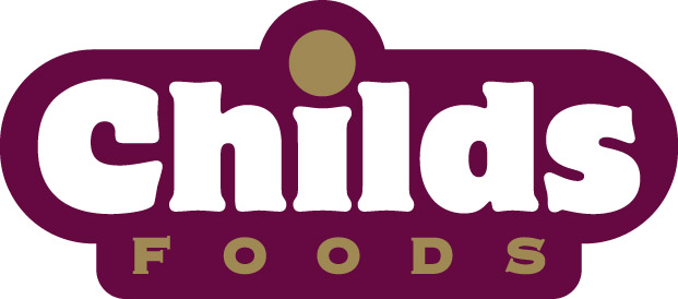
Childs Foods - One of Childs Foods most popular items are "potato croquettes". This design was inspired by these tasty little circular treats. A simple play on the "i" emphasizing the dot. http://childsfoods.com

See Saint John Visitor's Magazine - Emphasis is placed on "See" as the brand is quite often referred to in shorthand as "See" magazine. Design also allows for growth should the publication expand into other markets, the "See" is the common constant.
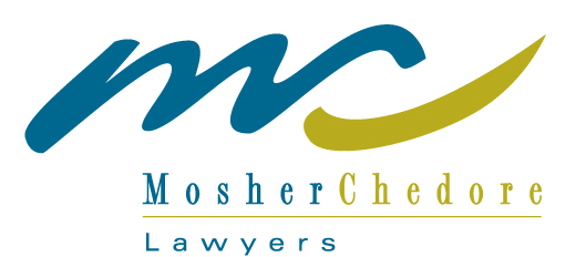
Mosher Chedore, Lawyers - Logotype developed to have a signature quality, as well as a wave reference for the company is in a port city. Also, integrating the the two principals "M&C" initials symbolizes unity. In addition the green stroke makes a subtle suggestion to a checkmark.
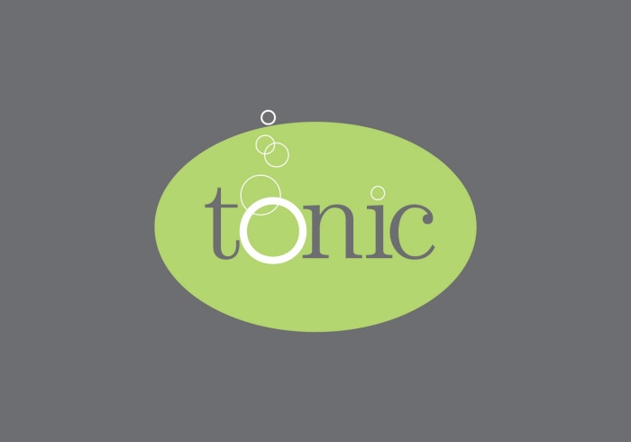
Tonic - Nightclub for 25+ crowd - Logotype was developed to have a sense of elegance, contemporary style, and playfulness with typographic treatment. The nightclub features dance music, DJs and live music with an extensive wine and martini bar.
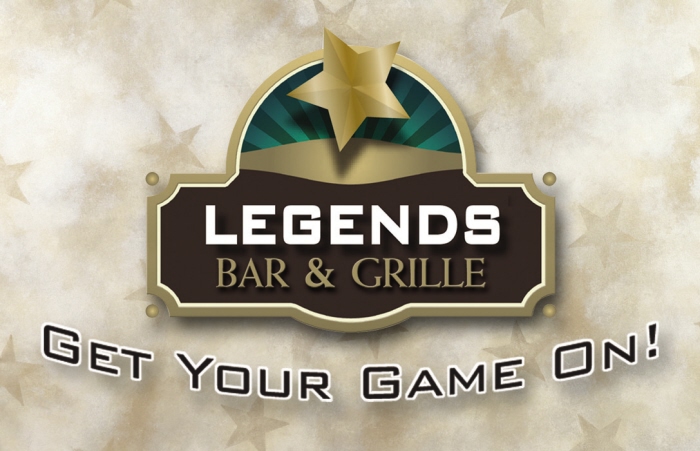
Legends Bar & Grille - Legends Bar & Grille at the 3Mile Entertainment Complex is a Sports Bar and Gaming Centre featuring "Coasters", an Atlantic Lottery Corporation Gaming Centre.
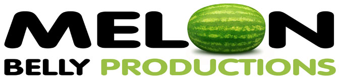
Melon Belly Productions - Melon Belly Productions is the brainchild (ok brainfart) of a couple friends. We put together short films for fun, ok one... so far. The name came up simply playing around with words. Actually we were jamming a "John Cougar Mellencamp" song and somehow it turned into "John Cougar Melonbelly". So, the indie production house of "Melon Belly Productions" was born.
gLike
Logotypes