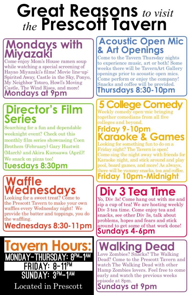
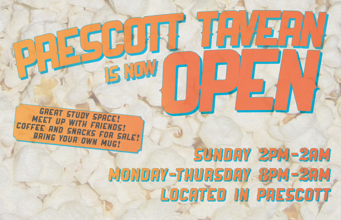
Great Resons to visit the Prescott Tavern (2015)
This is (probably) my final semesterly revision of this poster I designed a couple years ago. This revision includes switching to using entirely fonts that are available on the CLA Office mac, so that people can edit it in the future. I liked the combination I had before, but this is a layout that could be edited for years after I'm gone, so it needed to be updated. I'm still pretty happy with this layout, but I definitely prefer Bebas Neue to Ostritch.
View PDF
View PDF

A logo for a (currently unfinished/suspended) side project a co-worker and I had for a text adventure game to help students understand the process of requesting funding from the office we work at.
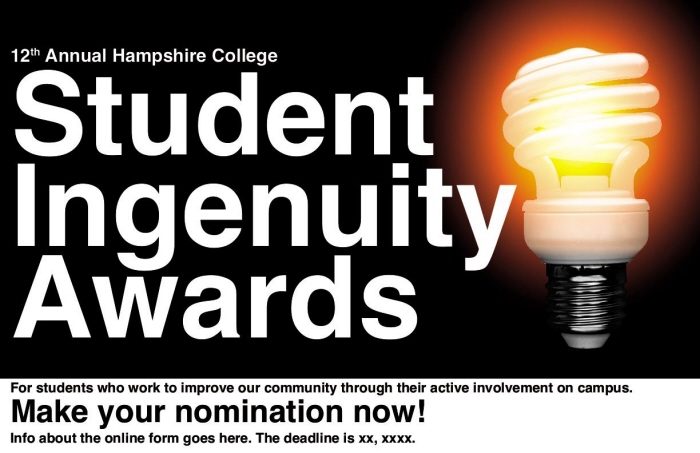
A revision/rethinking of the poster design for the Hampshire College Student Ingenuity Awards. We've been using the same poster for years, despite not having a working file for it anywhere, so I redid it this year. I'm not sure if this layout is going to be used or not, but I'm happy with it, and it's not just a jpeg.
View PDF
View PDF
A quick poster for an event hosted by the office I work in on campus.
View PDF
View PDF
A poster I made on a short schedule for an event on campus. There wasn't much time to make it and the images I was given were very grainy, so I decided to work with that as a visual element instead of spending the time to spend it. I think it worked very well in the end, though that's not a compromise I'd always like making.
View PDF
View PDF
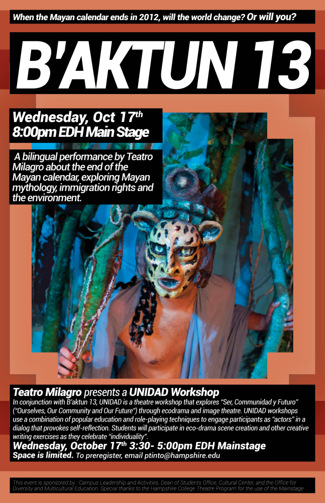
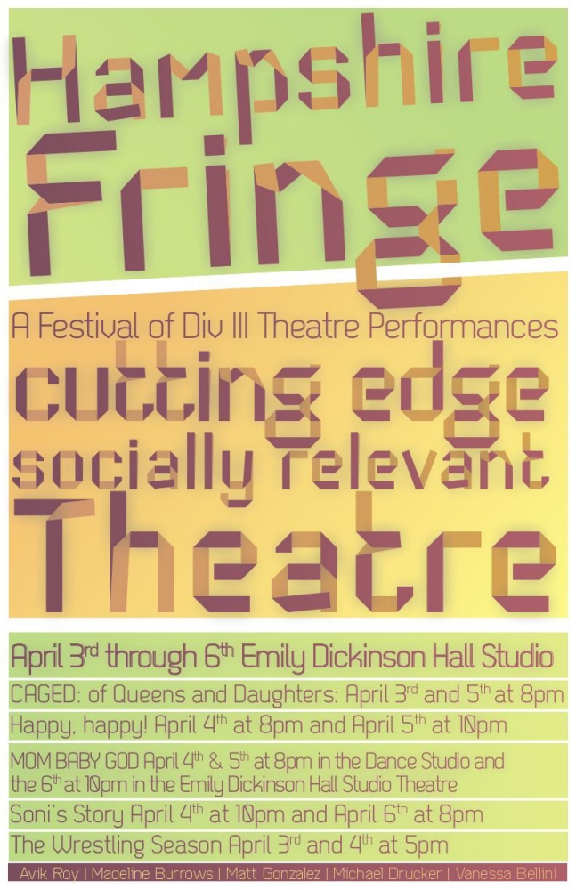
This was a very fun project. I was told to rethink an extremely low resolution (and barely legible) poster given to us by a group which would be performing on campus. As I wasn't given much other instruction, other than a set of pictures I could use, I tried a bunch of different crazy ideas and settled upon this. I think it's very effective and feels natural because the colors are taken directly from the image. It was inspired a bit by action figure packaging, which is kind of the vibe I got from this guy's costume and the exciting title of the performance. It was very well received and eventually redone in 8.5x11 and 16:9 for our digital billboard.
This was a poster I did in about half an hour for a performance. I wish I had been able to spend more time on it, there's a few nitpicky mistakes (black doesn't blend in exactly and it's more visible in print) but I'm proud of this for a very quick poster.
View PDF
View PDF
This was a fairly long term project that I edited in snippets over the course of the summer. It was interesting to work for an event that had some turbulence with sponsors- some left, others joined, and revisions were made. I think I'm proud of the end result.
This was a quick poster I did on a very short deadline.
View PDF
View PDF
My most recent project. I'm really happy with this one. We had a lot of time (comparatively, most of my projects are on very short schedules) to work through some ideas.
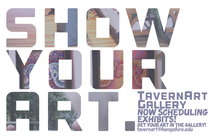
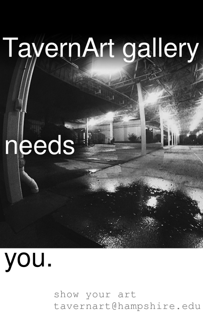
This is a poster I made to advertise and increase interest in the TavernArt Gallery in the 2012/13 school year. It was made in InDesign. It was later adapted for our digital billboard.
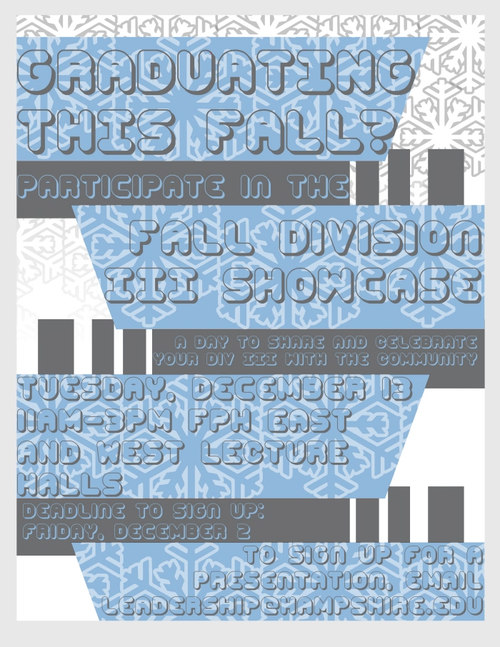
One of the things I like to do with posters is make sure that the headline is visible and legible from a very long way away. I think it's a very effective way of attracting attention. From there I wanted to keep the rest as simple as possible, and I think I did pretty well with that on this one.

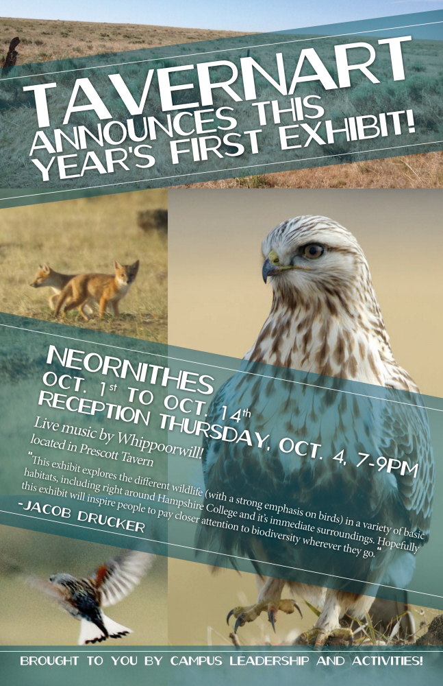
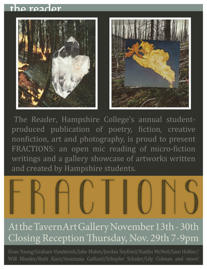
This was a poster for the first exhibit at the TavernArt gallery this year.
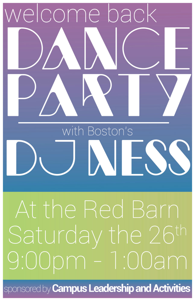
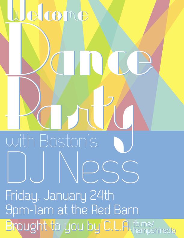
This was a very quick poster I made to advertise an event my office was sponsoring. I had an hour to get it done, and didn't have much information about the event beyond the title, location, time and date, so I kept it very simple. It was eventually printed in multiple color variations and adapted to 8.5x11 and 16:9 (for our digital billboard).
The fancier typeface is Newmodern... but the S character looked too much like a z. We liked Newmodern, but didn't think the s would be legible enough, so I changed the font of the S characters to Typometry pro. A bit of a kludge, which I wouldn't normally like to do, but it worked out in the end, and as the two are very similar I think it's fine. If I'd had more time, we would have found a better typeface and changed the whole style, to keep it consistent.
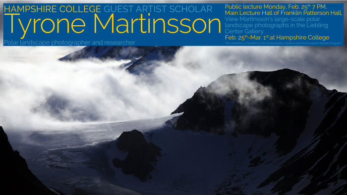
This was a poster done on very short notice for an event in a space sponsored by our office. It is another example of a project where working with the media I was given was tricky but worked out in the end. The text I was initially given was almost a full page, and the 'two images' attached were actually a single 600 pixel wide jpeg with two tiny photos in the center on a white background. I was eventually given a higher resolution copy of the two images, but as the intent was to keep them fairly small this was still a very interesting project.
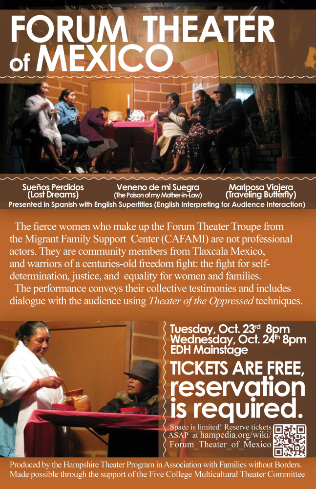
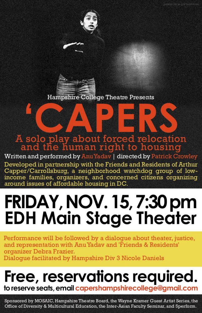
This was a poster I did for an event on campus which was in part organized and advertised by my office. This was a tricky one as we had to spend a lot of time going back and forth about simplifying the text and getting the most important information on there. When I was initially given this assignment, I was given a full page of text which the client wanted on the poster. That wasn't going to work, but I tried my best to work with them and keep the most important information on there. He was very happy with the end result, and I think it came out pretty good.
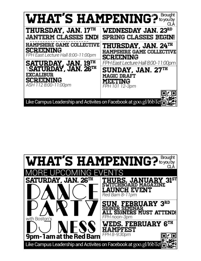
This is an example of the weekly 'What's Hampening?' Flyer I worked on. This was a very strange 'publication' in that it was distributed via napkin holders. It was intended to fit into the clear pocket on the sides of the napkin holders used on campus and thus (by distributing it weekly to all 200 napkin holders on campus) could be easily accessed and was seen by almost everyone on campus daily. While we keep the general layout the same, we like to keep it interesting by playing with different fonts and having special editions with slightly different layouts depending upon the upcoming schedule. This edition, the January Term 2013 2 edition was a great example of that. Not much was going on on campus, so we took this opportunity to advertise major upcoming events on the second side. I took the design of my poster for the upcoming dance party event and made a small version for this.
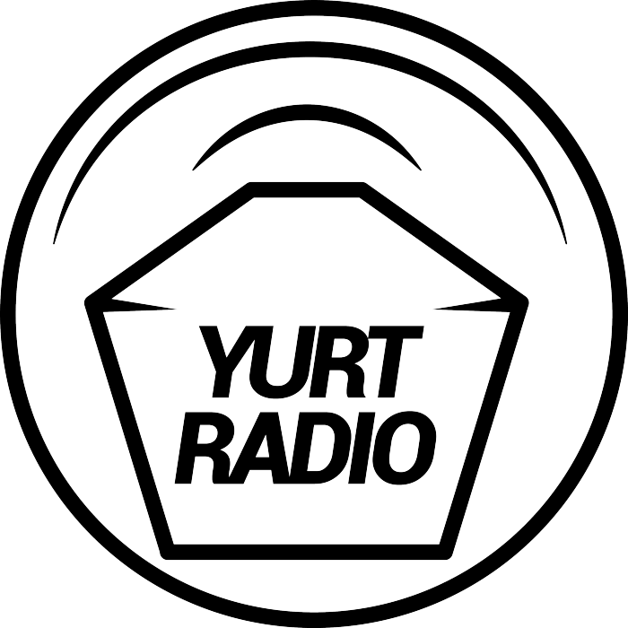
This was a logo I designed for the Yurt Radio, my campus's internet radio station. It hasn't been widely implemented yet, as the student group in charge of the station is having other troubles at the moment. I did it for free, as I had no formal experience with logos and was still learning Illustrator. It is a vast improvement over what they had been using on their advertising media (a composite of clipart which looked a bit like a muffin with wifi), but retains the basic ideas they were going for. It has an extremely simplified version of the shape of the yurt radio building, with a depiction of something emanating from it, reminiscent of wifi or radio waves. As I said, this hasn't seen widespread implementation as of yet, but it is used on a couple specific Yurt Radio show's facebook pages, and I've seen it on a couple posters.

This is a logo I designed for a startup company a friend and classmate is planning. The company will be a leather handbag company (I don't know much about the success of the company or how much progress he's made on it yet). He wanted the logo to be based on a drawing by his younger cousin, which featured the company name (Inti) surrounded by stylized flames. I really liked the drawing and found it was a great starting point. He was very interested in the idea of leaving potentially abbreviating the company name to NT (which is phonetically similar) in the future in branding, and so my final design made those letters more important and legible.
I don't have much experience with logo design, and this is only the second one I've done... this was free work, intended to give me experience and my friend a good starting point. My final product was made in Illustrator.
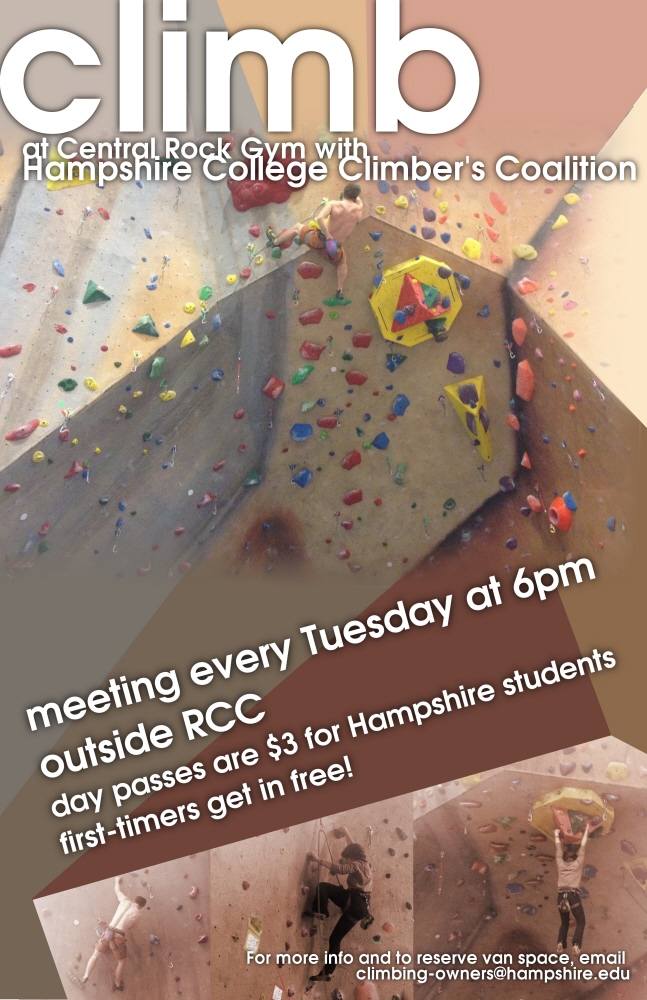
Climbing poster - done for my work study job in GIMP
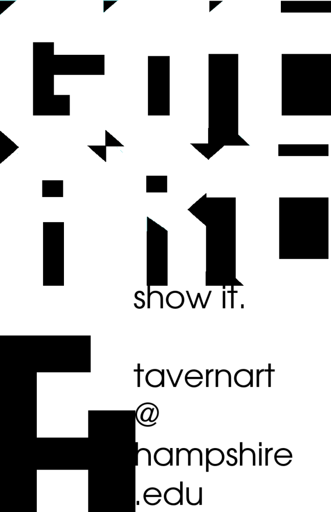
TavernArt poster - done for my work study job.
This is fairly old work, from before I knew InDesign or Illustrator. It was done in GIMP, and the more I look at it the more I see mistakes. I love the concept I came up with though, and I may revisit it in better software, with better experience someday.
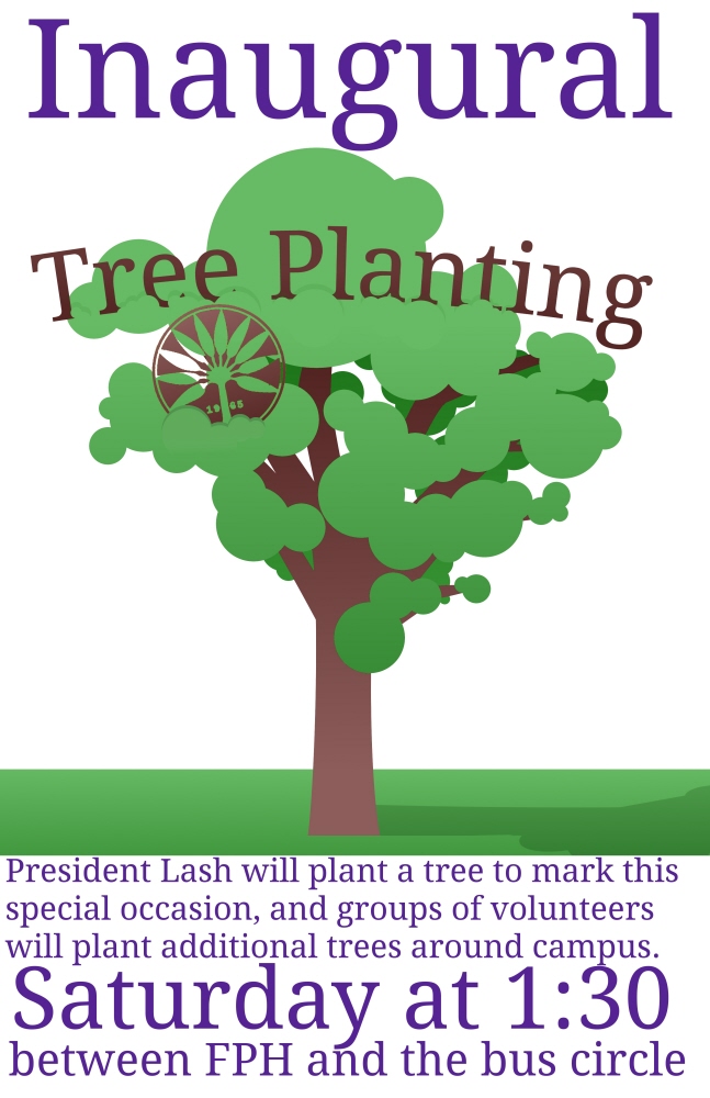
Inauguration Tree Planting poster - Done in an extreme hurry less than a day ahead of the event it was for. I'm not happy with the purple text, but my boss wanted more colors, and I think it fit! Done in GIMP.
gLike