
These are some character concepts I created based on the upcoming game Witchbrook. I drew 2 characters each with a casual and formal set of clothes.

Some character designs based on the game INMOST. The art style is very limiting so it was a fun challenge to work around that. I also created a couple of GIFs shown below.


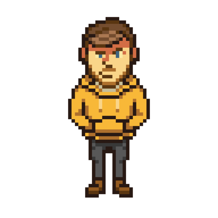
These are a set of sprites for a character based on myself in the style of Wargroove. In the game each character has a large portrait, a sprite for cutscenes and a sprite for the world map so I wanted to also draw all 3 designs.
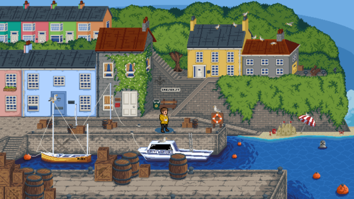
This Seaside Town scene started as an interpretation of the Wargroove style however I messed up on a couple of things such as the perspective of the scene so it doesn't hold as true to the original style as I wanted. I am still proud of the overall composition and detail of the scene even if it isn't entirely accurate to the source material. I also hid various emblems from the game around the scene...
A couple of sprites based on the style of Eastward. This was a really fun style to draw with and I think I created some cool designs that maybe don't stand out enough as some of the characters from the game itself.


A character I created based on the style of the Loco Motive. It was fun to bring so much life into the character's movements in this animation.
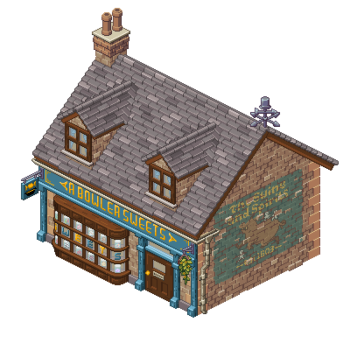
This is the building that I created while working on my Artist Experience Placement with Chucklefish. I followed their art pipeline which involves 4 stages: Research, Grey Box, Draw Over and Rendering. For the research phase I gathered various reference images of the type of building style I wanted to take inspiration from. I also thought about the overall context of the building and how it might fit into the world other than for just aesthetic reasons. The next 3 steps are explained in more detail below.
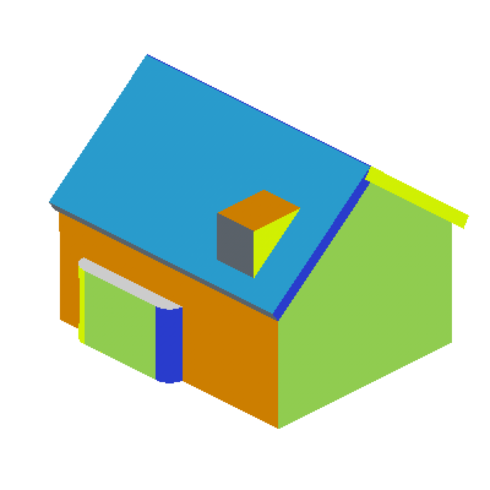
This is the Grey Box. Since my 3D skills are very weak I had to get someone else to create this model for me based on the requirements of my research and initial sketch. I could then use this as a base to draw over since it was set up with the correct dimensions and perspective of the art style.
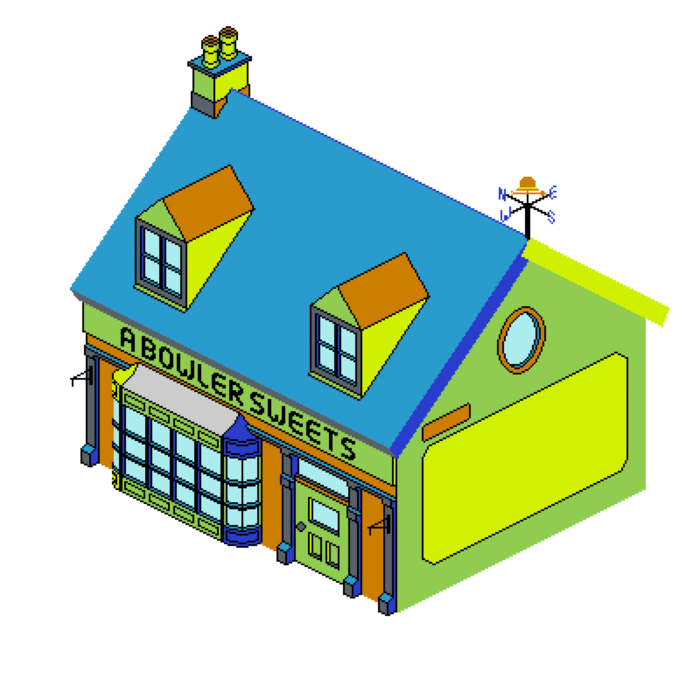
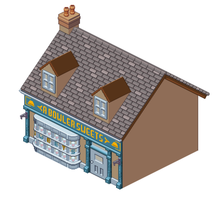
This is my Draw Over. I wanted to mark out where the key details of the building would be. In this case, I had chosen to draw an old sweetshop that used to be a hat shop so I wanted to include references to it once being a hat shop but enough detail to clearly show that it is now a sweetshop. This is also where I decided on the name of the shop which is a pun combining references to hats and sweets.
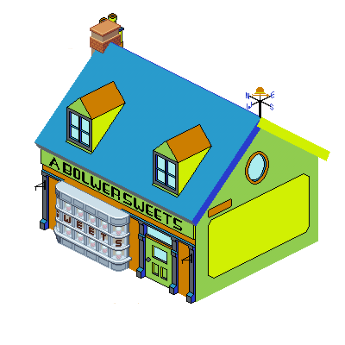
For some reason I started the Rendering phase with this ornate curved bay window. I had to make sure that I followed the rules of the isometric art style which is easier said than done when curves are involved.
I next tried to establish some colours, shape and texture to the front of the building, adding in a wooden frame with a new sign for the shop.
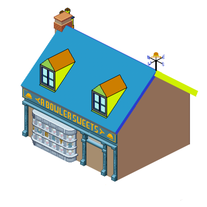
I then tried to tackle the roof by creating a repeating roof tile pattern. This was 1 of 2 designs I initially chose between but still wasn't completely satisfied with it.
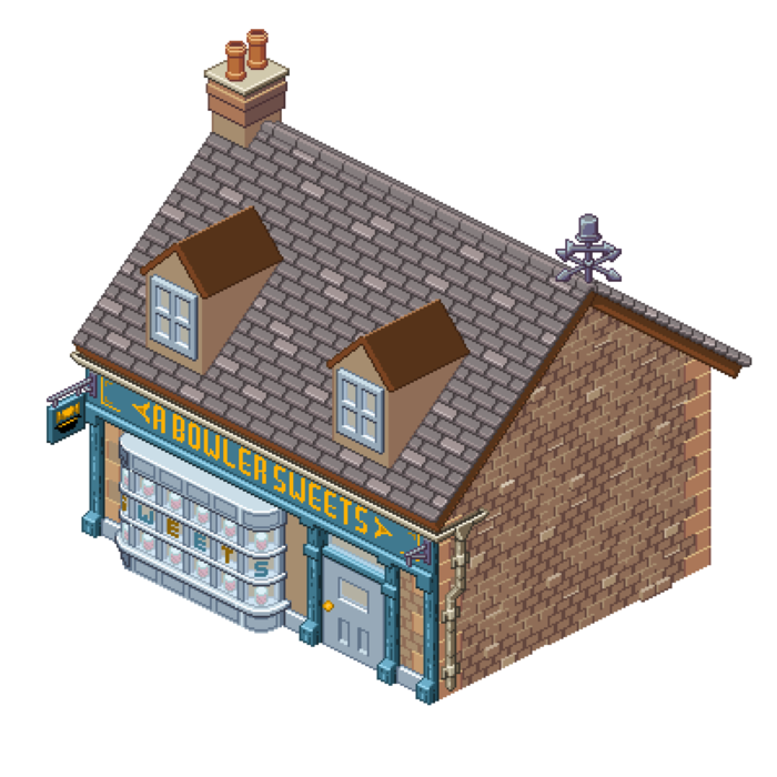
Next I tried to create a brick texture for the walls, I started with a perfectly repeating grid and then went through and broke it up with different brick variations such as bricks that go in and out.
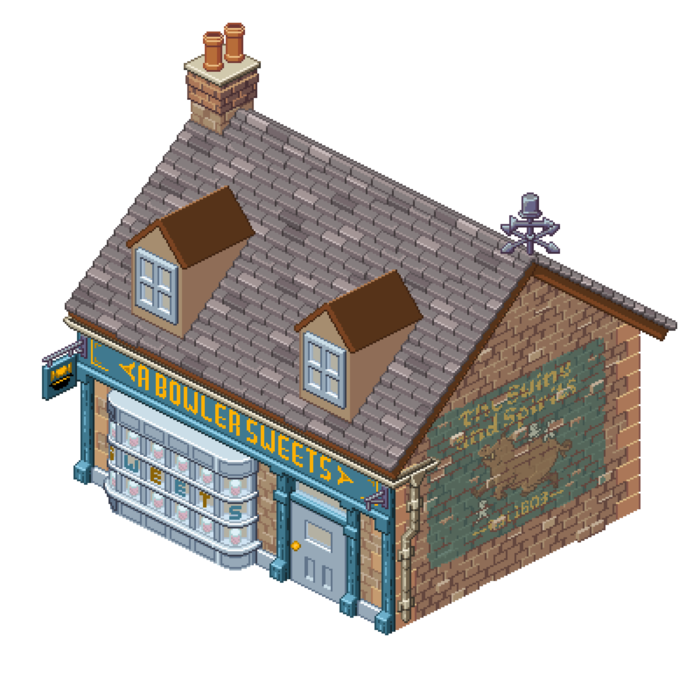
To add some interest to the plain wall I wanted to add a ghost sign. I chose a logo that is for another business within the game and then had to translate it to an isometric pixel art design. Once I had layered that over the wall I had to make it looked old and weathered by removing the colour in specific areas and lowering the opacity to give the effect that it had faded.
At this point I also went back and redid the roof tiles to give them some more dimension. These tiles look much more appropriate and fit with the overall style and design better.

The next challenge was drawing roof tiles for the dormer windows so that they worked with the new angle and joined up nicely with the rest of the roof. A decent amount of trial and error was used until I found a layout that worked nicely.

The last touch was to add a wooden texture to the front of the building. This not only tied the whole design together nicely, but also made more sense that the previous colour which gave the impression of a metallic texture.
gLike
Chucklefish Placement Project
I created some artwork that Chucklefish was so impressed with that they gave me the opportunity to participate in an Artist Experience Placement with them. Leading up to this placement I drew various characters and scenes in the styles of some of their published games. Once the placement began I had to follow their art pipeline to create and draw a building of my choice in the style of their upcoming game: Witchbrook.
Available
Freelance, Full-time
Alex Pollard
Pixel Artist and Games Designer
Plymouth, United Kingdom