
This was a data model to explain the breakdown of instances where and when people decided where to have dinner. If they had it at home, the breakdown was displayed by the clock graphic with the total amount listed. Underneath that was the mood and need-states of the individuals.
Once again, all information is proprietary and confidential, so the actual information has been stripped from this graphic and replaced with lorem ipsum.
View PDF
View PDF
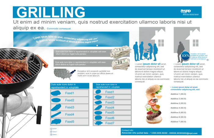
One page deliverable created as a proactive campaign for grilling data.
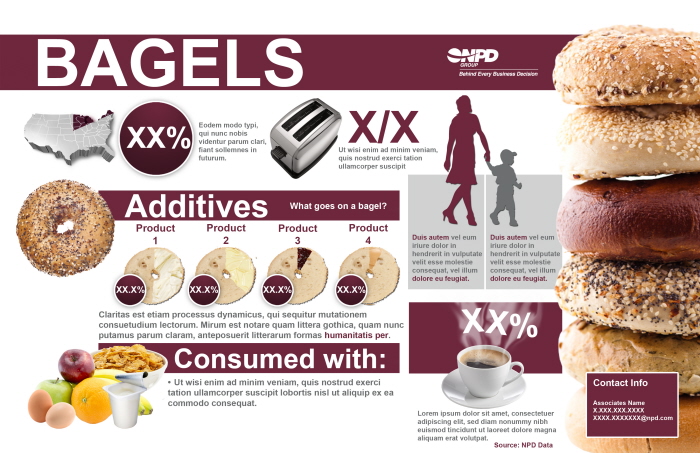
One page deliverable created to disclose Bagel data for a proactive initiative.
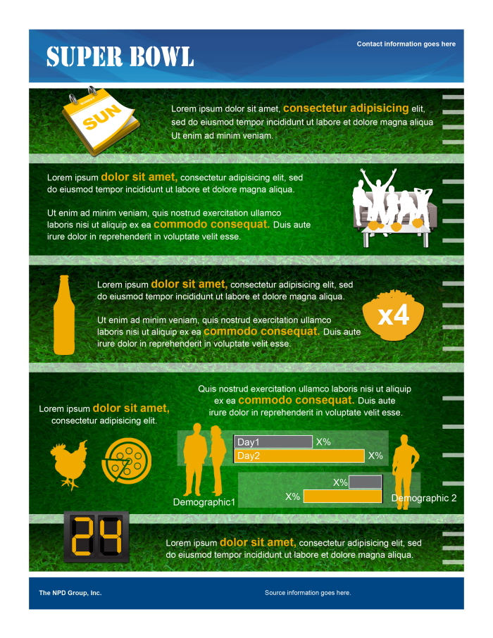
Infographic created for clients about the Super Bowl and food consumption. Data has been stripped and replaced due to information being confidential.
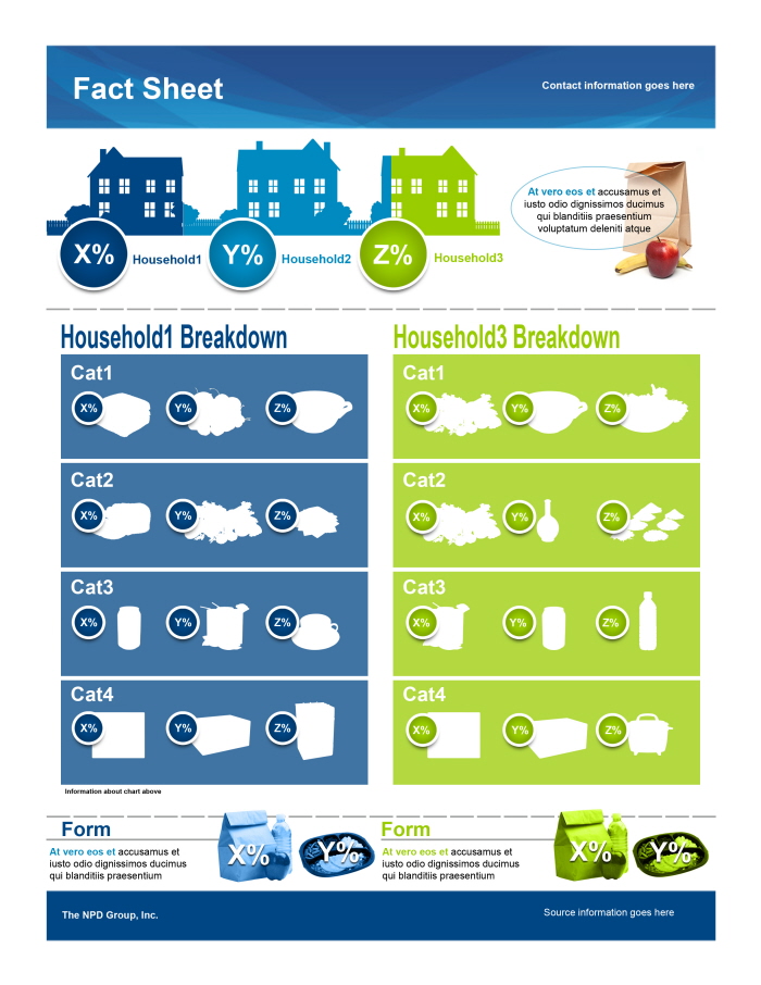
Infographic sheet based around a demographic breakdown. First chart is actually a stacked bar chart broken down into an image of each "household" and further illustrating two particular households (1 and 3) and their top ranking consumption habits. Information has been stripped due to confidentiality.

Marketing piece delivered to our clients with information pertaining to snack consumption while watching movies. The information has been stripped due to confidentiality.
View PDF
View PDF
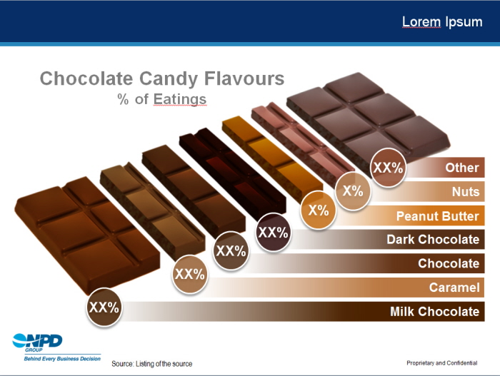
While working on a deck for our Canadian branch, I received a stacked bar chart showing different instances of chocolate consumption. Rather than show the stacked bar, I converted the graph into an image of an actual chocolate bar, color-coding each.
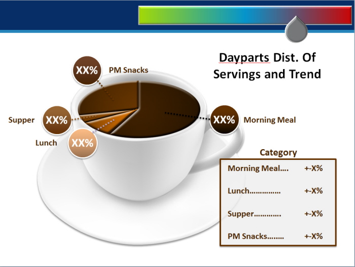
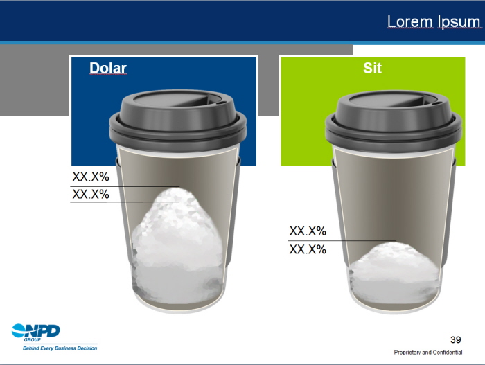
Coffee Data slide created to replace a stacked bar chart.
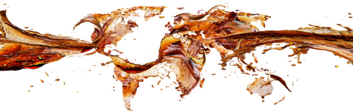
While working on a deck for one of our clients, I wanted to create a graphic specific to their global initiative. Using stock images, I created the illusion of soda splashing to create the map of the globe.
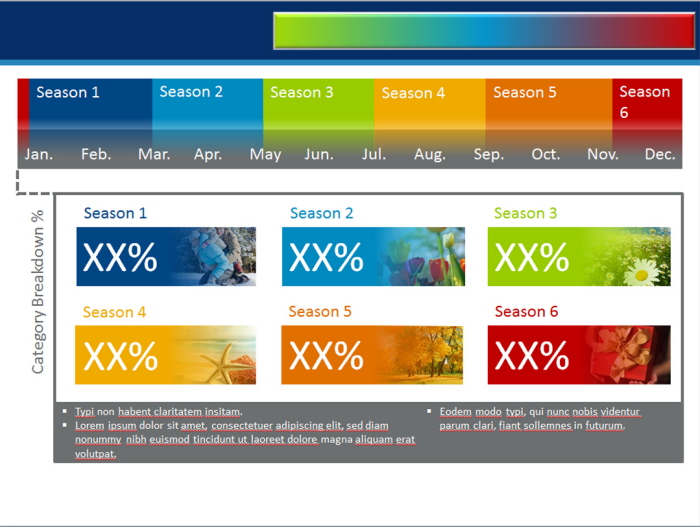
Working with advanced analytics, this layout was created to depict each of the custom season breakdowns for a research project.

Vector-based graphic created in Illustrator to demonstrate the relationship and process from "manufacturer to retail."
Animated Slide: in PPT, this slide shows the trends of content in coffee over the course of a year. Two differing values are represented through an animation over time.
Coffee cup graphic and "sugar" were created using Photoshop and animated in PPT.
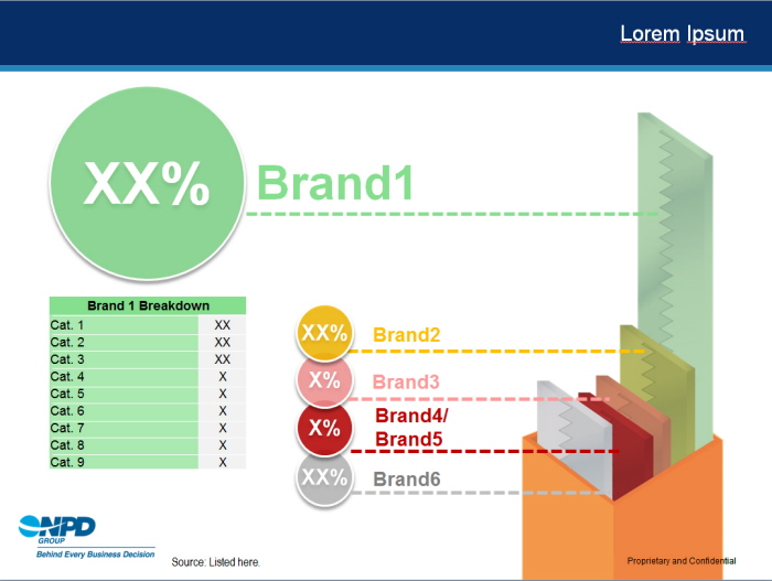
Using Illustrator, I converted a bar chart into the subject the data revolves around. The differing heights are actually representative of the percentages of each breakdown by category.
gLike
Work at NPD
The information is private and confidential to the clients who request it, so I have stripped the data and text boxes of any content. The layouts/graphics are my own.
Available
Freelance, Full-time
Brett Baldwin
Lead Graphic Designer, Photographer, Video Producer, Illustrator
Chicago, IL