
U.S. Department of Energy - Earth Day - Project included logo design, branding concept, 2 different posters, flyers, banners, table-tents and t-shirt design.
For this project I was the creative director and developed the design and branding for the event. Once the designs and branding was approved by the Department of Energy I tasked each of our designers including myself to continue to build the designs.
U.S. Department of Energy - Earth Day 2011 - Table Tents for use in the Department of Energy's cafeteria. This seemed like a simple piece, but the layout was what made it special.
All of the collateral was laid out in Adobe inDesign. It's funny, but clients never really understand just what makes the design work. Earth Day/Week is crazy and constantly changing and updating. This flip table-top card is what made everything work. So seemingly simple, but the text on the second side was the agenda used on all of the posters. We had 8 different posters and 2 agendas, 1 for each location. This second side and inDesign file was linked to 4 posters for each location so that when DOE made last minute changes we only had to make them in 1 or two files, then simply update our links for the other posters and reprint the 11x17s as needed. This idea is what enabled our team to make those frantic last minute changes and ensure they were accurate across 8 files.
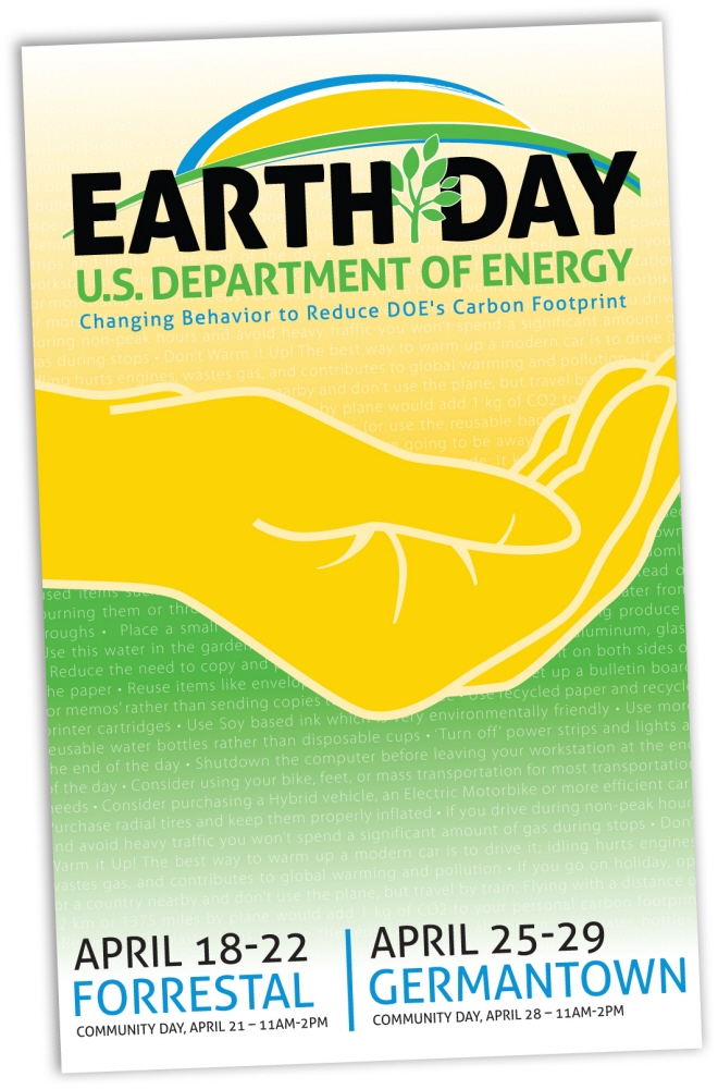
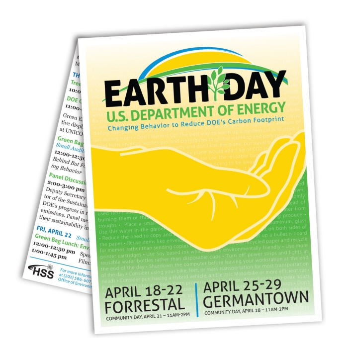
U.S. Department of Energy - Earth Day 2011 - This was the flyer/poster piece of the branding that was posted throughout all of DOEs facilities advertising Earth Week/Day.
This concept is what drove all the other branding pieces. I wanted to keep it simple and easy to read. I had the idea for the text treatment in the background during one of our initial meetings. After all, ways of reducing the carbon footprint was the ultimate goal for the national event.
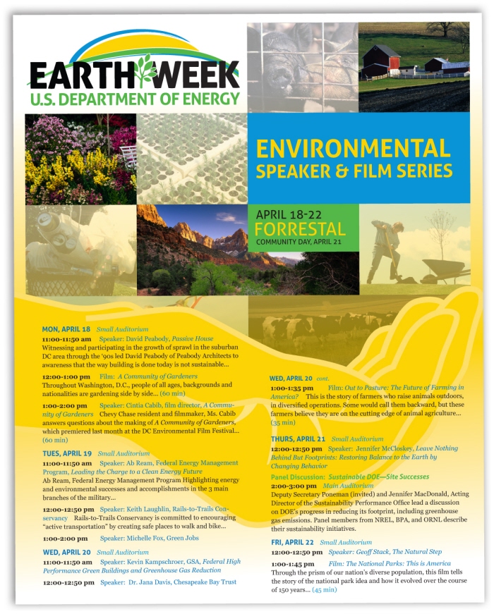
U.S. Department of Energy - Earth Day 2011 Poster - The Department of Energy had two locations with multiple sessions for the event going on at the same time, so after my initial meeting I felt it was important to design and develop something that was flexible and easy to update depending on the location.
The posters needed to not only be easy to update, but well branded and unique. The concept made it easy for the text and images to easily be swapped out and updated depending on the subject matter of each session. This enabled us to quickly customize and change the look for each poster, while quickly turning around changes and additions.
gLike
Branding Campaign - Earth Week 2011