
Cordish Company - Brochure - Brochure design I created for the Cordish Company's Daytona Live! brand. I designed the layout and developed the text. By utilizing the colors of the brand to highlight important portions of the content it helped prospective targets quickly pick out key words.
What Made This Design Special:
The main focus of the design had to be racing, so I utilized the checkered flag in various ways to help subtly create the look and feel the promoters were looking for.
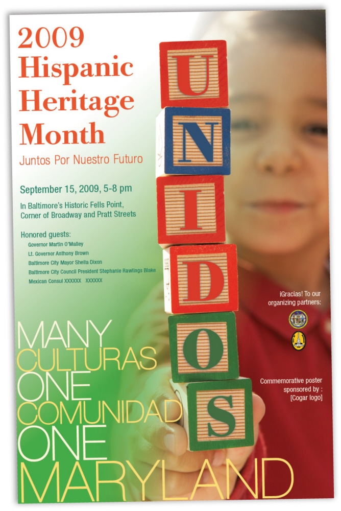
Baltimore Hispanic Chamber of Commerce - Hispanic Heritage Poster - Poster design for the Baltimore Hispanic Chamber of Commerce
What Made This Design Special:
They ended up using both versions, but what I thought needed to stand out was the community aspect, heritage and them all coming together. I achieved this through the use of color and the interplay of the image with the design. Utilizing the tree and children helps instill the notion of growth, new life and moving forward. The soft color palette helps to bring home that fresh new start feeling.
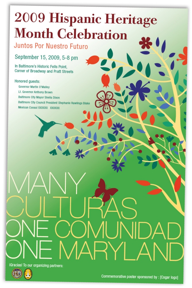
Baltimore Hispanic Chamber of Commerce - Hispanic Heritage Poster - Poster design for the Baltimore Hispanic Chamber of Commerce
What Made This Design Special:
What I thought needed to stand out was the community aspect, heritage and all of them coming together. I achieved this through the use of color and the interplay of the image with the design. Utilizing children helps instill the idea of growth, new life and moving forward. Manipulating the text within the image allowed me to add a small personal touch which made the design even more special.
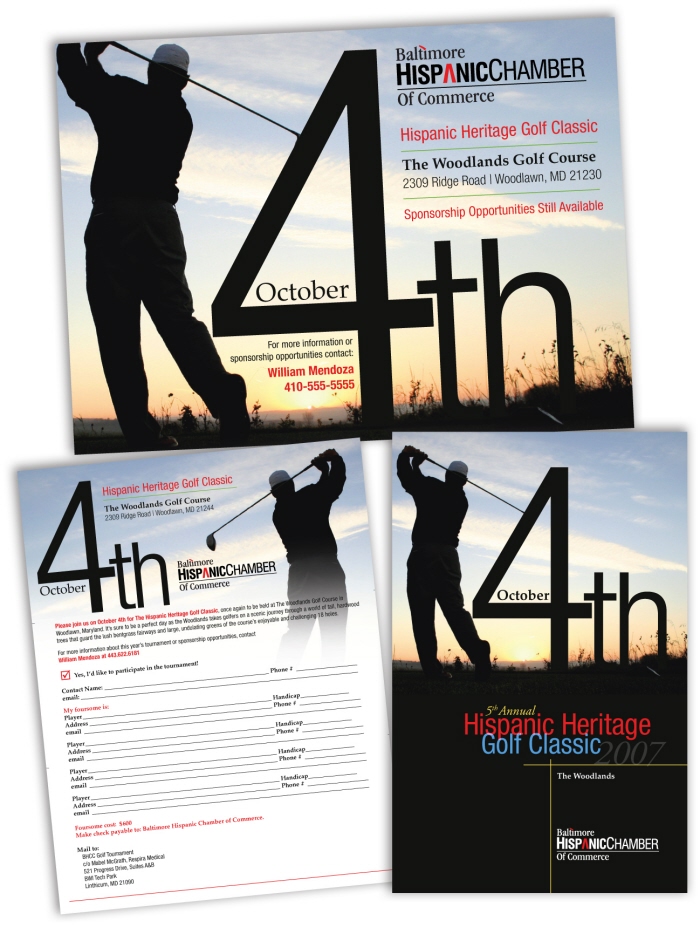
Baltimore Hispanic Chamber - Event Design - What Made This Design Special:
I try to approach every design problem with an unique answer. I took a simple project, and through the interaction between typography and imagery turned it into something different and eye catching.
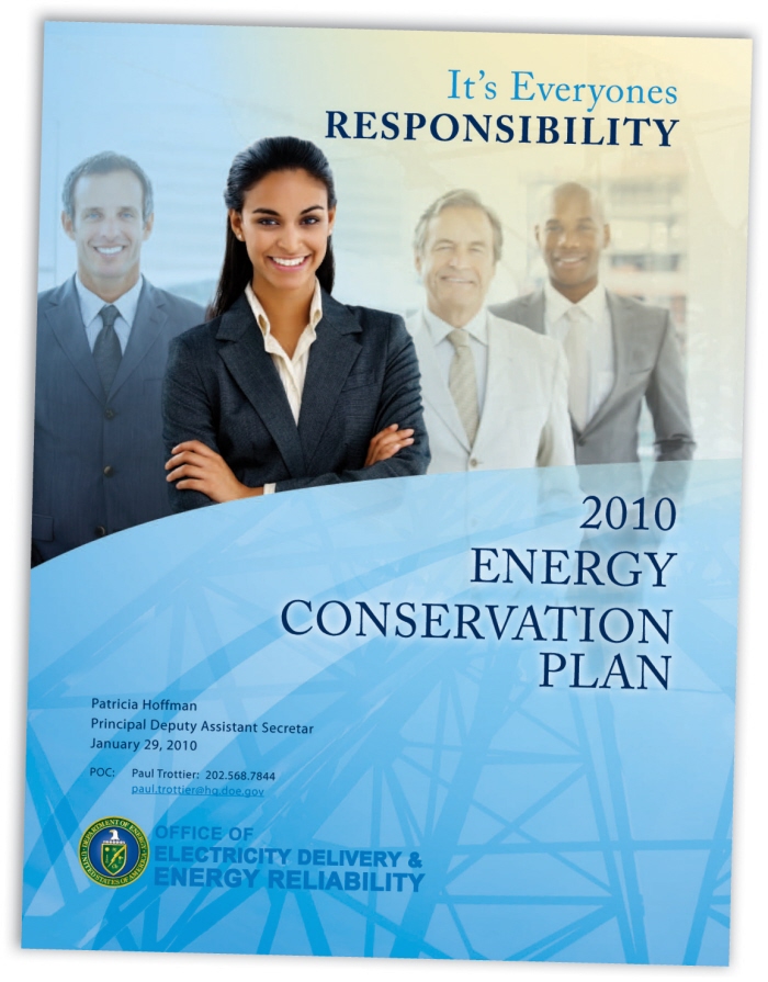
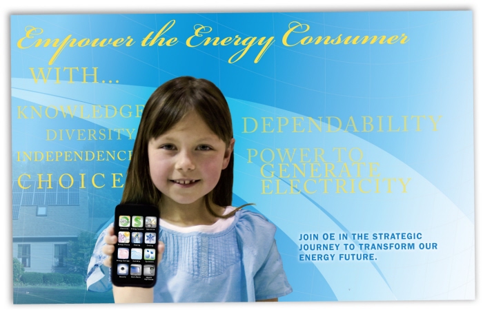
U.S. Department of Energy - Strategic Plan - Strategic Plan and Branding for the Office of Electricity Delivery & Energy Reliability
What Makes this Project Different?
Typically strategic plans are pretty long and boring, but I tried to take a different approach with this client. This one was still long, but I wanted the pages to read more like a magazine with a light color scheme that really highlighted the forward thinking approach of the technology they were developing.
U.S. Department of Energy - Strategic Plan and Branding for the Office of Electricity Delivery & Energy Reliability
What Makes this Project Different?
Typically strategic plans are pretty long and boring, but I tried to take a different approach with this client. This one was still long, but I wanted the pages to read more like a magazine with a light color scheme that really highlighted the forward thinking approach of the technology they were developing.
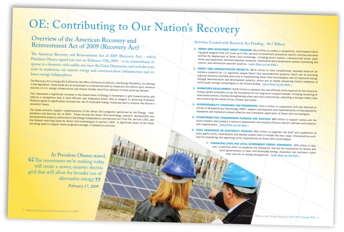
Interior pages for the Department of Energy - Office of Electricity strategic plan
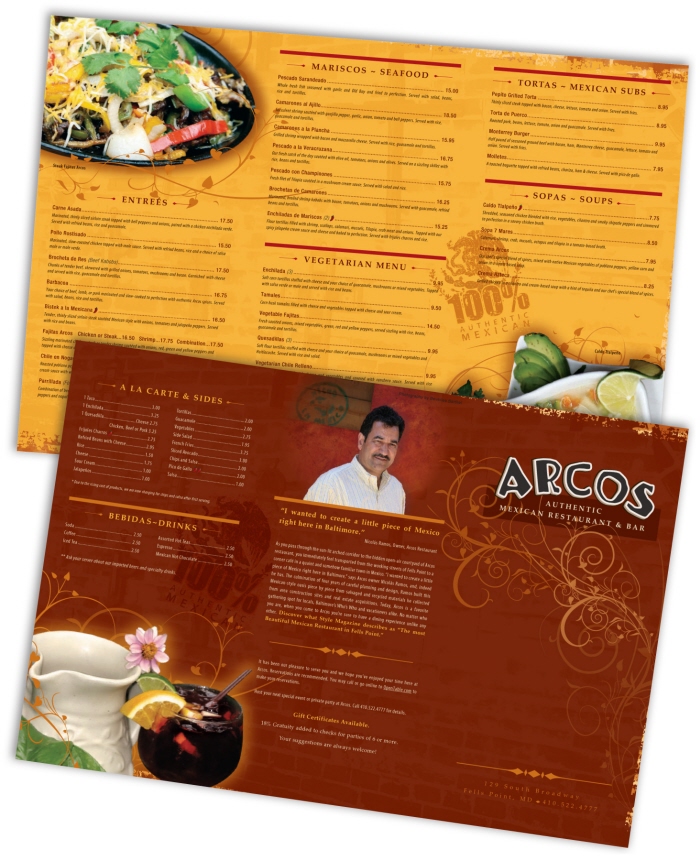
Arcos Restaurant Menu - This Menu was part of a re-brand for the restaurant which included a new website, logo, catering flyer, and HTML email campaign.
What Made This Special:
After the initial meeting, we based the entire rebrand off of a swirl pattern the owner applied to the ceiling with plaster. Everything in the restuarant is handmade and we felt it should show through in their collateral.
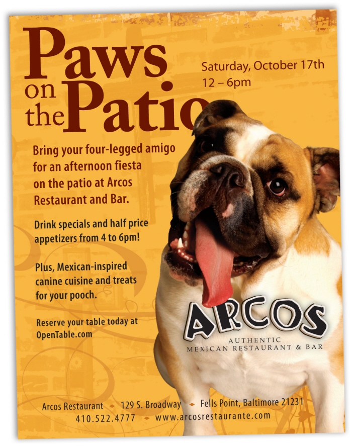
Arcos - Paws on the Patio Flyer - This flyer was used to promote the website and was part of an integrated campaign that utilized Print, Email and a Landing page to capture the traffic from the email.
What Made This Design Special:
I really love how the image used helps interacts with the logo, making it more playful and slightly adding dimension to it.
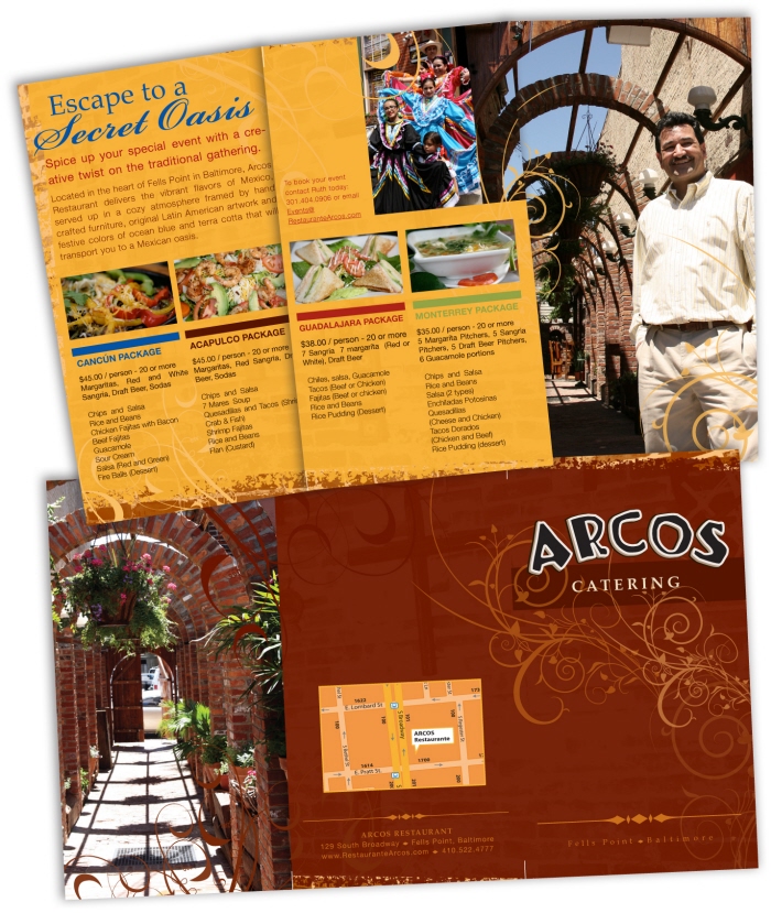
Arcos - Catering Menu - This was a brochure for the catering portion of their business.
What Made This Design Special:
I utilized the vibrant colors in the images to brand the packages. The font choices work in perfect harmony with the Arcos branding to make one cohesive package. I also felt it was important to really make the owner a prominent part of the design. He really makes you feel at home in the restaurant and gives the viewer someone to identify with.
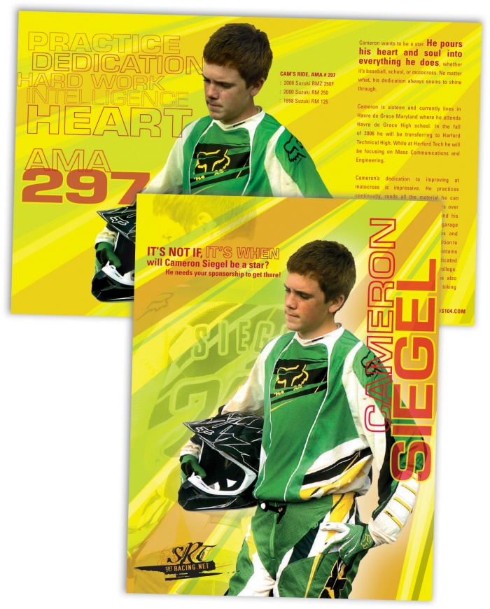
SRT Racing - Brochure - What Made This Design Special:
I developed the branding / marketing concept, shot the photography and designed the layout for SRT. I really wanted the design to mimic the fast paced, adrenaline pumping speed of the sport. I came up with the layout and color scheme based on the riders gear.
Cameron is an amateur rider, but his collateral and branding gives his sponsors the appeal of a world class, professional rider.
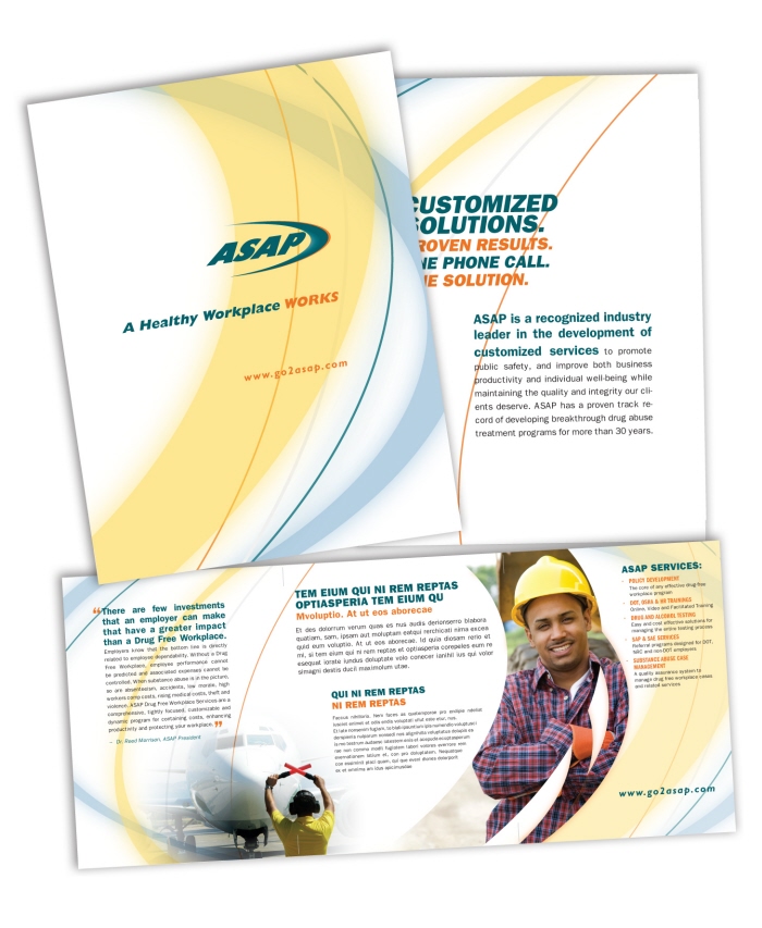
ASAP Substance Abuse Professionals - 7x9 Trifold Brochure. This design is based off the clients logo which was already in place. I used tints and compliments of the colors from their brand to add variation.
I wanted to keep a clean, light feel to their collateral and utilized the shape from their logo to create different shapes for the picture boxes.
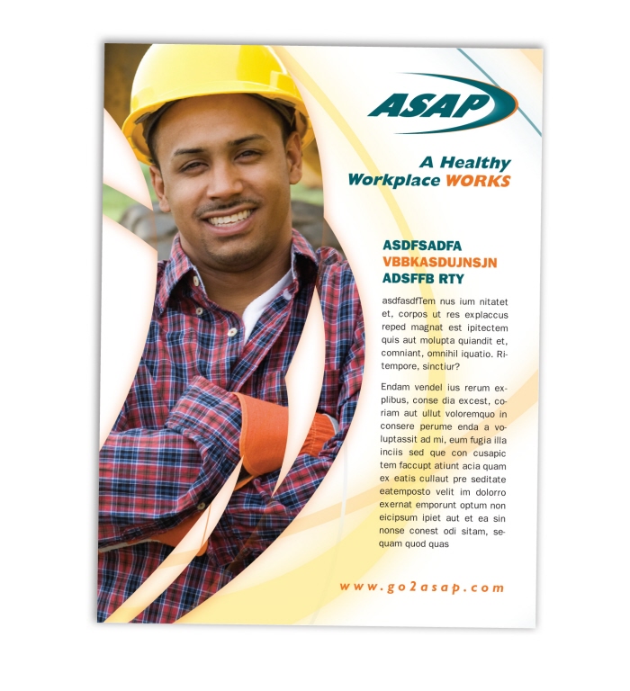
ASAP Substance Abuse Professionals - Flyer insert which was utilized along with the folder design for ASAP. This again plays off the curves within the logo.
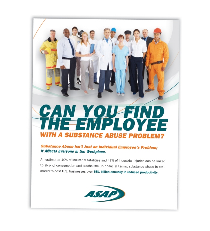
ASAP Substance Abuse Professionals - Marketing concept for the Flyer insert which was utilized along with the folder design for ASAP. This again plays off the curves within the logo.
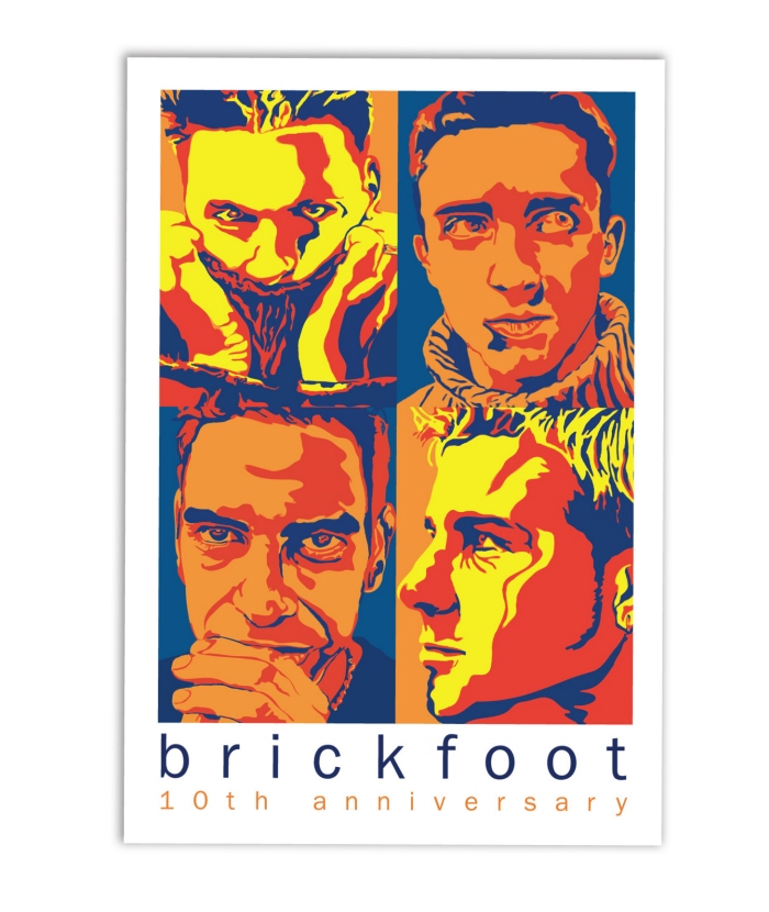
Brickfoot Poster - Poster that I designed 10 years ago. It was one of my first designs ever, but is still one of my favorites. They originally showed me some black and white images and I remember just being blown away by the candid shots. They were the inspiration for the design.
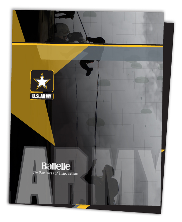
Battelle - Folder Design - Folder design for the Army Market Sector within Battelle.
What made this unique was the printing effects we used. I utilized different varnishes to really make certain items pop.
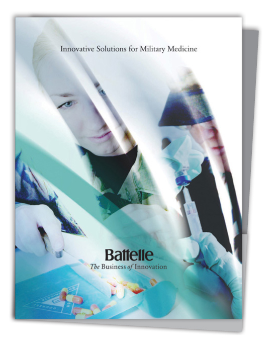
Battelle - Military Medicine Folder - Folder design for the Military Medicine group within Battelle.

Battelle - Invitation & Branding for Conference - Conference flyer and invitation. This design was also utilized as a large mural for the conference as well as promotional materials.
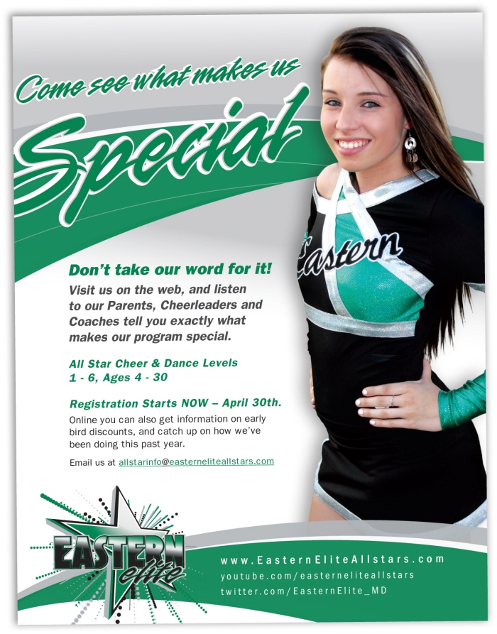
Eastern Elite Allstars - Flyer - Flyer design as part of their integrated campaign to help drive traffic to the website and YouTube page for registration.
The design utilized the tagline and was branded with their logo and corporate colors.
gLike
Print Design