
A mobile-friendly version of a local restaurant's home page. Research showed that potential customers wanted location, hours, and phone numbers the most - even before the menu selections - so the page was developed with those three items at the top. Click-to-map and click-to-call buttons make it easy to find the restaurant, and all clickable buttons are spaced apart to lessen the chance of clicking the wrong field.

A look at the same mobile site on a scaled smartphone screen. The buttons are more placeholders than finished displays, just to demonstrate spacing and operation.

Before: The original site was plain and confusing, offering mysterious log-in boxes with no explanation and no logical flow to a visit.

After: The redesign included a more eye-catching color scheme, better copy, and moved the log-in options to a dedicated page.
View PDF
View PDF

Before: The original site was plain and confusing, offering mysterious log-in boxes with no explanation and no logical flow to a visit.
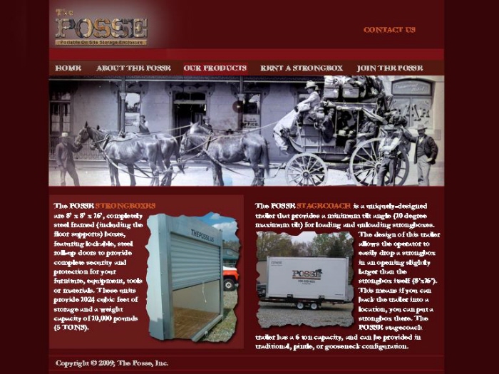
After: The redesign included a more eye-catching color scheme, better copy, and moved the log-in options to a dedicated page.
View PDF
View PDF
gLike
Web Design
Selected website updates.