
The "BE" campaign holiday card series. The client provided the verbiage and asked for a few non-traditional style cards. These cards could either be mailed, sent digitally, or posted on Instagram. They had to utilize the client colors, and the dual stripe motif.
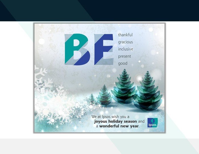
Snowflake / hillside trees for this first design. The stripe motif was added on the large letters. The concept being that we are imparting a sense of peace over the landscape.
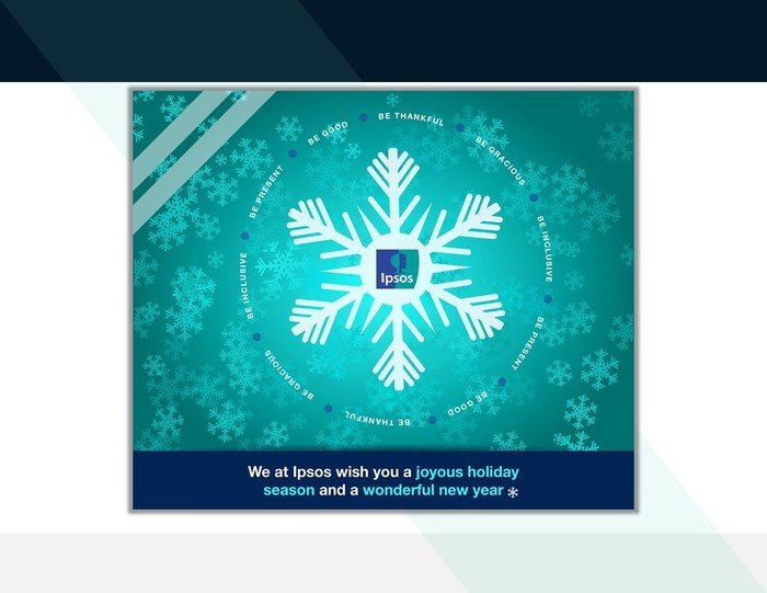
Continued with the snowflake variation, adding the strips in white at the top. This time, the verbiage is wrapped around the snowflake and the logo itself. The concept being that these statements are being spun out from the client.
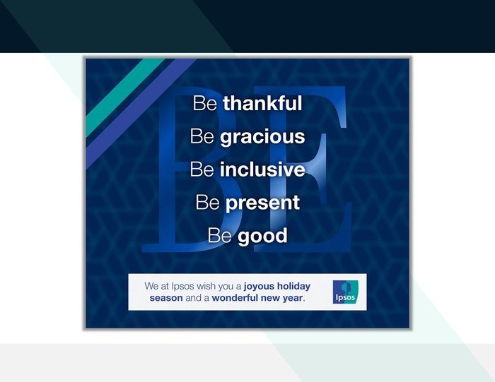
Including the stripe motif in the upper left, but "BE" is quieter. The concept being we are not telling you to do something, but encouraging you in doing it.

Stripe motif at the bottom in the client colors. Using the snowflakes around the edge, but not touching the client logo. It's a crystalline look, allowing for the words, despite the smaller size, to be clear in understanding. The concept being this is a wish for us all.
gLike
Generic Cards
Generic non-specific holiday example cards.