


Design Brief:
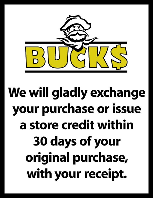
Bucks was a local Tri-State dollar store chain competing with the major national players in this retail category. After they got a local agency to create their Buck icon they sought us out to create all their in-store signage from sales to legal items to differentiate Bucks from the competition.
Action:
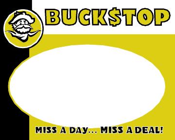
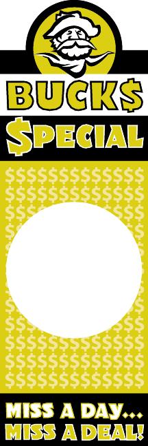
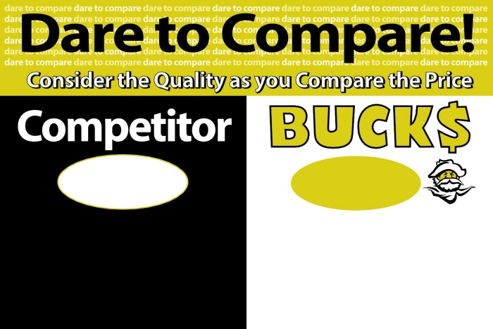
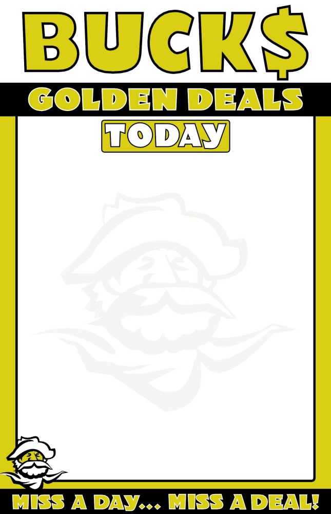
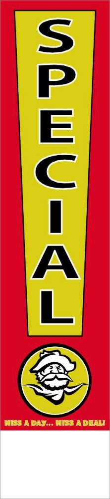
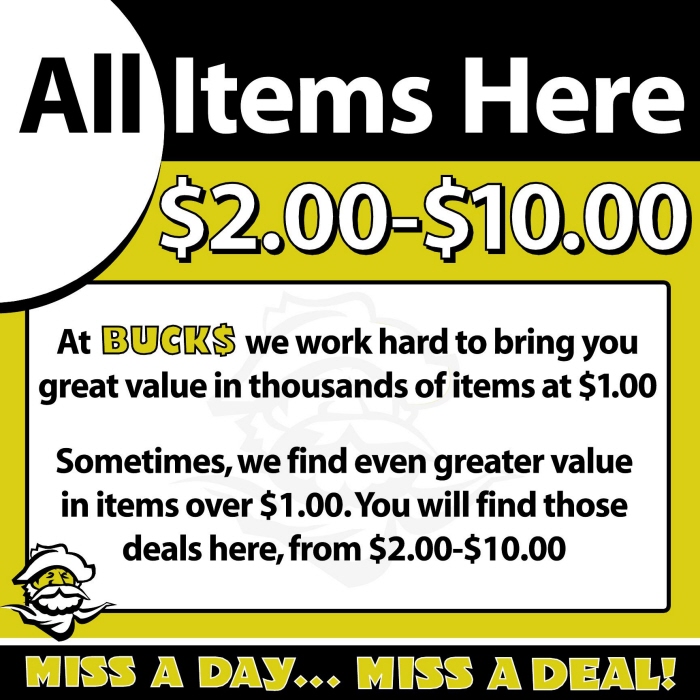
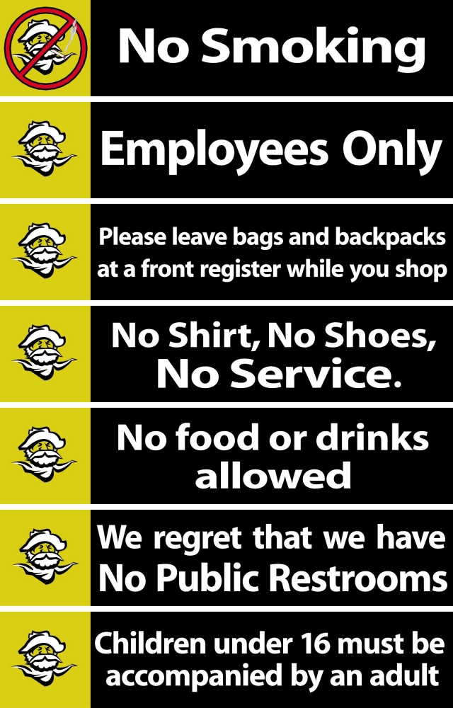
Their corporate colors of black and gold would be the predominant look in most of the signage as well as the addition of red in certain "hot" sales signs. The stores would have a clean, fresh, professional look and include the following:
• 5 x 4 Shelf Card. • 3 x 9 Card. • 4 x 18 Specials Card. • Shelf Strips. • "Dare to Compare" Endcap Header. • Golden Deals Dry Erase sign for both the weekly flyer as well as special deals which could be hand-written on. • 24 x 36 Seasonal Window Signs. Aisle signs and all the legal signage continued with gold & black design.
• Adobe Illustrator
• Indigo HP
• Komori Press
• Large Format HP printer
Bucks Dollar Store Signage