
VelvaCling Logo - This logo was designed for extra slim clothing hangers, flocked with velvet-like material to keep fabrics from slipping off. The bold, black "Velva" communicates the hanger's texture while the thinner "Cling" reiterates the hanger's slim design.
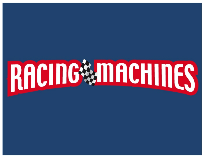
Racing Machines Logo - This logo was created to help pull three (3) separate and completely different toy packages together to form one dynamic family. Its bold colors and checkered flag stand out on rich blue backgrounds, each logo curving to match the die windows and frame the product(s) below.
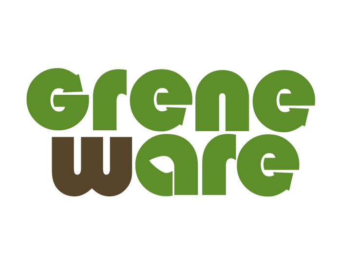
Greneware Logo - Logo for a line of biodegradable bamboo tableware. The "e"s were a natural for integrating the familiar recycle arrow and the center of the "a" presented an additional opportunity for inserting the leaf shape. Coloring the "w" brown added interest and contrast to the green, both colors eluding to the inherent colors of the bamboo plant.
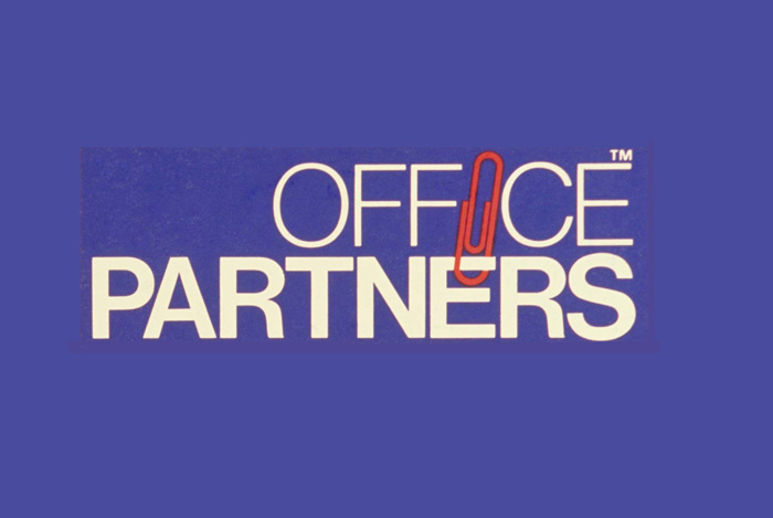
Office Partners Logo - This name was a natural for integrating the paper clip image. Since the logo would be applied to filing cabinets packaging, utilizing a blue print theme, the bright white type was accented nicely with the red paper clip. A further enhancement was the juxtaposition of the bold font against the thin font.

ChefElect Logo - Created for a line of kitchen appliances, utensils, gadgets, storage items. Simple font and illustration with gradient work well on a variety of background colors.

Culinary Elements Logo - I arrived at the brand name by brainstorming words associated with cooking and kitchen. After brand was trademarked, I designed the logo to be used on packaging for a line of kitchen gadgets . Red is known for its appetite inducing properties so was a natural background for "culinary". The (Copperplate) font is a throw back to kitchen appliance logos used when appliances used to outlive the kitchen they were installed in!

One of three logos submitted (pro bono) to the Mayor's Wellness Committee of South Plainfield as a way of giving back to my community. Pink color symbolizes being in good health ("in the pink") and green symbolizes new growth. The heart, M and W nest together to form a icon that could be used without the 3 line title once equity has been established.

One of three logos submitted (pro bono) to South Plainfield's Mayor's Wellness Committee, selected to be used as letterhead and printed on other stationery/flyers. Green symbolizes new growth (or new behavior) and pink stands for good health ("in the pink"). The slogan was added to advertise the committee's purpose. The pot of gold is the metaphorical reward for staying healthy.

Personal preferred logo/colors.

One of three logos submitted (pro bono) to South Plainfield's Mayor's Wellness Committee. I was happy to give back to my community in this way.
gLike
Logos