
Client: Kaufman Chiropractor - A last minute advertisement from a Bothell chiropractor. Ad was created in half a day with no revisions, based off a fax sent late in the morning. Stock photography was used as the main image. Their only requirement was to include their logo and photo of their building. Advertiser was very pleased with the outcome.
2009 WNPA First Place - Category: Best Black and White Ad
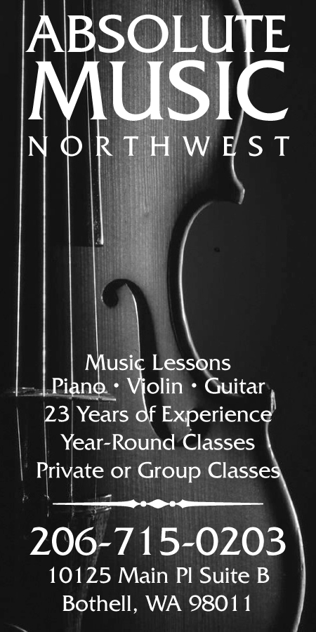
Client: Absolute Music Northwest
A small black and white newspaper advertisement for a client offering music lessons. Both the layout and the logotype were created in two rounds. Stock photography was used as a background photo.
2009 WNPA Second Place - Category: Best Small Black and White Ad
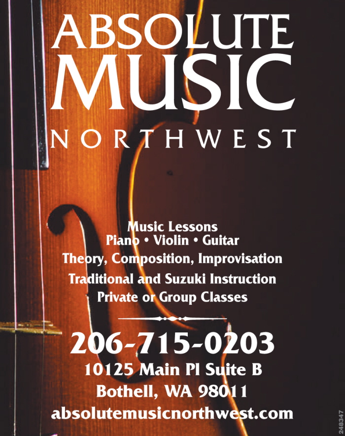
Client: Absolute Music Northwest
Client liked their black and white ad so much she decided to run it again in color and later as a business card.
2010 WNPA First Place - Category: Best Color Ad

Client: Aesthetic Denture
Small ad created for a denturist. Stock photography was used as the main image.
2011 WNPA Second Place - Category: Best Small Black and White Ad

Client: Gotta Dance
Spec ad created for a Redmond dance studio. Illustration of dancer rendered in Photoshop.

Client: Whole Earth Montessori
Two-color ad created with a faux duotone effect. Stock photography was used while repeating the leaf motif in the logo.
2010 WNPA First Place - Category: Best Use of Spot Color
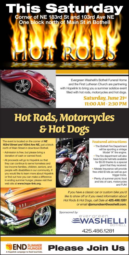
Client: Evergreen Washelli/Bothell Funeral
A combined effort from both the advertiser and myself went in to creating this ad. Customer supplied the wrong size and did not have time to resize the ad to the correct dimensions. I jumped at the chance to add the flame text (HOT ROD) at the top half. A proof was sent back to the advertiser, who approved and was very happy with the addition.
2009 WNPA Third Place - Category: Best Full Color Ad
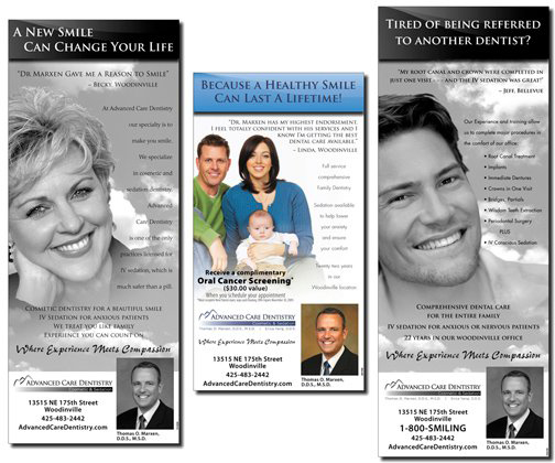
Client: Advanced Care Dentistry
A series of ads created to tie in with the look and feel of their existing media, which included their website, brochures and corporate identity.
2010 WNPA Third Place - Category: Best Ad Campaign

Client: Greater Bothell Chamber of Commerce/BuyBOTHELL
This full color ad was created to tie in with an existing theme created with their local directory. The image is a stock photo with a few Photoshop manipulations. The bag was converted to match an existing shopping bag. The tree in the background needed to be increased upwards by two inches. To make the photo simulate downtown Bothell a parking meter had to be removed from the background.
2011 WNPA Second Place - Category: Best Use of Full Color
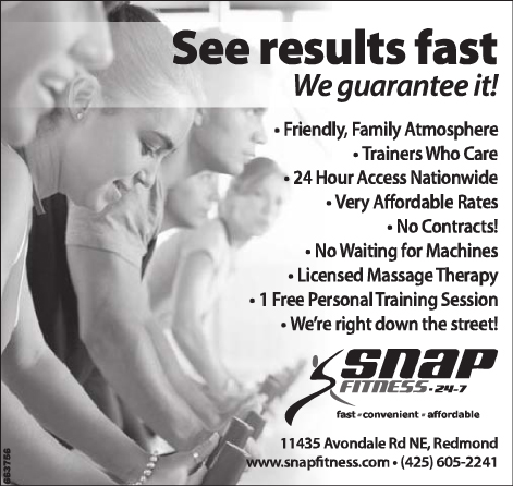
Client: Snap Fitness

Client: 180 Degrees Chiropractic
Client wanted something that would stand out beyond the other ads in the local paper. The stock photo image was selected because of the symmetrical balance and chiseled model. A gradation to fade the image to black was added to the bottom, where reverse text was added. Client was very happy with the creative portion of his advertisement.
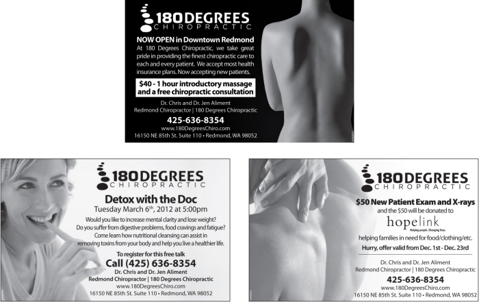
Client: 180 Degrees Chiropractic
A series of 3 ads, each created to highlight a special offer or event.
2012 WNPA Second Place - Category: Best Ad Campaign
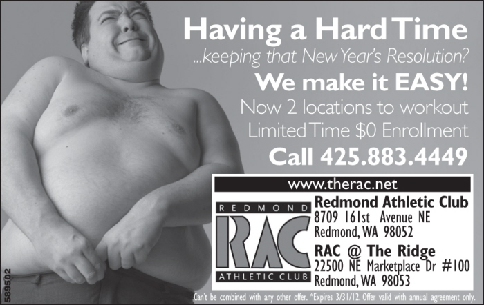
Client: Redmond Athletic Club
A small ad created one month after New Year's. Client wanted to emphasize both their workout program and the convenience of their new location. Limited on space, I tied the two together with the headline "Having a Hard Time ...keeping that New Year's Resolution? We make it EASY".
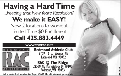
Client: Redmond Athletic Club
The owner enjoyed the humor with his previous ad but wanted it geared towards women. With that in mind a stock photo was chosen of a girl that may have gained a few extra pounds during the holiday months.

Client: Evergreen Womens' Health Center
Never thought I'd be doing an ad for something like this. Let alone win first place with it in the WNPA.
2010 WNPA First Place - Category: Best Use of Full Color
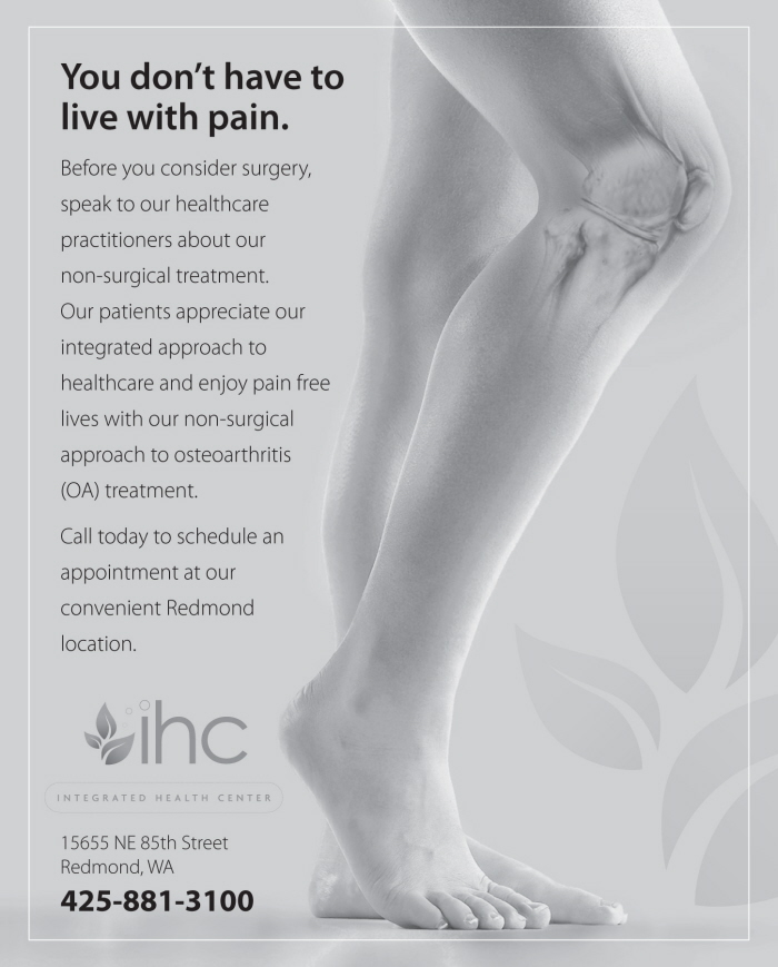
Client: Integrated Health Care
The challenge with this project was to create an ad using existing material from their sister offices. Several pdf's with the same image were sent to me. All contained large amounts of text. I was able to extract the knee image and combine with only the essential copy. The leaf in their logo was repeated in the background to help emphasize their holistic approach to medicine.

Client: Integrated Health Care
A skybox/toe-lug (front page ad) was the challenge with this ad. Spanning across the entire paper (6 columns) but only 1.5 inches tall. With the new year just around the corner they wanted to advertise their weight control program. I wanted to make use of their leaf logo again, as I did in their previous ad, as it lends itself to the holistic approach that they offer.

Client: Cascade Vista
Spec ad created for a regular client. Client asked for something cute and humorous to compete with other retirement homes.
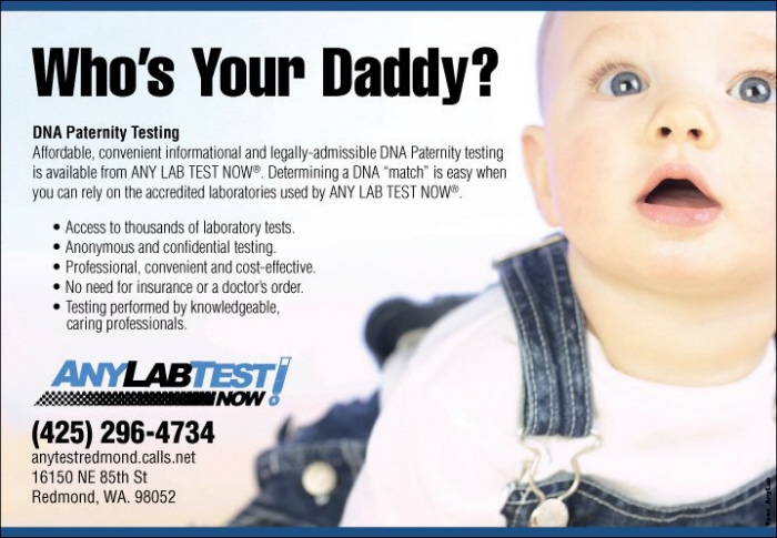
Client: Any Lab Test
Another humorous ad created, using the "Who's Your Daddy?" headline for DNA testing.

gLike