
Originally, this started life in a different version in 92, for use in ads for a college radio show. Playing around with very orthogonal forms - a line and a circle.
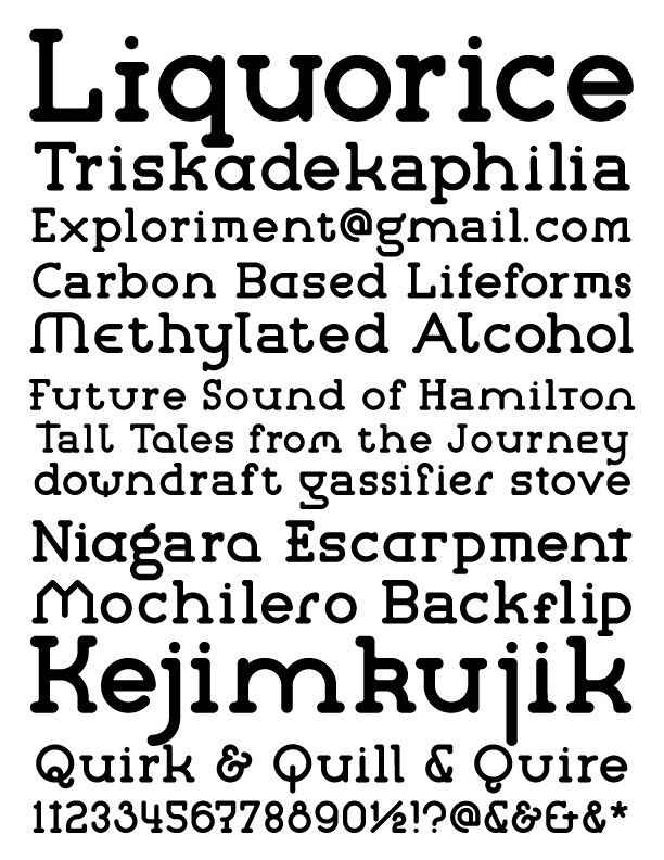
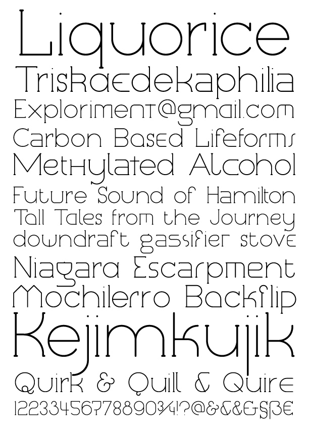
Now that I once again have the means to work on type, I decided to have another crack at this. There was still something I liked about the orogonal version, but decided to take it in a different direction. Namely to standardize it a bit, have lots of alternate characters, have sans-serif and serif versions, and a few different weights - Micromum, Minimum, Medium, Maximum and Megamum.
I think what I’ve come up with is the logical result of tossing DIN, American Typewriter and Lubalin Graph into a crock pot and letting it stew to create this. Or, to be all type geek about it, a globose adnate unmodulated geometric modernist typeface.