
I started from the most basic element that describes the company the best, movies (a reel) and Spanish speaking (talking bubble).
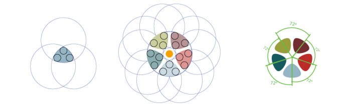
I designed a geometrical harmonic movie reel in negative. The reason of this is using diferent colors in each hole to represent the variety of countries and ectnicities that speak Spanish.
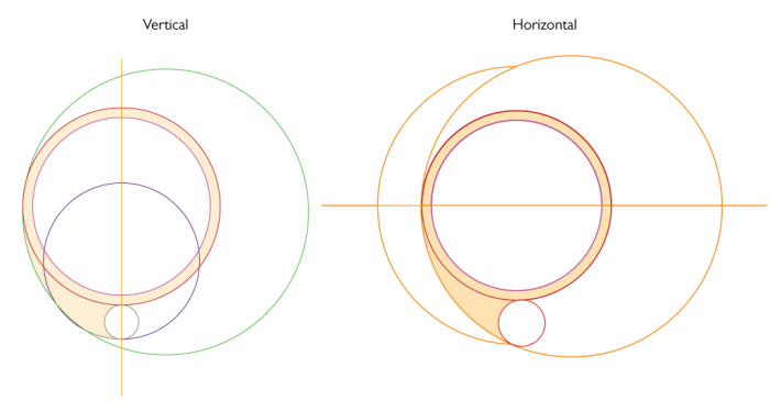
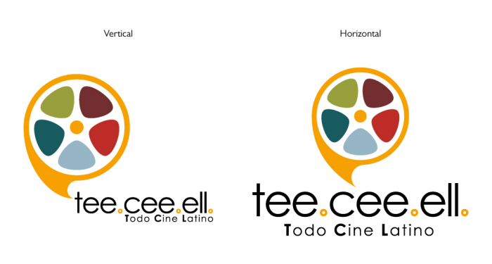
I designed the talking bubble and exterior part of the real based in perfect geometrical circuferences. I designed two version (vertical&horizontal). In the vertical the circuferences are aligned to a vertical axis. In the horizontal one the circuferences are aligned to an horizontal axis.
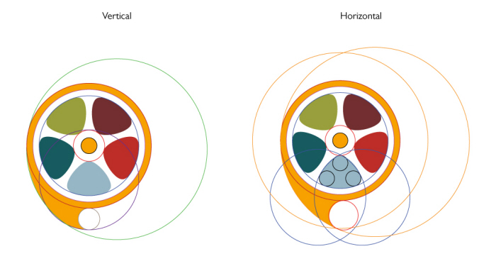
Placing the reel inside of the talking bubble keeps the geometri of the axis.
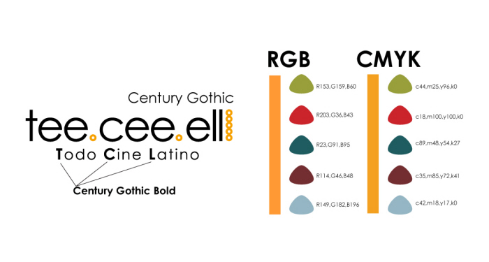
Due to the use of circunferences on the design I chose Century Gothic as typography. The colors:
Orange is the sun, one of the colors that best represent the Latino personality.
Green is nature, forest and jungle. Central and South America is plenty of them.
Brown is the earth, soil.
Red is the blood and pasion.
Blue is the sky.
Blue greenish is the ocean and caribean.
The idea of mixing all this colors is to describe a character and explain the variety of spanish speaker. It is a lenguagge that represent a lot of countries.
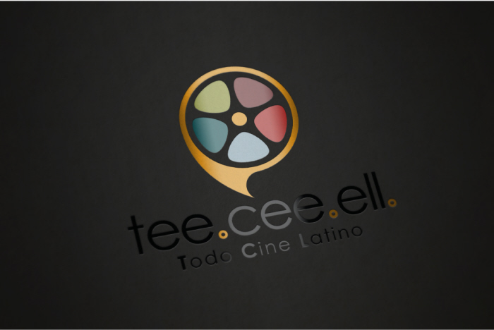
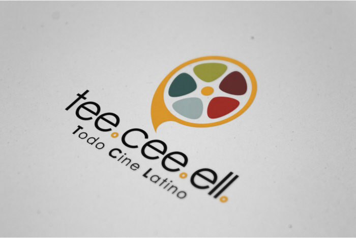
The final product.
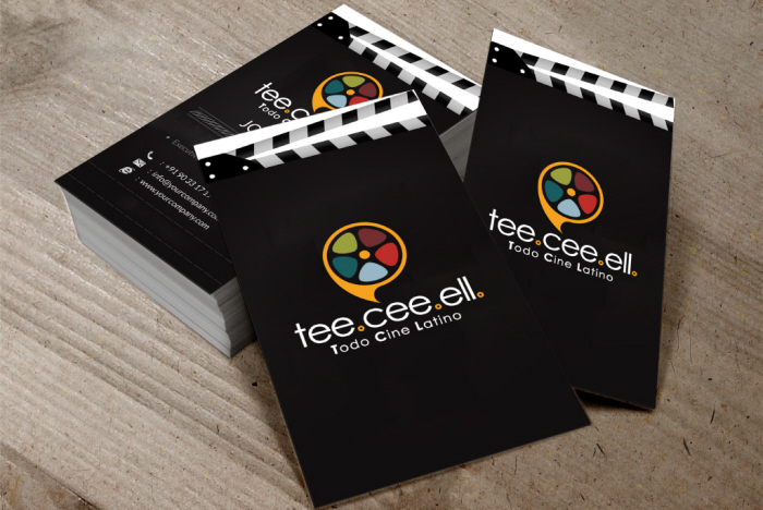
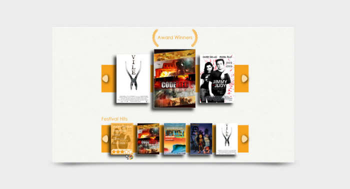
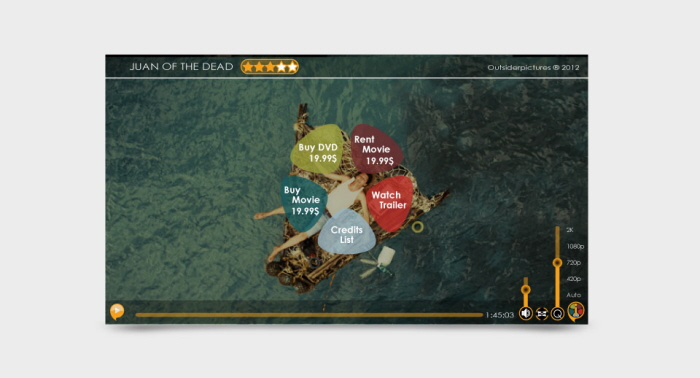
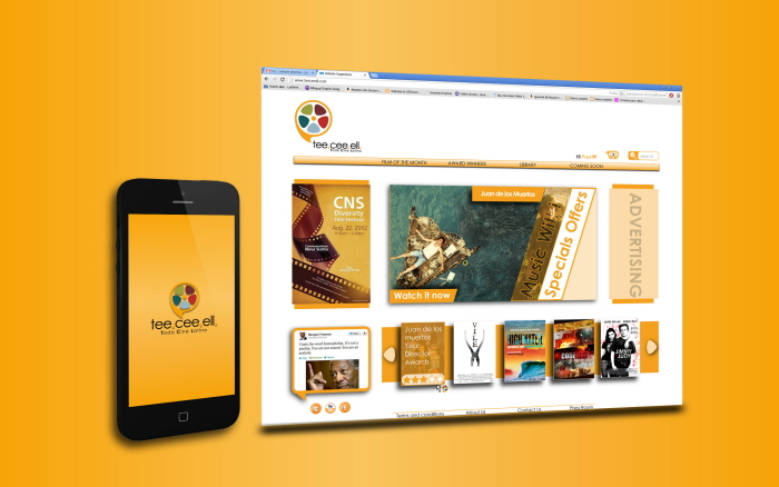
Once I had a solid Corporate Identity, I begun to design the UE elements and the website.
gLike
Tee.Cee.Ell.
I was asked to create a corporate identity, web and UE for a new website of movies on demand, Tee.cee.ell. It is focus in Spanish speaking audience. I created a corporate identity with two version of logo, vertical & horizontal.
Francisco Fernandez Garcia
Creative Graphic Designer at Freelance / Graphic Design Services
Los Ángeles, CA