
Cover Brochure
Inside brochure
gLike
FORHUS ce Brochure
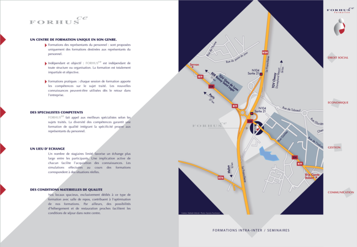
I designed the cover concept with a metaphorical image of a child’s first steps—symbolizing growth, learning, and moving forward—blending it with structured text and brand colors. The upward diamond shape suggests progress and forward thinking. I handled the visual direction, layout, and production, aligning design with Forhus’s mission to empower participants through multidisciplinary, intra- and inter-company training.
View Website
Nathalie Gribinski
Multidisciplinary Graphic Designer | Blending Fine Art Intuition with Design...
Chicago, IL