
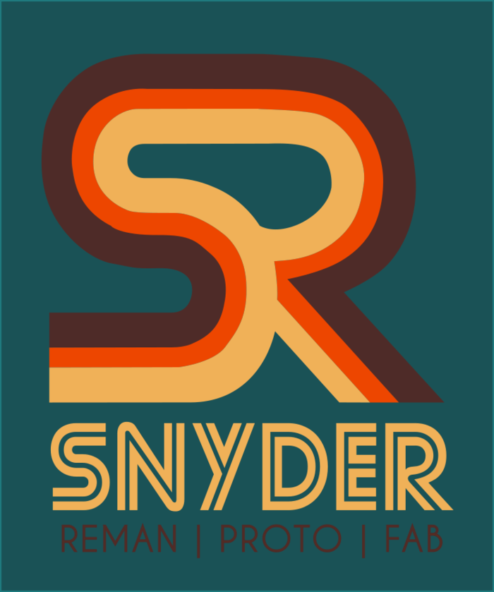
When the Snyder family—a father and two sons—approached me for a rebrand, they had a clear vision: they wanted to look modern without losing their soul. As a successful team in the remanufacturing and prototyping space, they needed a logo that felt engineered but lived-in.
The design process began with their shared passion for motorcycles. We built the color story around a specific shade of paint found on an old Harley Davidson tank the father used to own. This injection of personal history gives the brand a warm, nostalgic undertone, while the clean, geometric typography ensures the logo remains legible and versatile across modern applications. Today, the new branding unites their team, celebrated by a framed poster hanging proudly in their fabrication shop.