
gLike
Affordability Brochure
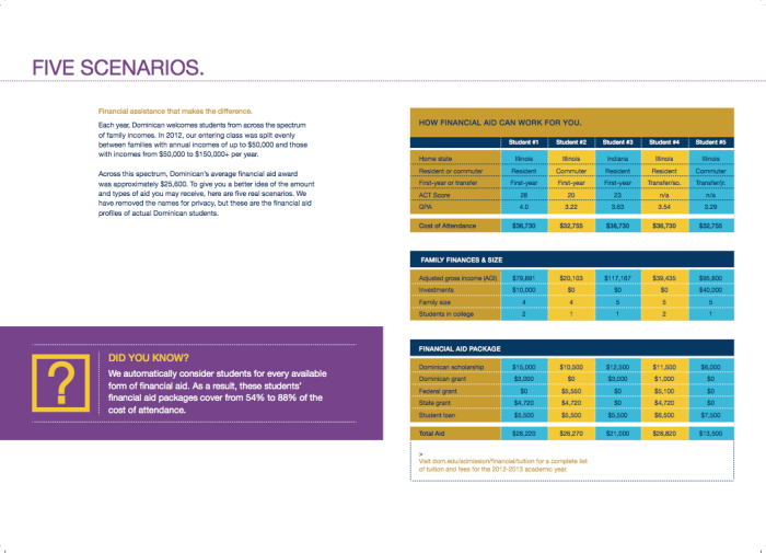
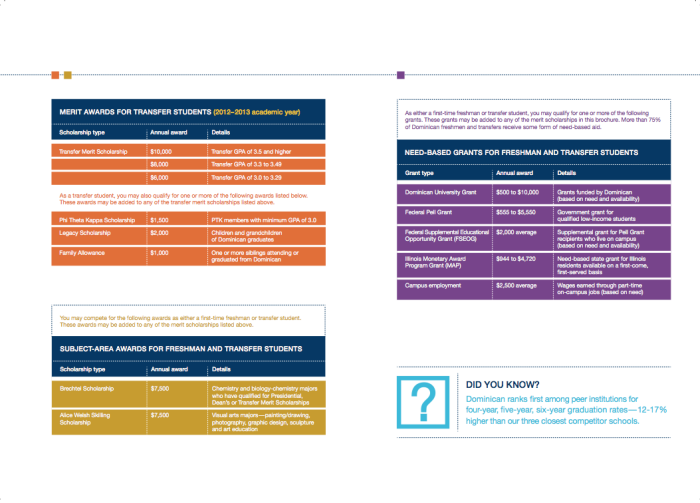
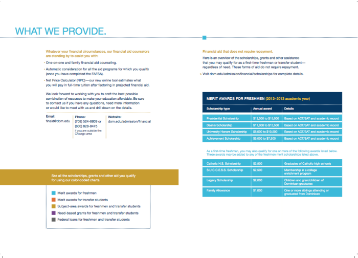
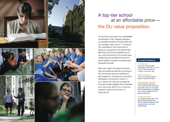
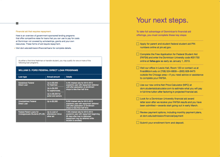
The Affordability Flyer is a typography strong piece. It’s composed of a series of charts that allow the user to synthesize a large amount of information. The flyer helps incoming students and their parents to understand how affordable schooling can be. The use of charts and colors allows for simplicity that all users can understand. Legends and contact information were placed near the charts to provide the user with quick and easy clarification tools. Colors, delicate use of type and layouts provided a clear line of communication to our users.