

Our client Rodan + Fields approached us to improve how their products were showcased, as customers were having difficulty seeing what was inside the existing packaging. This was one of several concepts I presented. By maintaining their current packaging structure and introducing a PET clear option, the design addressed visibility concerns while elevating the overall look with a more premium feel.

This concept features a clear acrylic box with a sliding lid paired with an SBS sleeve, allowing for full product visibility while adding structure and branding space. The design balances a clean, premium look with functional durability, elevating both presentation and customer appeal.

This concept features a paper-wrapped tin base and lid, designed for durability and repeated use. While the product isn’t visible inside, the structure provides a sturdy, premium solution that can withstand constant opening and closing, while offering a refined, tactile unboxing experience.

This Dr. Pepper concept was developed as part of a large program bid that included multiple pallet displays options. This was one of the two pallet concepts presented, designed entirely in corrugate. The display features a bold, curved Dr. Pepper form as the focal point, with energetic layers of college fan visuals on the back to add depth, movement, and a strong sense of brand presence.

This concept was designed for a dual full or half pallet display, using a consistent graphic approach across both formats. The design emphasizes the National Championship trophy as the focal point, creating a strong visual centerpiece that draws attention while reinforcing the prestige and excitement of the campaign.

A 3D counter display concept for Munchkin Grass-Fed Infant Formula, designed with playful curves and bold block elements to create visual balance and shelf appeal. Fully executable in corrugate, the design reinforces a clean, green, and sustainable initiative while maintaining a fresh, engaging presence for shoppers.

A more cost-effective counter display option that maintains the same visual impact, featuring curved side elements and a dimensional header for added presence. Designed as a one-piece structure with an insert to create a tiered layout, this solution balances efficiency in production with a clean, engaging presentation.

This floor display concept draws directly from the product’s natural curves, echoing them throughout the structure to create a cohesive and eye-catching design. The flowing form adds a sense of movement and playfulness, making the display more inviting while reinforcing brand identity and shelf appeal.

A more standard yet different display option designed for cost efficiency and easy assembly. The layout keeps messaging clear and straightforward, with the flexibility to add a header when needed, while still offering a distinctive look that sets it apart from typical standard displays and maintains a clean, functional presentation.
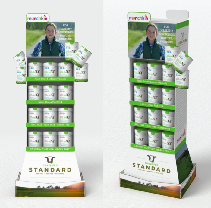
Ultimately, this design was selected for production, striking a balance between standard structure and creative detail. The addition of lug-ons and an interesting base tray adds depth and dimension, elevating the overall design while maintaining a practical and efficient build.
gLike