
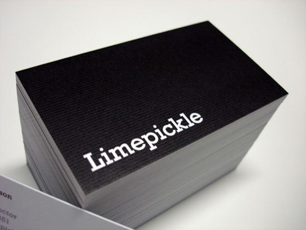
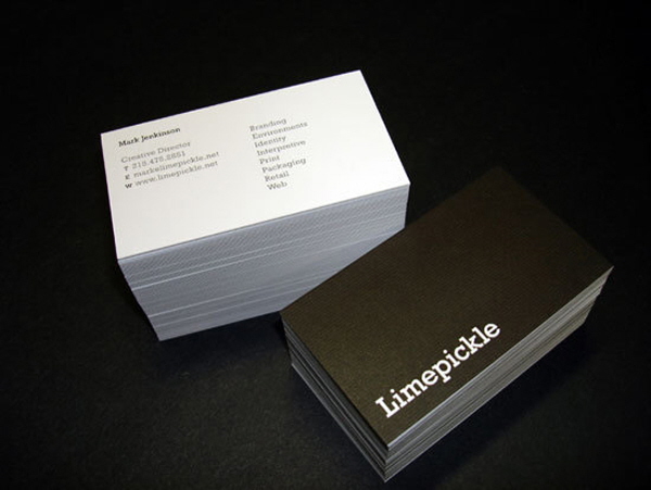
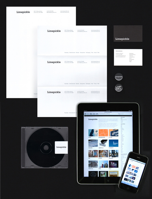

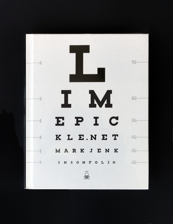


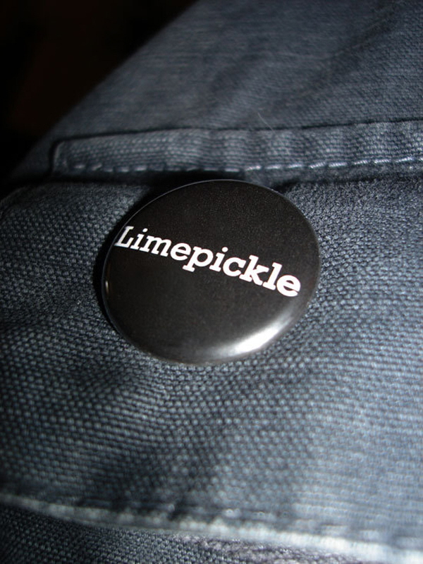
This is the identity system I designed for myself as a freelancer, contractor and consultant. I was driven by 4 things; The Name, Simplicity, Reproduction and Cost-effectiveness. The Name - Limepickle - is an Indian condiment that is served cold with poppadums. Like me its an acquired taste ;-) but it's also one of my favorite foods so it has personal meaning. Since it's a relatively unknown food in the US, the name always provokes conversation, which makes it memorable. The temptation with a name like this (that has a fruit as part of the nomenclature) is to use predicatble, associated colors, which is something I wanted to avoid.
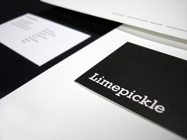
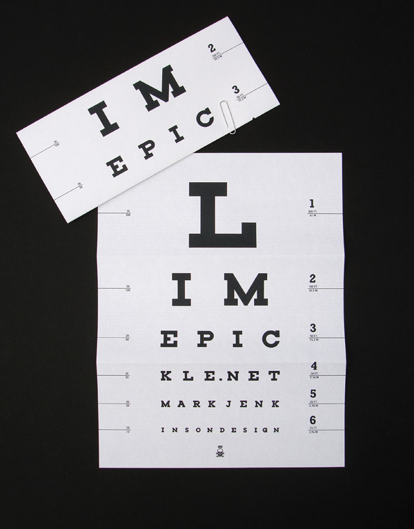
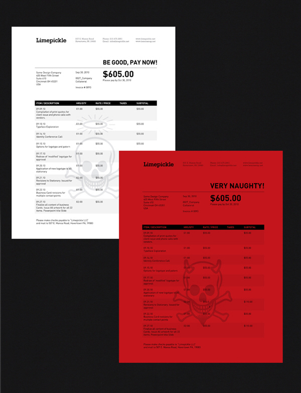
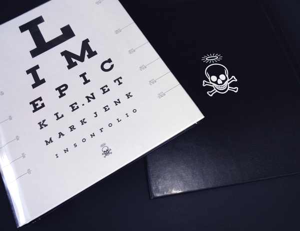
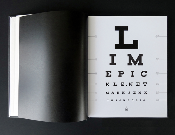
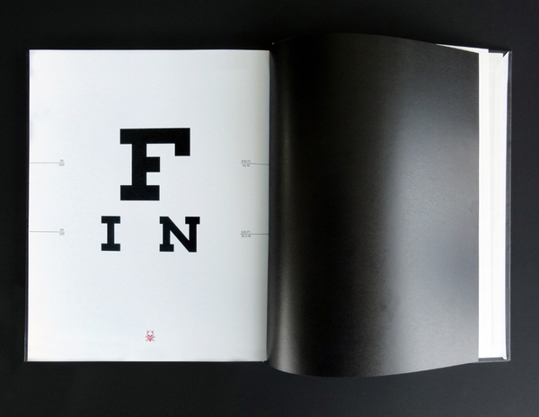
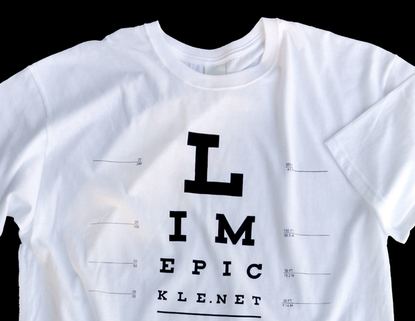
The identity also has some simple but joyous elements to alleviate the starkness of the monochromatic identity; The skull and crossbones with halos and horns on the invoices, the hand drawn masthead on the sketch paper (I do a lot of thumbnails), and the eye chart portfolio cover, as well as some pins that point to my roots as a designer in London.