Ripley's Intimates Department

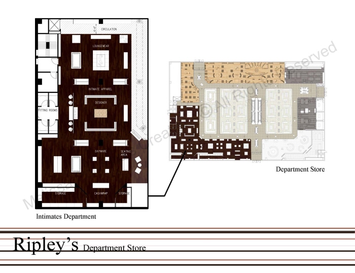
Department Store Floor Plan - The loungewear is adjacent to the Women's Dept. for clients to make an easy transition from one dept. to another. The middle section is the Designer; the designer is in the middle to showcase the merch. and make it a focal point. It is also viewable from the walkways, which will help visually pull clients in. Lastly is the daywear, since this section is in the corner, I decided to place the daywear there b/c clients who will be purchasing these items will seek out this section on their own.

Elevations - Elevation A is a view from the main walkway of Ripley's into the three different sections if the Intimates Department.
Elevation B is a view from the Women's department facing the cash wrap in the daywear section.

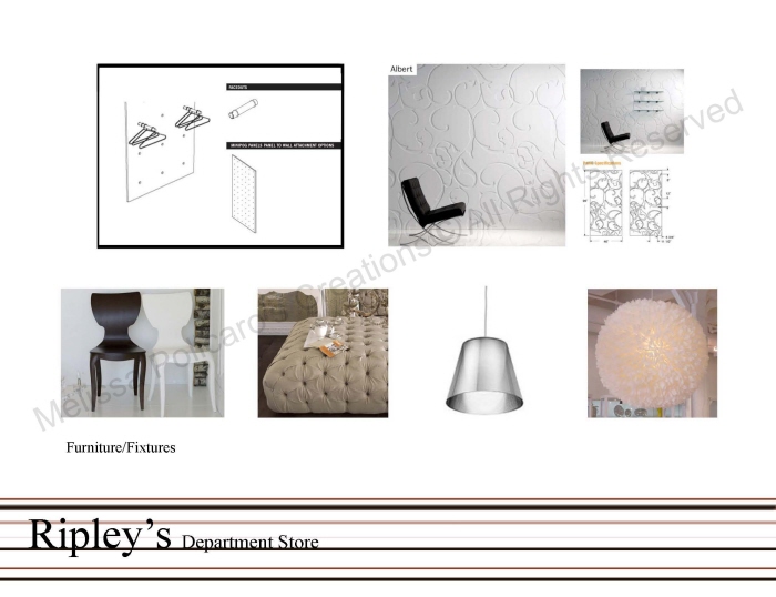
Merchandise Display Details - The visual display detail in the left is the unit which is used in the Designer section of the department. This display allows the merchandise to be viewable form two sides and also lets the merchandise speak for its self with such a simple set-up.
The second visual display detail is used in all sections of the department, which helps bring in branding visuals as well as storage for intimate garments. They also serve as dividers for each section.

Cash Wrap/Daywear Perspective - In this perspective is the daywear section, in which the cash wrap is located. The cash wrap wall is made up of goose feathers to give the space a luxurious feel and soft touch of femininity. The four rectangular displays act as a guide to the cash wrap as well as conducting more impulse purchasing as clients wait online.

Designer Section Perspective - This perspective is a view into the Designer section. This section is meant to be sleek and sexy. The manikins display designer merchandise and also sit in front of the dressing room wall, which one can gain access to by going behind the wall from the left or right side. The focal wall has a simple design in white that helps the merchandise stand out by contrasting against the white. The lighting pendant is a repetition of goose feathers for that luxurious soft touch.

Materials and Finishes - All materials and finishes were chosen to give the space a feminine, intimate feel. This was done by using shades of red, brown and bronze, with touches of white to lighten up the color palate.

Furniture and Fixtures - All furniture and fixtures were chosen with women in mind. They have a feminine curves and a soft elegant appearance.
gLike