
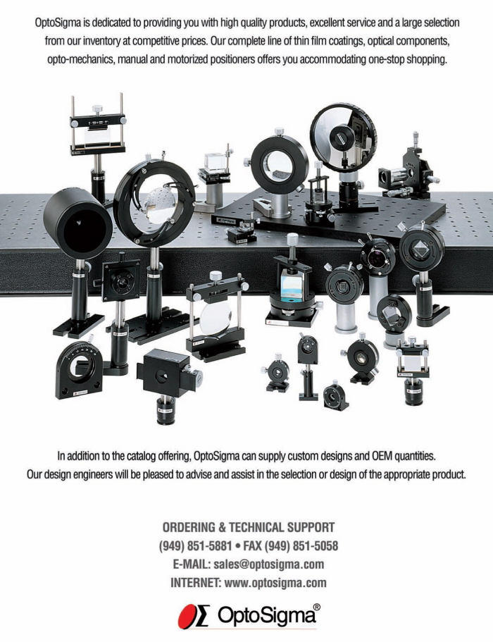
Catalog color. I selected an image of a prism to capitalize on the company tagline being "Improving the Quality of Light"
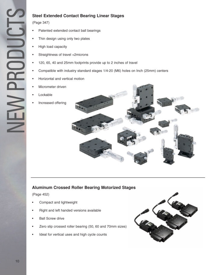
An example of an interior product highlighting splash page.
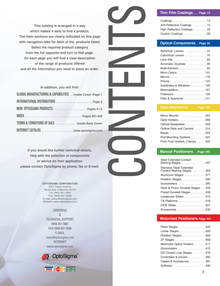
Table of Contents - using the color coding and subsequent page tabs and section dividers to divide the immense range of products into something easier to navigate. Additionally, the rainbow of colors being similar to the visible spectrum is a deliberate nod to the company tagline and product focus.
Sample product page.
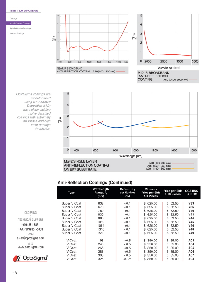
Sample product page - these waveforms(numbering in the hundreds) had to be loaded into illustrator and converted to 4-color print ready artwork.
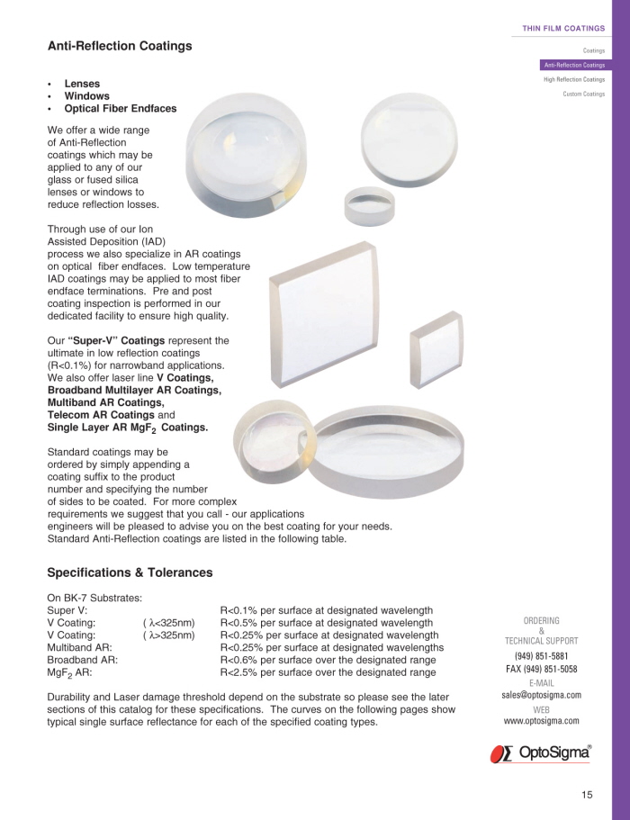
Sample product page with updated product photos.
Sample product page.
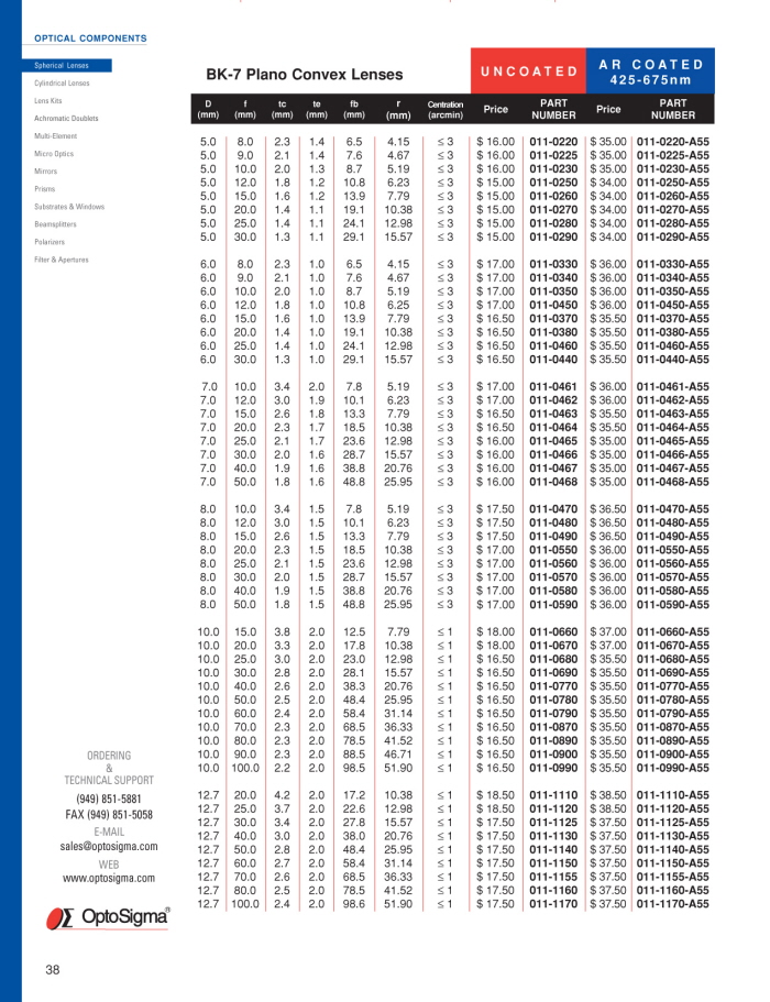
Sample product page highlighting the multi-page product pricing matrices.
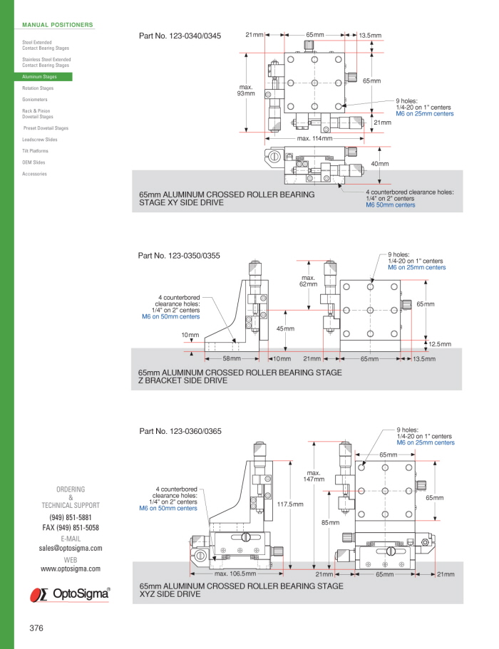
Sample product page showing the mechanical diagrams, all conversions from autocad in illustrator.
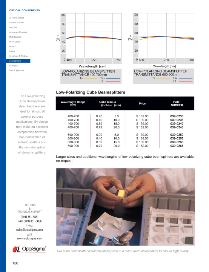
Sample product page with product engineering data waveforms.
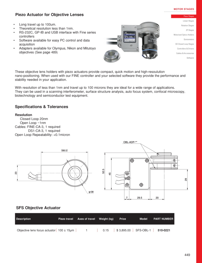
Sample product page of mechanical products.
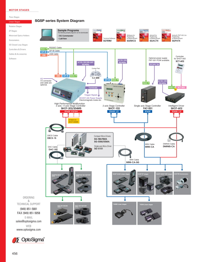
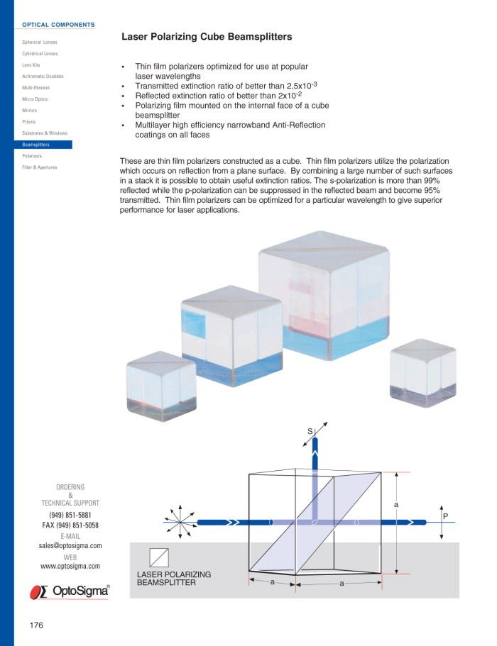
Sample product page - custom made diagram of product integration.

Section divider page.
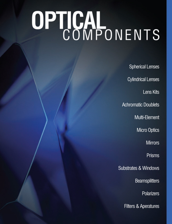
Section divider page.

Section divider page.

Enter Your Description Here

Section divider page.
gLike
Optosigma Product Catalog
A long term project (3 months) for the creation of a new, updated catalog for Optosigma, an international manufacturer of Optics, coatings and mechanicals. Using client-supplied photos, copy and engineering diagrams, I created updated pricing tables, product data matrices, mechanical reference diagrams and waveform light/laser performance data for a large (550 pages) catalog.
Additionally, a new, easier to use reference/user interface was needed, so I created a color-coded product tab on each page for each product section. This design element then carried over into the company website redesign as well (which you can see in my portfolio)