
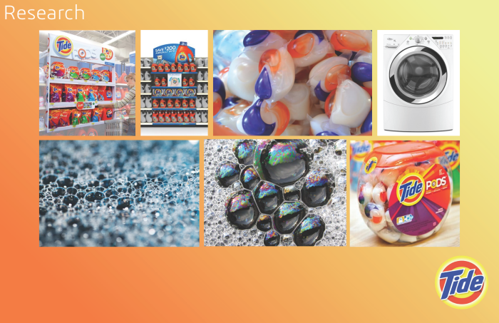
Researching for the POP display included looking at prior Tide displays, most being very straightforward and not too fun. I expanded my research to look at the shape of the Tide Pods themselves as well as everything that the Pods interacts with; the washer, the container they're in, the suds/bubbles it produces.
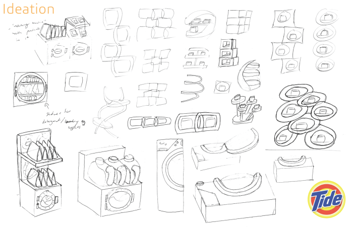
Going into ideation, initially I focused on integrating a "washer" model into the display and having the Pods interact with it in some way. I found that I had put myself into a corner just focusing on the "washer", so I took a step back and focused on more modular shapes and forms reflective of the Pods.
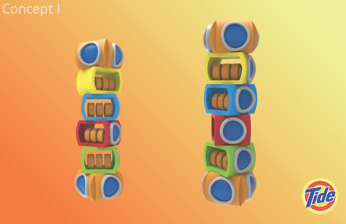
I eventually came down to two concepts. This first one was a series of stacked "washer pods" that would hold the Pods inside them.
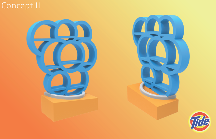
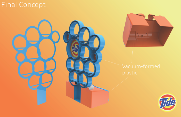
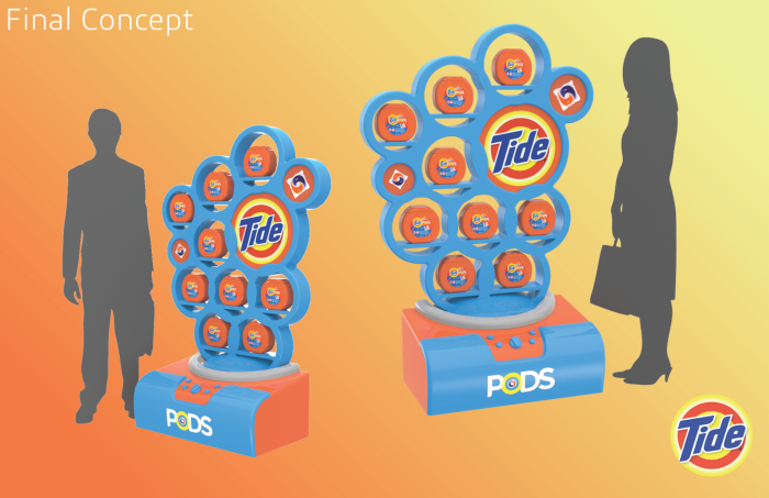
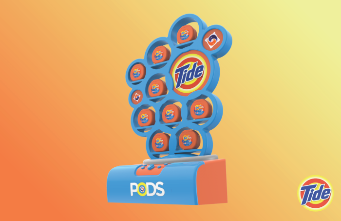
The second concept was to have a series of bubbles coming out of a "washer" and have the pods resting inside the bubbles. I felt like I could do more with this concept than the first one, so I proceeded to refine this concept even further.
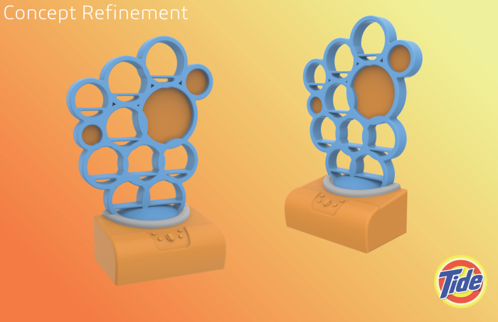
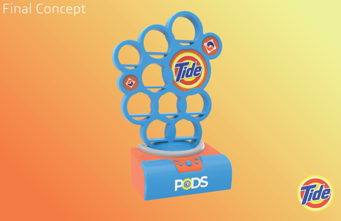
With refining it, I made the bubbles a nicer, more similar size, added circles for the Tide brand logo and images of the Pods, and stylized the "washer" more.
gLike
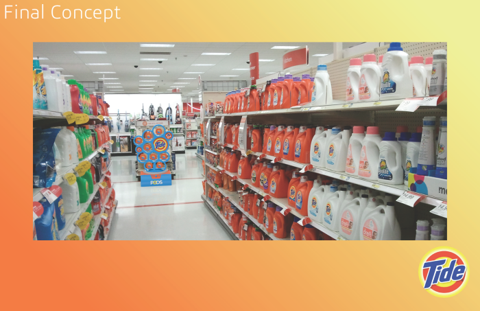
Tide Pods Point of Purchase Display
A Point of Purchase display for Tide Pods that I completed for my Exhibit Design class in Spring 2016.