
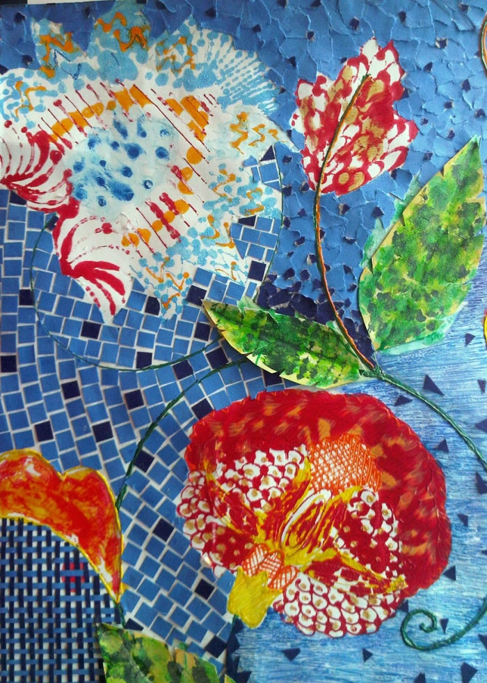
Colors from the images of Chinese New Year were abstracted and eventually used to complete my final surface and its co-ordinates. The scales of the dragons helped me to achieve the technique for my print. The colors used by Kenzo are vibrant and energetic and they went perfectly well with the Chinese New Year. Forms from chintz were used as a structure to build upon the final print. The flowers and leaves from the chintz were used to give the main form to my surface. Since Kenzo prints always have florals I decided to follow the same language and use the chintz .
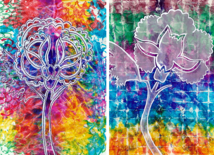
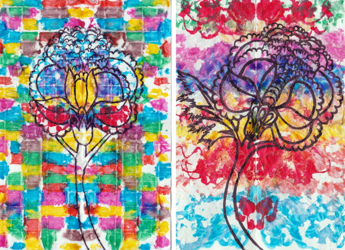
The form has been taken from Chintz. The flower has been enlarged and used on different surfaces while simultaneously, exploring different techniques on them. None of these surfaces were taken forward, as the exploration for the the Dragon-scale abstraction was used for the final print.
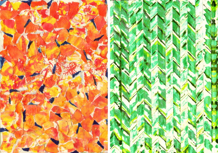
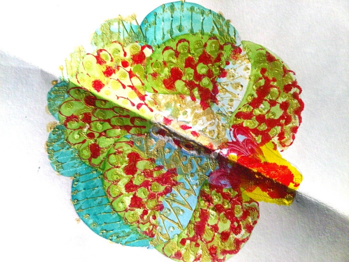
Co-ordinates for the main print taking basic elements like dots, lines, mosaic and the dragon scale explorations. The colours are drawn from the main print.
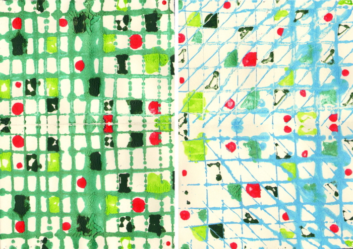
Explorations for the background of the print.
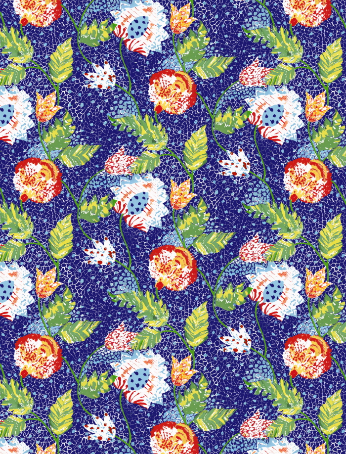
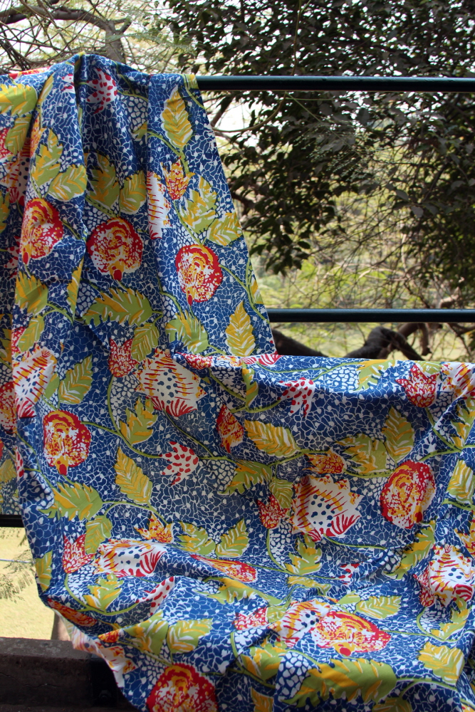
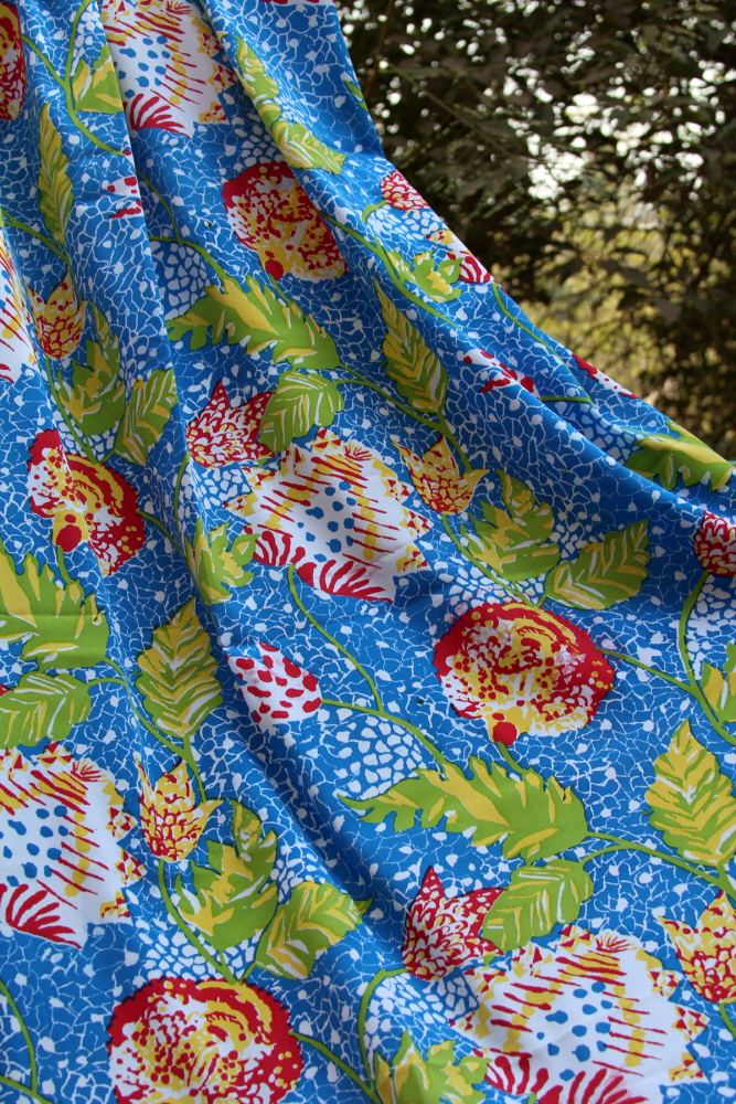
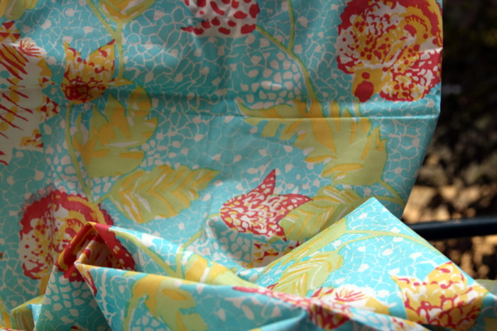
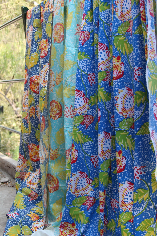
The print was screen printed with the use of only four screens. There are a few color ways.
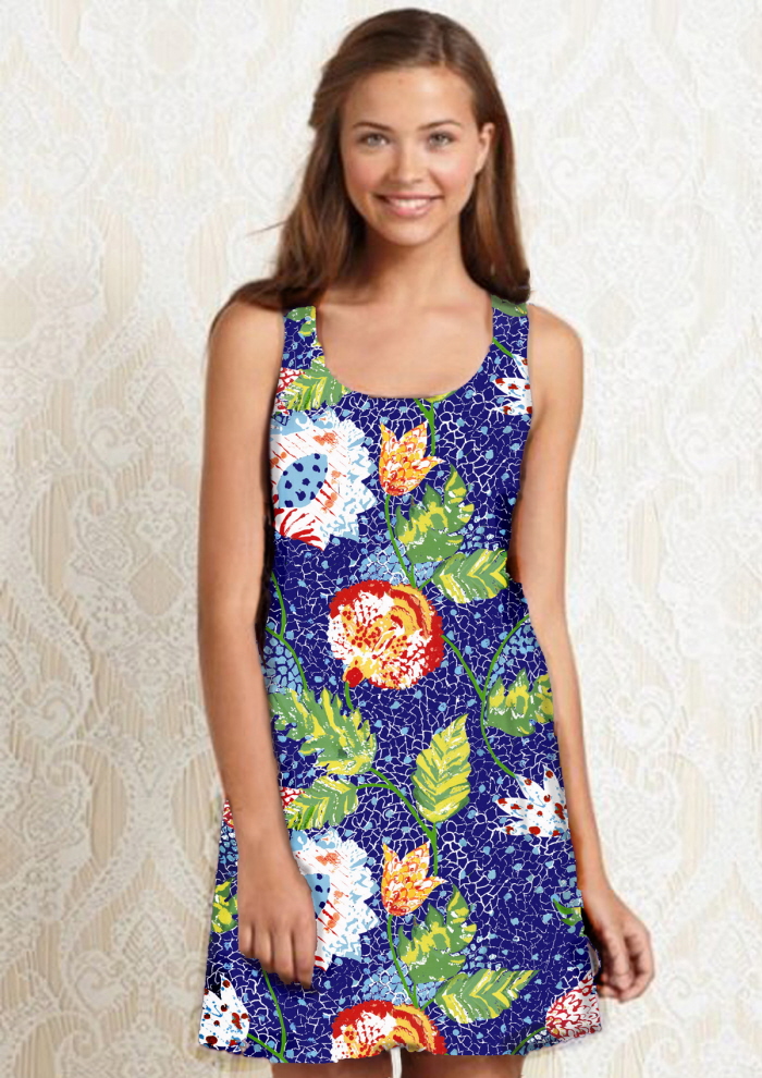
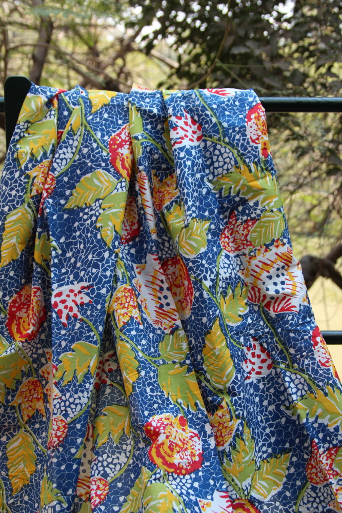
Mapped garment.
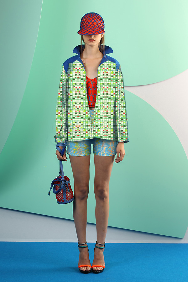
Different co-ordinates and the main print were mapped on Kenzo model.
gLike
Chintz in China | Surface Development
The prints here were created as a part of hypothetical project where one chooses a high fashion brand to develop a print design. I have chosen Kenzo, a brand incepted in Japan and is popularly noticeable for its flamboyant florals and dramatic silhouettes. For this collection, I have developed a mood-board that aims at building a festive and colourful print directory for the brand. Images of dragons, and chintz were my inspiration towards form and structures of the print. A set of co-ordinates including embroideries and other prints were also created to complement the main surface design as a part of the collection.