
InterWire - Check out the year! I was using flowery and vintage vectors before it was on your t-shirt!

U.S. Foodservices - This is a double sided header for one of their entrance units.
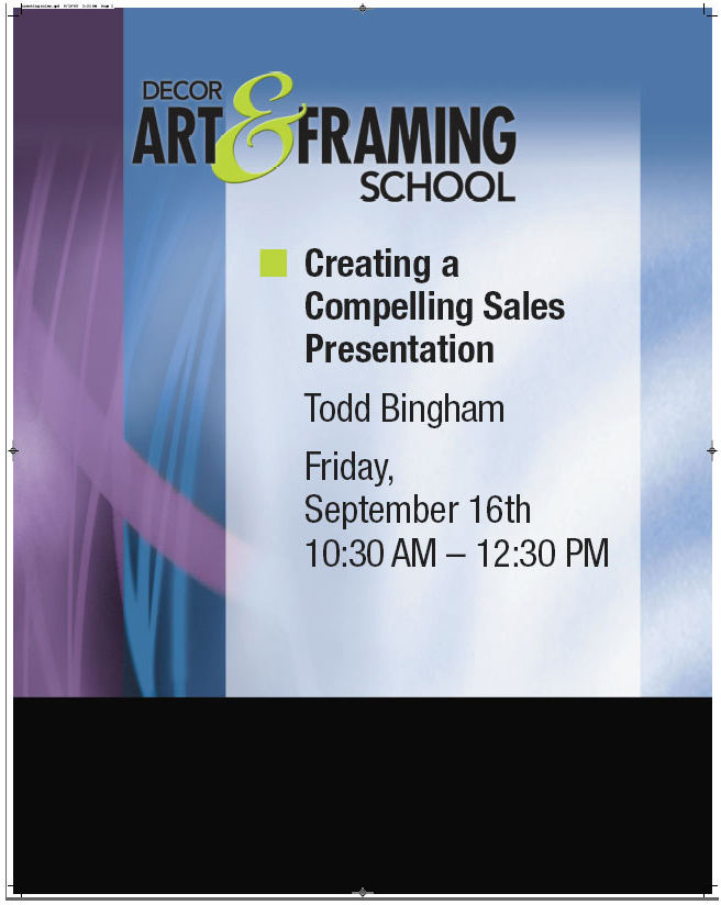
Decor Expo - DECOR is one of my favorite shows. Again, you are dealing with artists that want good design. The background on this is only partly vector. There was a texture bitmap thrown in.
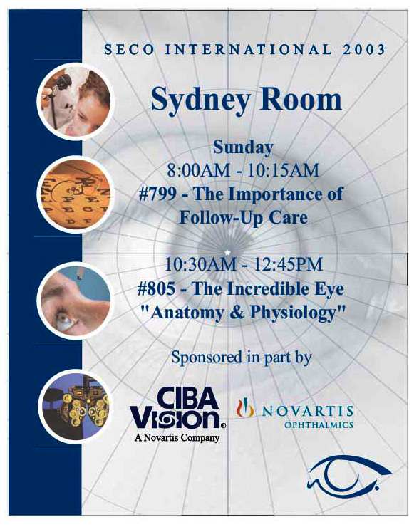
SECO year 1 - They had some high res Eyes and I made the "spider-web" from a grid distort.

SECO Year 2 - The bitmaps that lined the bottom were there and I made a world motif (requested to go with their international concept for the event).

GICC - A previous experiment that became a visual. You can get away with this when the client is under time pressure and has no idea what they want. Again, all vector. Gotta love that StarTrek font.

Specialty Graphics Imaging Association (SGIA) - After trying to give them a variety of abstract backgrounds they chose this raster version. Large format printing should be as much in vector as possible.

Charts + Exhibits information design

ELCA Tribal Africa Art Style - Nice natural feel. I tried to make that wood grain in vector with a noise filter and stretching but it never did come out the way I wanted it. So I went with a lot of raster on this one.

Green Industry Expo direct mail - An example of the print work I did for GIE. This was a singular project so I was able to fully incorporate strong hierarchical typography.
gLike
Print and Signs