Wichita Thunder - Project For: Wichita Thunder Alumni Night Jersey Design Contest (WINNER) - I stumbled across this concept while working on the script logo for the front; I started sketching the script in a varsity-style font and decided to run with the concept, making the jersey a sort of "Letterman Jacket" of sorts. The script is fully original but inspired by basic scripts that are used for Varsity/Letterman jackets, with large Varsity letters on each sleeve adorned with two gold stars to commemorate Wichita's two league championships. The jersey striping is designed to mimic a Varsity/Letterman jacket cuffing as well to keep with the theme
Grand Rapids Griffins - Project For: Grand Rapids Griffins Design Contest (WINNER) - I wanted to create a sped-up evolution of the Griffin's aesthetics, both in-terms of the jersey and the logo. The secondary logo is a link between the Griffins' parent club (the Detroit Red Wings) and the city of Grand Rapids (which creates the "wheel" in the familiar Red Wings logo). This entry became the winning design, and was worn by the Grand Rapids Griffins for their New Year's Eve game
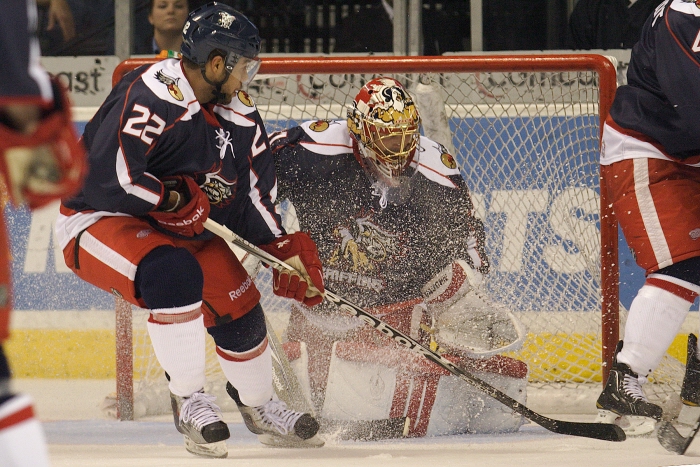
Grand Rapids Griffins Uniform In-Action - The final jersey was spot-on to my original design, though some of the accessory items were changed-up by Reebok. The socks were an inverse of the home design and the numbers and nameplate lettering were recolored versions of the LA Kings set-up
The Final In-Action (12.31.10) - I couldn't design the back to mimic the front collarbone's design, as seen here, due to the uniform's cut. The nameplate would have cut into the design, so I eliminated it on the rear
The Final In-Action (12.31.10) - The front collarbone design is shown well here, and you can see how it isn't present on the rear of the uniform
The Final In-Action (12.31.10) - While I designed the uniform to be based off of a specific Reebok template, the final was printed as designed on a standard uniform. On the true template, the red striping down the arm would have been an actual strip of piping, whereas on the produced jersey it was simply printed onto the jersey
Wenatchee (WA) Wild - Project For: Icethetic's Wenatchee Wild Re-Branding Contest (Runner-Up) - The Wenatchee (WA) Wild of the NAHL, two years into their existence, wanted to create a new image for their club and approached the hockey design blog Icethetics about holding a design contest to find their new identity. This is the Primary I designed for the contest, along with the original Secondary mark and the updated mark I did for their Seahawks specialty uniform
The Final In-Action (3.18.11) - Here's the Seahawks-themed jersey in-action. The jersey itself began with a design by Gary Cekus, then I did some modifications to the jersey along with adding my logo, and then the Wenatchee Wild decided to add a whole lot of the Seahawk's green to the final. The logo is solely mine, but the rest of the uniform was a collaboration
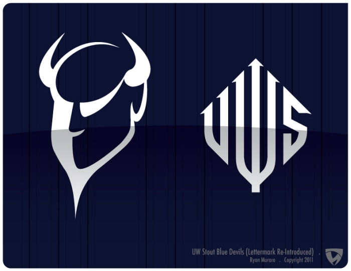
University of Wisconsin Stout Blue Devils Athletics - Project For: Freelance Proposal - My Alma Mater currently has no "Devil" logo, and uses a standard block-S for it's primary athletic mark; I wanted to change that, while bringing back a lettermark logo the University used in the 80's. Unfortunately, my proposal was denied due to it being too "Devilish" (the lettermark was dropped originally because the current Chancellor didn't like the "W" forming a pitchfork), but it did lead to the creation of a Mascot committee *UPDATE* This logo is now being used by UW-Stout's bowling team
Northwoods Hodags - Project For: Clink Room Hometown League - The "Hometown League" was all about things that made a place unique, so being a Wisconsinite I thought of Rhinelander's famed Hodag, a creature created as a hoax by a 19th century lumberjack/prankster. The "H" lettermark was the first thing I sketched for the identity concept, though on the cap there would be only 3 thread colors; the shading represents the stitch pattern levels that would be produced on a cap logo. The Left Hodag logo finally came-together after many versions that never looked quite right, and the mascot logo (I named him "Happy Hodag") was an off-the-cuff logo I originally sketched almost jokingly
Cleveland Browns (Home) - Project For: UniWatch Cleveland Browns Redesign Contest - I wanted to have a classic look for my Browns redesign while pushing it forward and acknowledging the design hurdles that face modern uniforms. I moved the sleeve striping up to the shoulder to address the decreasing visibility of uniform sleeves and placed the TV numbers on the helmet, not only further clean-up the sleeve area but also harken back to the Browns of the 57-60 seasons
Cleveland Browns (Away) - Project For: UniWatch Cleveland Browns Redesign Contest - The pants further honor the Brown's uniform history, as I kept the pant striping the same as it has always been (Orange on outside) and using historically-accurate sock patterns. I went with Brown pants, a color only used recently and with no pant stripes in that version, for aesthetic reasons (I felt it balanced-out the Orange helmet nicely, and complemented the heavy amount of Brown present in the away uniform) while moving the Al Lerner memorial to the hip where the Nike-template belt loop overlapped the pant striping; I always like to have the template work for, not against, the design, and I felt the templates intrusion on the pant stripes could be made into a design feature that looked intended
Cleveland Browns (Alternate) - Project For: UniWatch Cleveland Browns Redesign Contest - My original submission had no White whatsoever on either the home or away uniforms (I took the Gray facemask as my color palate indicator), but I decided to keep the traditional White/Brown/Orange scheme there. On the alternates, I stuck with my original intent, primarily because the helmet looked so good (the Browns used White helmets until the '52 season, and in my original palate Gray = White) but also because the Orange tops popped just a tad too much with so much white. The logo is obviously an update on the original "Brownie the Elf" logo, and is featured on the compression gear's sleeve but not on the uniform itself
Regdab Raccoon . Project for: Threadless T-Shirts' "COLLEGE!" Competition - I felt compelled to enter Threadless' "COLLEGE!" competition, especially since my homestate Badgers were one of the featured schools. I looked back into the Badgers' history and forgot about the story of Regdab ("Badger" backwards) Raccoon, and after recalling his history I had to make a logo riff based off of the single-year mascot. In case you don't know, Bucky was originally a live Badger, but he proved too hard to handle so for one year Bucky was represented by a live Raccoon (a Badger costume was created and used for the following season onward). The original sketch was done atop the vintage Bucky Badger logo (only the sweatshirt is a direct trace, the rest is completely original work), not just to keep proportions right but to be a tongue-in-cheek reminder that for one season Bucky the Badger was a Raccoon (or as Wisconsin put it, a "Badger in a Raccoon costume")
Milwaukee Brewers - Project For: Milwaukee Brewers "Put the YOU in YOUniform" Promotion - The Milwaukee Brewers, my hometown team since birth, are running a contest to design a one-game-only uniform for a 2013 Spring Training game. This is my entry, inspired by the Milwaukee Braves (specifically the '57-'62 uniforms) along with the "necessary" colored side panels. The secondary logo is a laughing Bernie Brewer, meant to mimic the "Laughing Indian" logo on the classic Braves uniform my Grandfather was obsessed with
Columbus Fighting McCooks - Project For: PuckDrawn.com's Columbus Blue Jackets Re-Brand Competition - I tried to avoid staying with the Civil War-theme of the previous identity, but couldn't resist going with the "Fighting McCooks" once I found out about them. They were two brothers who fought with a combined 13 sons for the Union during the war, hence the 15 stars on the primary (one for each Fighting McCook). The secondary is a Buckeye + the Ohio State flag
World Table Hockey Association - Project For: WTHA (World Table Hockey Association) - The newly re-formed WTHA approached me about doing a full identity system for them, and after many months of work the primary is finally ready to see the light of day. The system is built around the "WTHA" lettermark that resides within the logo, which will populate all the logos in the new system and is "inspired" from the original WTHA mark that was used during the 1970's
Escanaba Logger Lagers - Project For: Clink Room Shadow League - For the "Shadow League", the goal was to create a mash-up logo that was a single color design. The stein was the first concept and the official cap logo entry (this render is v2)... The Logger Lager Lady is an obvious riff on the Miller High Life girl, created as a sleeve patch concept for a "complete" logo package
Ashland UnDead - Project For: Clink Room Night League - I had an itch to do a "Zombie" design, so I used the Night League format to make a second design. Pretty straight forward, just your typical half-decayed dead guy coming back to life
La Crosse Possums - Project For: Clink Room Night League - My first design for Plan B Branding's "Clink Room" for their Night League. The idea would be that the team could be garnered nickname mash-ups like "La Crossums" or "La Possums". The logo itself creates the "L" and "P"; if expanded, the accompanying wordmarks and lettermarks would show that better
Zombie Possums - Project For: Clink Room Night League - After my first round of submissions to the Clink Room's Night League, there was a suggestion to do a mash-up of my two concepts (Possums and Undead) from the guys who ran the site; I took that suggestion and ran with it, to say the least
Hamilton Tigers - Project For: PuckDrawn.com's Iron Designer Competition, Hamilton Entry - I felt like creating a heritage-esque design, and Hamilton seemed like a perfect opportunity to do so. The Uniform is directly inspired by the original Hamilton Tigers' uniforms, and the logo is inspired from the original Tigers' logo and the city's coat of arms
Seattle Sockeyes - Project For: PuckDrawn.com's NHL Expansion Competition, Seattle Entry (WINNER) - I wanted an active, colorful logo for my Sockeyes concept, so I started by selecting colors taken from pictures of the Salmon itself and tweaking them slightly. The uniform was the hardest part to design, as I wanted to avoid the traditional style designs I favor for hockey uniforms
Milwaukee Bocks - Project For: PuckDrawn.com's NHL Expansion Competition, Milwaukee Entry (WINNER) - I wanted a German-feeling design for my Milwaukee team without it being directly German, so I went with a color palette that was inspired by vibrant German beers like Maibocks. The main logo is inspired by the use of goats/rams in the promotion of Bock-style beers
Ottawa Civics - Project For: PuckDrawn.com's WHA Re-Branding Competition, Canadian Division - My second design for PuckDrawn's WHA competition, this one for the Ottawa Civics. I chose the Civics due to their miserable history (read about it, if you're curious, here http://en.wikipedia.org/wiki/Ottawa_Civics ), so I figured there wouldn't be a preconceived look to be bound by. I based the primary figure off of a soldier found on the city's coat of arms, though the jerseys are my favorite part of this design
Detroit Red Wings - Project For: PuckDrawn.com's Original 6 Re-Branding Competition (WINNER) - This was my proposal for the re-brand of the Detroit Red Wings. I went with a Pegasus for the primary logo to both reference the team's name and to reflect Detroit's automotive industry (or what's left of it). The winged "D" would be the basis of a full wordmark as well
Waukesha (WI) River Foxes Minor League Baseball - Project For: Freelance Proposal - This is an update of a proposal I sent during the Summer of 2009 for a minor league Baseball team that was to begin play that Spring in my hometown of Waukesha, WI. The team was to play at an existing stadium (to be renovated for the team) along the Fox River, hence the name, but the economy indefinitely delayed the team's creation. The secondary/cap logos are riffs on the Washington National's "W" logo, while the Fox is completely unique to this proposal
Clarksville (TN) High School Wildcats Baseball - Project For: Uniwatch Design-A-Uni Contest (WINNER) - This is the design I created for the Clarksvillle Wildcats Baseball team. The team uses the Cub's "C" logo and wanted to keep using it, so the logos are built around the existing Cubs "C" the team uses, but are otherwise completely unique to the team. The script on the away is also unique to this proposal, and my favorite part of the whole logo system
Stillwater HS Ponies Lacrosse - Project For: Stillwater High School's Lacrosse Team - I have done many designs over the years, but this one is my first true logo. I did it my Freshman year in college for my roommate's old Lacrosse team. It's based on the school's existing mark, just toughened-up a bit
Indie Music . Project for: Threadless T-Shirts - I've frequented Threadless since College, but until now have never submitted a design. This is my first submission, an idea that was batted around between a friend of mine and myself for awhile. The design itself is a monster, and took more time then I care to recall to make it come to life
South Point Fellowship Church - Project For: SouthPoint Fellowship Church - SouthPoint, who found me through an old UniWatch article, contacted me to request I work with them on an new logo. After just one round of sketches a final direction was chosen, and within a few weeks of starting the final product was complete. The colors are from their previous logo, and the font is a cleaned-up version of Garamond with custom lettering on the "SPFC" letters
South Point Kids! - Project For: SouthPoint Fellowship Church - The people at SouthPoint liked my initial logo so much they asked me to do a logo for their youth ministry, based off of a logo from the initial sketch stages for the previous logo. A light design to recover from the grueling Threadless design, and also SouthPoint is a pleasure to work with
Badgers for Boobies (2011) - Project For: Badgers For Boobies Breast Cancer Benefit Pub Crawl - For the second year of Badgers For Boobies, a new logo was created to play off of the "Teach Me How To Bucky" trend that swept Madison during the Badger's '10 season. As with the previous year, the logo was printed onto T-Shirts with all sales going towards the Susan G Koman Foundation
View PDF
Badgers For Boobies (2010) - Project For: Badgers For Boobies Breast Cancer Benefit Pub Crawl - One of my high school friends is a yearly participant in the Susan G. Koman Walk For A Cure, and in order to participate each walker must donate $2k towards Breast Cancer research. For part of her fundraising, she was organizing a pub crawl and wanted me to do the design. The money needed to print the T-Shirts was donated, and I did the design for free as a favor, so all proceeds went towards Breast Cancer research
Abbys Angels - Project For: Abbys Angels For a Cure - This project stemmed directly from my work for "Badgers For Boobies". Somebody at the Susan G Koman walk like my friend's T-Shirt, and I was asked to do a logo for them. There is also a fully horizontal logo for letter heads and banners
gLike
Freelance Identity Projects
Ryan Muraro
Designer Eau Claire, WI