Personal Mood Board - The parameters for the project were fairly loose, but the first thing I was asked to do was to create a mood board that showed what influenced me as a designer. I love architecture, furniture, cars and pop-art, and these things populated my mood board. These elements didn't influence the project, but as a whole my style derives from what is shown
RC Lens Mood Board - As I said, the project was fairly loose, and only a few parameters were set. One was to make my project about one team that Reebok outfitted, so naturally I picked the team I knew the least about. I knew nothing of RC Lens, or the city itself, or anything about the league overall, but I didn't want my decisions to be influenced by anything but the research I did specifically for this project
RC Lens Graphics Package - After looking everywhere for info on RC Lens, I was able to put together a sort of story for the team that I could use going ahead. I imagined my design as a sort of rebirth of the brand, and I wanted to focus the designs on existing elements that would have a more organic feel for the club
Pt 1 . The Team - The other stipulation that was in the project brief were final deliverables; a uniform set for the team, and a line of gear for their fans. This is part one, the team's aesthetics
Existing Soccer Kits - As always, the beginning research stage involved looking at the existing market for soccer kits to see what trends were common, good or bad. The left two images were the kits Reebok had designed for RC Lens that year, and the middle row of selected uniforms were the ones with elements I wanted to take cues from
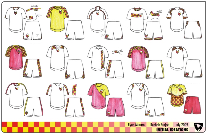
Initial Uniform Ideation - I started my sketching by creating a basic, faded template to draw on to allow for quicker translation from idea to paper. I didn't go long before realizing that my graphics would have to compliment a uniform template, and not the other way around
Specific Uniform Trends - Template-driven uniforms have been around forever (Michigan's winged helmet was patterned not through aesthetics, but through the helmet's physical construction), so I wanted to look at modern ways a uniform's template could drive the designs for the better. Sublimation has exploded recently, becoming a way for designers to go crazy, but I wanted to use it as a way to subtly use the checkerboard pattern RC Lens frequently employed
Template Sketching - I used my knowledge of the human form to drive the construction of my template, and I also made sure to construct the kit in a way that teams could easily personalize their uniform's aesthetics. The front arm panel was a design that showed-up in my earlier sketches, so I found a nice way to incorporate the design into my template
My Final Template - This is the construction diagram for my template, with a loose materials list. I gained valuable experience through my skinsuit designs, and it came in handy as I worked-out how my jersey would look, how it would be made, and how it would perform in the real world
Home Kit Sketching - My kit in-place, I went to work nailing-down the final uniform designs. I did some very quick color studies on element color combos, and I liked Red-on-White the best. It's use in RC Lens' history wasn't there, but their uniforms ran the gamut for years, with Yellow-on-Black being the only kit style with much history. I wanted to keep a sort of tradition to the uniform, but I also wanted my own sensibilities to drive my final concept
Away Kit Sketching - The away kit was the trickiest design, mainly in how restrained I wanted to go. I had a set concept for my alternate, so I wanted a uniform that was the aesthetic counterweight to the alternate. I talked myself into the Pure White concept, which would not only balance the team's aesthetics but would create a look that was best defined as "pure" and "essential"
Alt Kit Sketching - The alternate was my first finalized design, one that would be a tribute to Lens itself. The town was at the center of France's coal mining industry, and the logo itself makes nods to this past (more noticeably in earlier versions of the RCL crest), so I wanted a jersey that was pure black with hits of RCL's "Blood and Gold". I also used the alternate to design on an existing Reebok kit, to show that my template wasn't an attempt to "cheat"
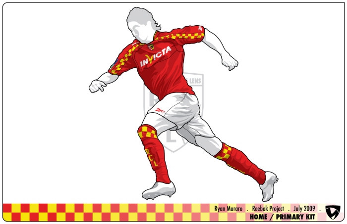
Final Home Kit - This is my final Home/Primary kit, posed on a template I constructed specifically for this project. I like to make a "final" rendering that is aesthetically accurate, but keeps a sort of "sketched" feel to it, not just for ease of modification but also because I like the sneaky simplicity of such a presentation (though each template takes a few hours to properly make and set-up)
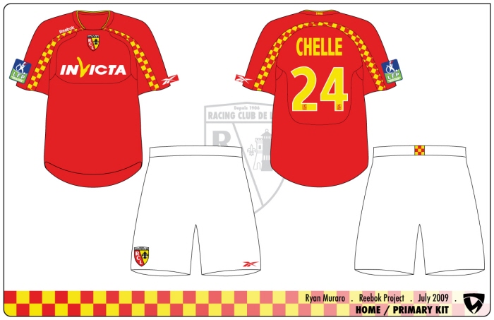
Home Kit Flat Design - Here's the straightforward design for the Home kit, shown fully with all the proper graphics. The back hem on the shorts carries the 3x3 checker square I wanted to introduce across RC Lens' aesthetic range as a nod to their fans, and the collar sports an embroidered "1906", the year RC Lens was formed
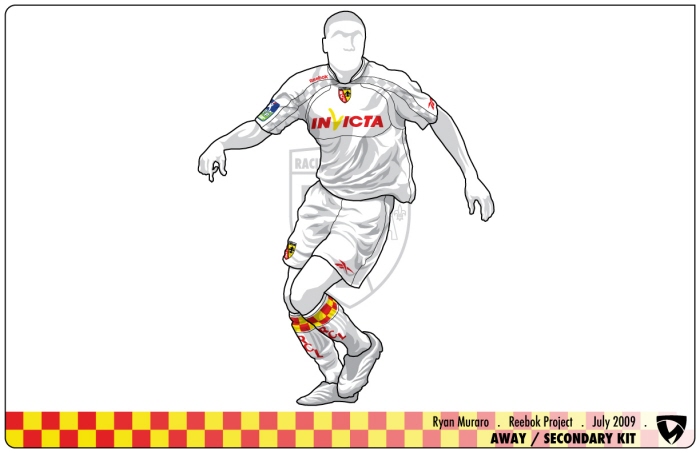
Final Away Kit - With all the graphics in-place, the Pure White kit isn't so pure, but it makes all the graphical elements pop that much more. I particularly love the socks, and how much the Blood and Gold checker pattern stands out. I should mention the "RCL" on those socks (and all three kit's socks) are formatted just as it is on the crest, but with the rest of the crest pulled away the lettermark creates a nice, simple element all their own
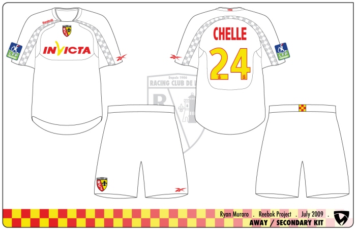
Away Kit Flat Design - Same drill, the flat version of the Away kit. The sublimation used here is subtle, unlike on the Alternate, where it is used to full effect
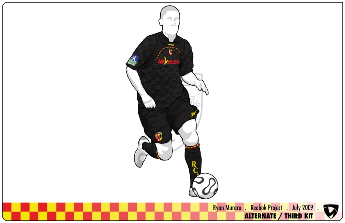
Final Alternate Kit - My personal favorite, mainly because I love how the corded piping works as a thinned-out version of the checker pattern used in the other kits. It's a nice extension of the brand elements I wanted to push in the uniform lineup
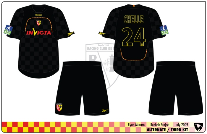
Away Kit Flat Design - The piping pattern is exactly as how it was on Reebok's existing template, so I didn't mess with their template. That said, I feel it works to great effect on this uniform, as the whole look becomes a sort of evil version of the Pure White. The ghosted nameplate and numbers are particularly sinister
Pt 2 . The Fans - As I said earlier, I was also tasked with creating a line of RC Lens merchandise for their fans; this is part 2, the fans aesthetics
Existing RC Lens T-Shirts - This is the lineup of T-Shirts that were in RC Lens' fan shop when I started this project. They had just switched from Nike to Reebok, so the only merchandise they had was any existing gear that wasn't produced by Nike. Because of this, their look was pretty scattered, and in sore need of a refresh
T-Shirt Trends - I went ahead and made two "categories" for the T-Shirts I was going to design, one training and one fashion. I was going to make one training T-Shirt design for sure, but the number of fashion-focused T's I was going to design was dependent on how much time I had left and what concepts I liked enough to go ahead with a full rendering
Training/Simple Graphic T-Shirts - This is pretty self-explanatory, just a selection of training/simple T's that I stockpiled as reference for this project
Training T-Shirt Sketches - My initial sketches for the training T-Shirt. I was more playing with layouts then designs, as everything would look more accurate once vectorized. I also wanted to make sure the design was editable for multiple teams, rather then being specific to RC Lens only
RC Lens Training T-Shirt Color Options - I chose a font-heavy concept to turn into my trainer T-Shirt, though colors were up in the air. I did know that I wanted to do a yellow shirt as a nod to the RC Lens uniform history. I should mention that these are just a few of the coloration options I did, as my full color option sheet included every possible combination of RC Lens' colors
"Essential" T-Shirt - I went bare bones for the final concept, boiling my idea down to it's simplest form. Hence, the design was called the "Essential" Tee
Fashion/Elaborate Graphic T-Shirts - While my "Essential" Tee was straight-forward and simple, I wanted to create a few uniquely RC Lens designs for the fashion T-Shirts. This is a small sample of the T-Shirts I documented, as my final folder included over 60 examples
Fashion T-Shirt Sketches - The first sketch page of fashion shirt concepts. I am a minimalist at heart, so most of my designs kept that sensibility
Fashion T-Shirt Sketches (cont) - My second page of fashion T-Shirt concepts. Some of the shirts I loved as sketches I didn't care for as much when put into Illustrator, so of the 8 shirts I fully designed I only included 3 in the presentation
"Heritage" T-Shirt - The "Heritage" Tee was completely about RC Lens, using elements of the team to create the design. Their name, nickname, stadium and founding year all hover above the lamp-and-rook from the team's crest; the shirt is sky blue to call back to RC Len's early history, as sky blue was their uniform color up until the adoption of "Blood and Gold" in 1923
"Vintage" T-Shirt - The "Vintage" Tee is simple and clean, using the lamp crest shown earlier in this presentation. The crest was printed on a black material, rough cut and sewn onto the shirt, while the hem tap was similarly treated
"Vineyard" Sketch Progression - For my last T-Shirt, I wanted to make something that was unlike anything else in the presentation. I sketched a design that involved spiraling vines, and I took that design and ran with it. This is the progression of the "Vineyard" T's graphics, from initial sketch, to the skeleton/road map, to the fleshed-out final
"Vineyard" T-Shirt - The final "Vineyard" Tee, and the ending point for my presentation. Sadly, two weeks after flying-out to Boston to show this project the job I was going for was eliminated, and the division was moved overseas yet again. For now, this is just a showcase of my capabilities. I should mention that the folks at Reebok were all gracious and professional, and while the circumstances around this project are a bit of a sore topic with me, it is still the one thing I'm most proud of in my entire portfolio
gLike
Reebok Soccer Project

I spent the summer after graduating from Stout chasing after a job with Reebok in their Global Football (Soccer) division. I went through a few phone interviews and was given the opportunity to fly out and have a full, final interview. For the interview, I had to complete a project to present, and I was given a month to complete the task; this is that project, exactly as it was shown

Ryan Muraro
Designer Eau Claire, WI