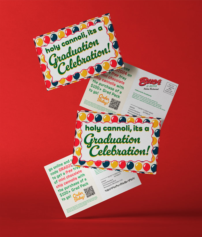
Mailer
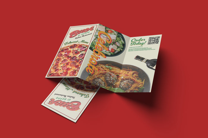
Tri Fold Menu
Tri Fold Menu (Inside)
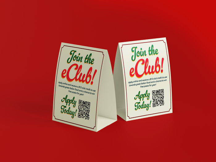
Table Tent
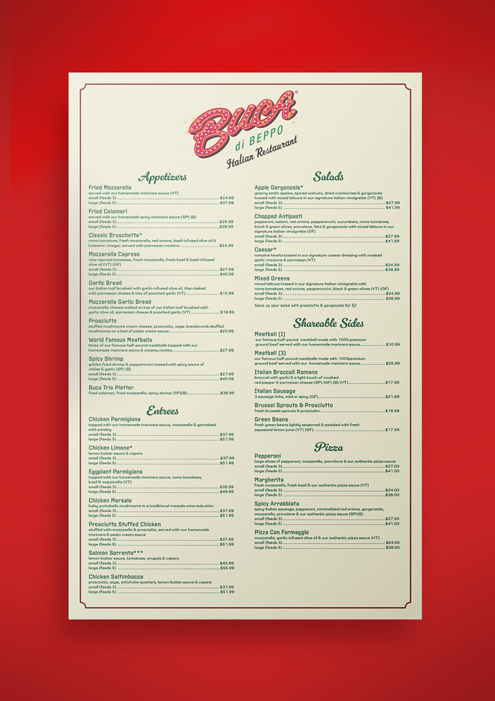
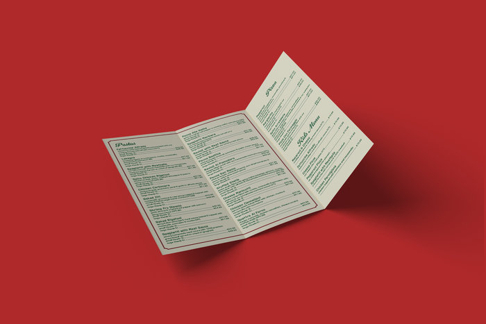
Menu
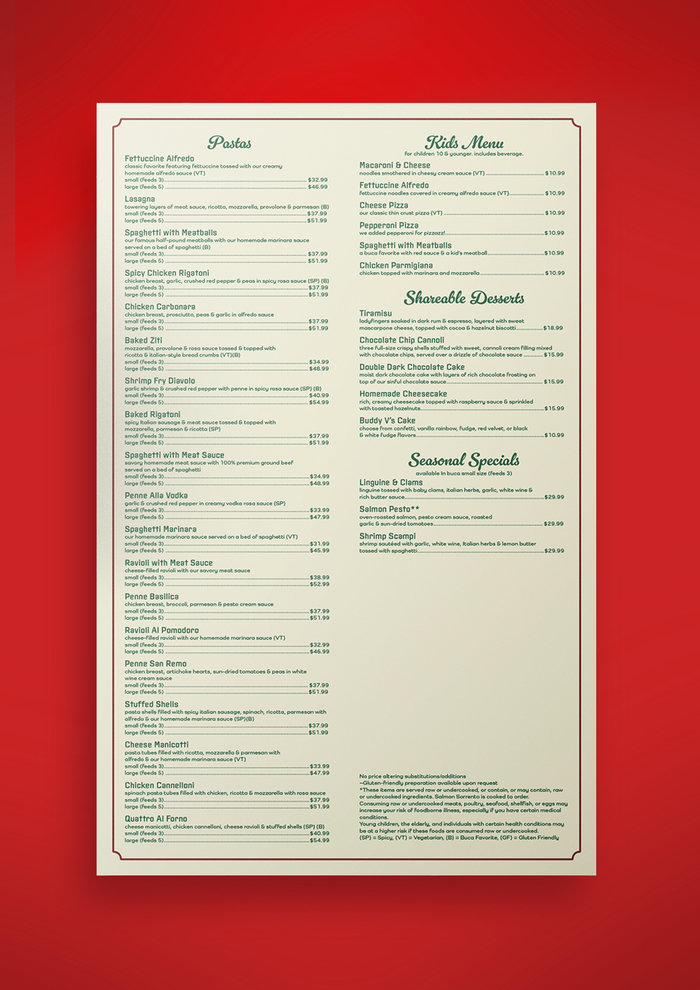
Menu (Back)
gLike
Buca Di Bepo Redesign
For the final project for one of my classes was redesigning a existing physical and digital deliverables from a list of restaurants, my two strongest pieces was my trifold takeout menu and my mailer. Since Buca di Beppo is an Italian restaurant I used a cursive font because it gave a more fancy impression and it matched the font used in the logo. The color scheme was mainly comprised of yellow, red, blue, and green to stick with the color scheme of the logo and the interiors of lots of the restaurants around Minnesota. I used real pictures of food on the trifold menu because the site of food on the menu could give you an idea of what you would want to order for takeout.