
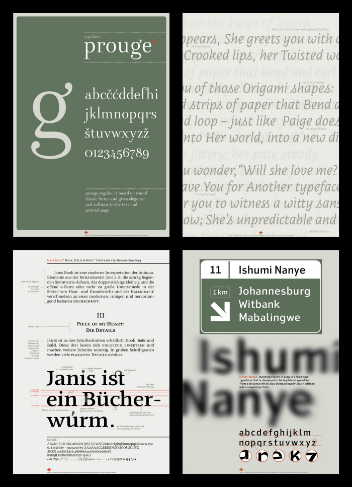
Marija Rnjak (CRO), Prouge
A soft didone that is best for titling, but can be successfully used also in smaller sizes down to 12 pt.
Diana Ovezea (ROM), Paige Italic
A bodytext oriented continuation of a previously display typeface. But the principal idea remained the same. Every character still pedantically maintain the look of folded strips of paper.
Marianne Riegelnegg (AUT), Janis Book
Expansion of a book type family Janis, that got fresh small caps in Regular and Bold.
Kevin van Reenen (SAR/UK), Ishumi Nanye
A sans serif typeface created for the road sign system of South Africa. It uses the recognisable triangular shape from South-African flag for huge ink-traps, much needed for the best possible readibility from a distance.
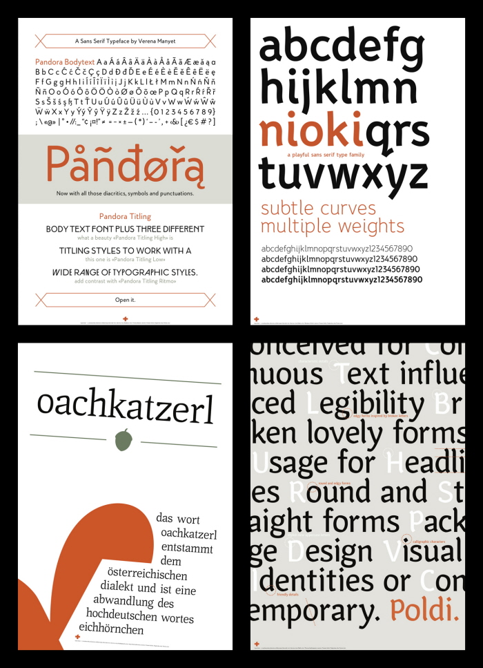
Verena Manyet (AUT), Pandora
A continuation of a slightly rounded sans serif typeface, with three different style variations for titling. It offers a art nouveau, bauhaus and avantgarde styled capital letters.
Marijana Oršolic (AUS/SRB), Nioki
A humanised sans serif family offering multiple weights.
Anja Schwendenwein (AUT), Oachakatzerl
A serif typeface inspired by linguistic contrasts - the sharpness and softness of German language spoken in Austria.
Theresa Radlingmaier (AUT), Poldi
Poldi is a modern typeface with a calligraphic character.
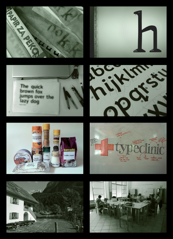
Our typicall process, with a little help of baking paper and a domesticated llama.
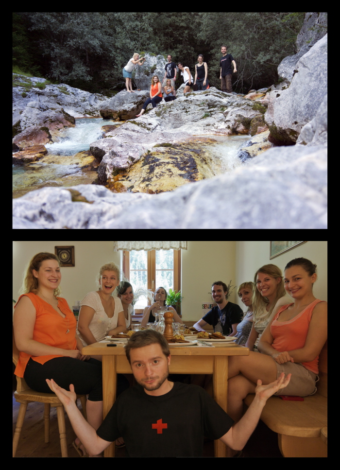
Our beautiful host - Trenta Valley, Slovenia
gLike
TypeClinic, 5th international type design workshop, 2012
TypeClinic, 5th international type design workshop, Trenta, Slovenia
Our workshops (previously named tipoRenesansa) dealt with bodytext and display typefaces for print and digital usage. Participants of all levels of expertease came from all over the world to work for a week in Trenta Valley, Slovenia. The final products includes typefaces with 40 characters minimum, which are later displayed in B1 poster size.
Our participation fee is 290 Eur, which covers mentorship, sleeping and eating arrangement, prints, and 70x100cm presentation posters.
If you are interested into participating at our 6th workshop that will be held in middle of February 2013, please send an e-mail to [email protected].