
Bellissima Skin Renewal Cream - Bellissima: an elegant and luxurious beauty and cosmetics brand.
The concept behind the packaging for the skin renewal cream was to create a form that was sensual and luxurious yet minimal. The graphics on the surface of the cap are textural and refer to the renewing power of the cream inside. The logo is meant to be simple and elegant while still portraying a sense of luxury and class.

Red Hat Saké - Red Hat is a saké that comes with its own cup. The cup sits on top of the little bottle much like a hat and is red in color, hence the name “Red Hat”. The logo design is meant to be bold and strong without being overbearig, loud or detracting from the bottle and cap. Overall, the bottle, cup and logo intend to be memorable and quirky without taking away from the saké drinking experience.

Red Hat Saké - Red Hat is a saké that comes with its own cup. The cup sits on top of the little bottle much like a hat and is red in color, hence the name “Red Hat”. The logo design is meant to be bold and strong without being overbearig, loud or detracting from the bottle and cap. Overall, the bottle, cup and logo intend to be memorable and quirky without taking away from the saké drinking experience.

Red Hat Saké - Red Hat is a saké that comes with its own cup. The cup sits on top of the little bottle much like a hat and is red in color, hence the name “Red Hat”. The logo design is meant to be bold and strong without being overbearig, loud or detracting from the bottle and cap. Overall, the bottle, cup and logo intend to be memorable and quirky without taking away from the saké drinking experience.

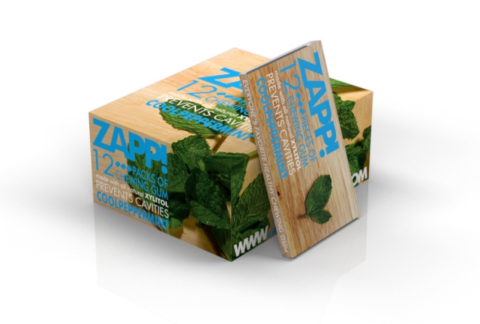
ZAPP! Gum -
ZAPP! gum was looking for a new identity that better emphasized the healthy and natural characteristics of their product. Furthermore, they were looking to expand their once on-line only business into retail, and needed a design that would stand apart from existing competition. The logo was designed to be simple, bold and easily distinguished from other gum brands.
gLike
Packaging