
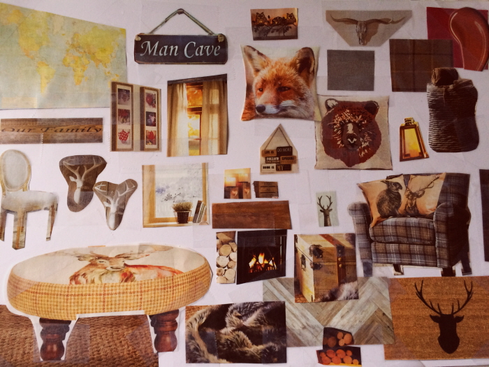
This mood board was designed to be heavily masculine, this can be seen with the gentleman's bowler hat lamp shade right through to the quilted leather chesterfield and solid wooden drinks cabinet. The colour scheme is based on earthy tones such as rich chocolates and cranberry hues.
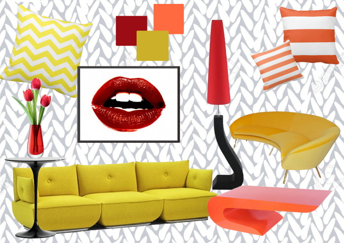
I wanted this mood board to reflect a bold style, this is why I have used Photoshop and its layers to create crisp edges instead of physically cutting or tearing paper and gluing it in the right position. Also, I have used bright eye catching colours and prints which work well together as a collection.
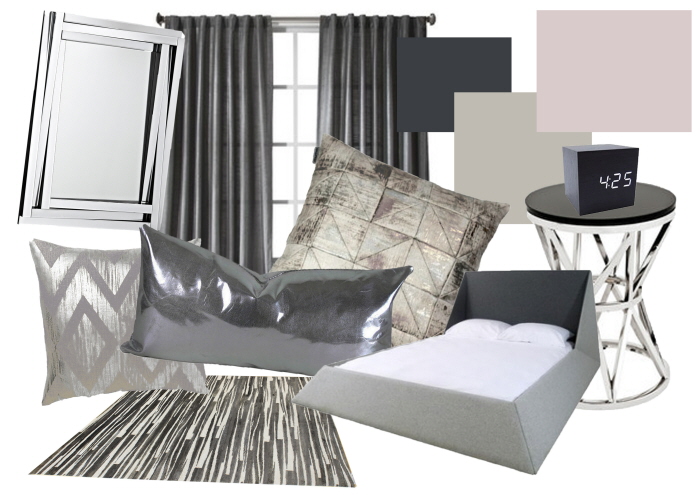
I wanted this mood board to take on the concept of the ultra modern design. I have used materials that are metallic based and shades of silver and grey in colour. I have also tried to keep everything in a crisp layout with very angular edges to give it a clean feel.
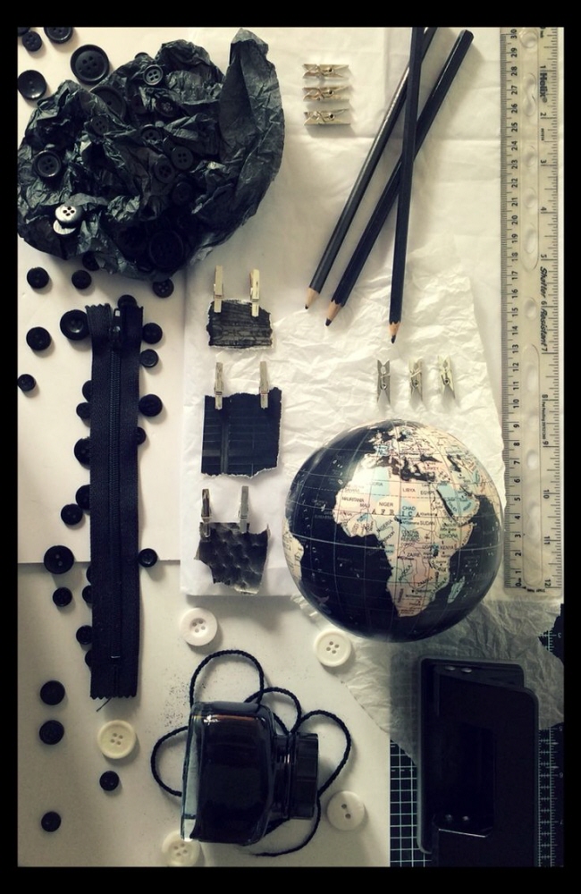
Quick mood board based on a black and white study theme.
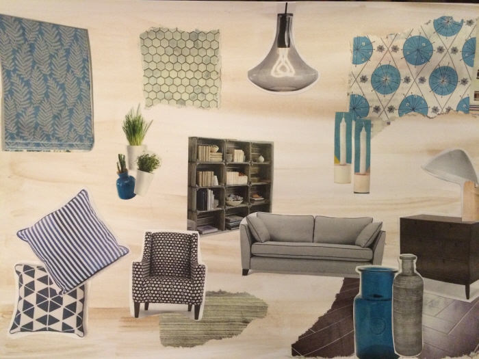
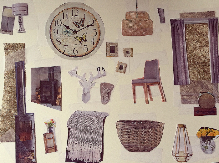
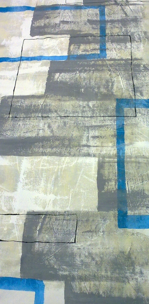
This mood board is based on a modern calm interior. I wanted to create an essence of industrial space such as the light fixture and crates which make up the bookcase yet I also wanted to keep a livable' feel with the patterns and textures.
Interior Design Mood Board
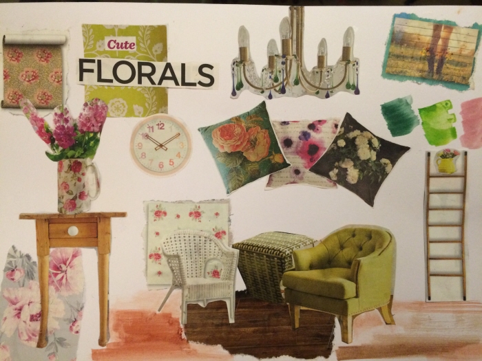
This mood board is based on florals, it is very reminiscent of a country kitchen style room with a varied colour palette.
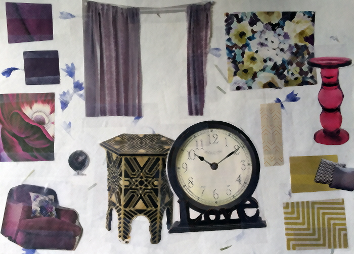
With this mood board I wanted to create a relaxing feminine style but I also didn't want it to look too young with just lavenders and purples; this is why I added a Moroccan element to the board. You can see its influence in the design of the side table and in the patterning of some of the materials and wallpapers. I feel this mood board works quite well but if I were to try this again, I would add a few more Moroccan elements and so there wouldn't be such a separation between the lilacs and the golden tones.
Interior Design Mood Board
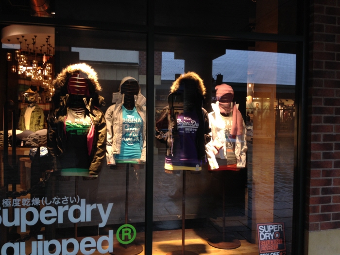
On these mannequins, I was given strict guidelines on the overall style of clothing to be worn and how each item should be placed.
I have gained experience with colour matching and the way each type of fabric falls differently (meaning the way it is pinned should also be different).
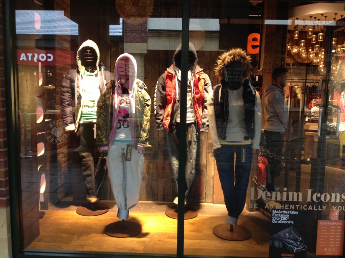
This is another window dressing I completed during my time at Superdry. Although I was told the overall style wanted by management, I did pick all of the individual items to place on the mannequins. As a general rule, Superdry wanted the colours to be evident and wanted plenty of layers to create an urban look. This piece was created during a denim promotion and so the highlight had to be the jeans on each mannequin.
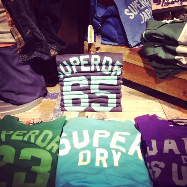
During some of my time at Superdry, I have also been encouraged to be creative with some of our folding techniques. Although Superdry do have a standard way of folding clothing, I did have the opportunity to showcase my own styles on the front tables and in the window display areas.
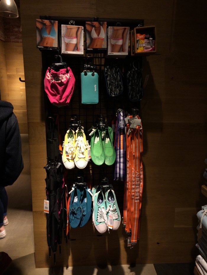
This is one of our smaller accessory stands in which I have merchandised rapidly after choosing, pulling, pinning and tagging the stock then creating the layout on the metal grid using metal prongs.
If I had more time dedicated to this stand then I would fully stock the boxes at the top of this stand and align them all properly, I would hang the belts differently so they looked uniform next to each other and all the shoes would be stuffed with their laces tied and their tickets tucked inside neatly. The final touch I would make, would be to bring the orange umbrellas to the front, this would give the brighter colour a better chance to catch the customers eye (rather than the black which blends into the shadows).
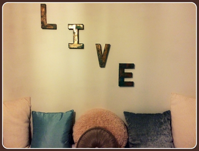
Using part of the colour scheme from my 'calm' mood board, I created 3d letters using mache and collected ticket stubs from my past. I then collaged them onto the mache letters and highlighted them heavily with spray paint and acrylic so when the light hits the letters, the viewer can see traces of the tickets stubs shine through.
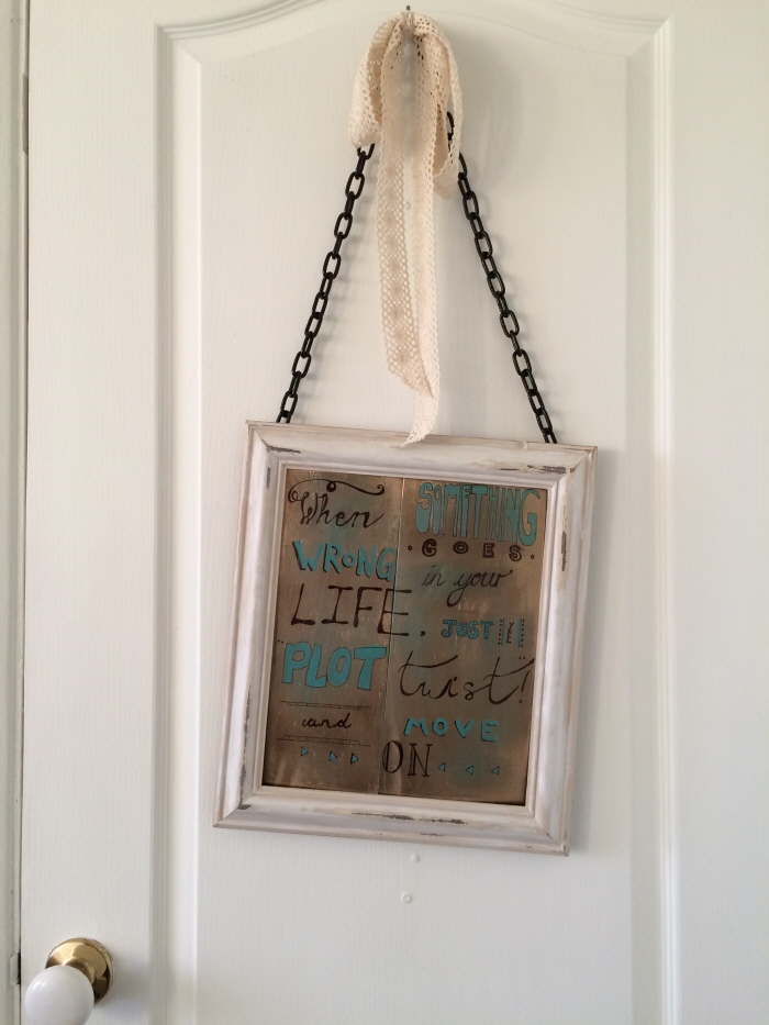
Also using the same colour scheme, I created this wooden sign from recycled/reclaimed wood. I used my knowledge of typography to lay out the message and eventually hung the sign on the back of this door so the viewer can read the message before leaving the space. As an added touch I also used some crochet ribbon to bring a more feminine appeal and contrast with the industrial style of the sign (such as the chain and thick border of wood).
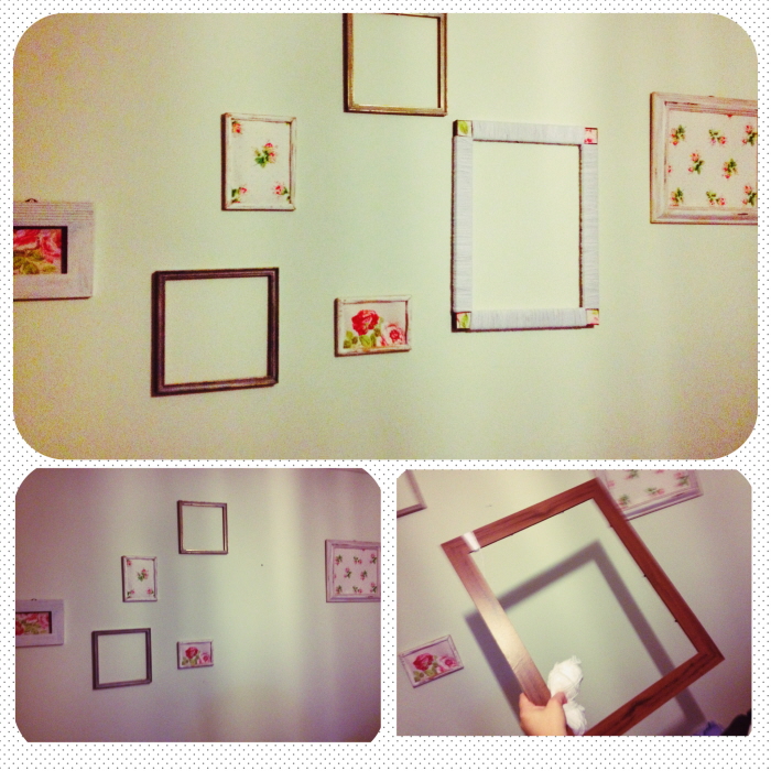
In the past I did a small blog on Facebook, some of the write-ups included tutorials on sections of Interior Design and how to achieve each look. This one for instance explained how to hang frames in the 'Shabby Chic' way. Using wallpaper cuts to fill odd frames, using different sized frames and even painting and sanding or wool wrapping frames to achieve a cosy but shabby look.
This is part of my final pieces' print at Chesterfield College when I was studying textile design. The project at the time was called 'Wear A Chair' and the results I gained were a triple grade of Distinction/Merit/Merit.
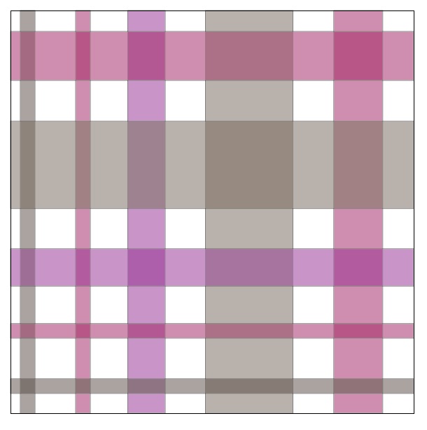
This is a simple gingham swatch I designed using Illustrator, the colour ways can be easily changed and the swatch itself can be used to fill any design in the program. Illustrator is also an excellent tool to keep inspiration flowing.
This is a more complex repeat swatch, this pattern can also be used in Illustrator to fill any designs and again the colour paths can be changed easily too.
gLike
Interior Design/Visual Merchandising
A collection of my interior design boards and visual merchandising at Superdry. I have also included some textile design pieces of my own creations.