

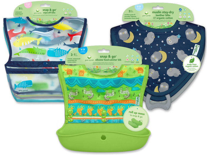

Client: Green Sprouts. Project: Development of a comprehensive "learning to eat" program that communicates not only the appropriate feeding stages for a baby as they grow, but also the key safety features, benefits, and healthier materials to give mom's choices and pertinent information. Role: Graphic Design.

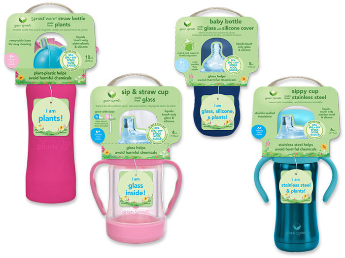
Client: Green Sprouts. Project: Development of a comprehensive "teething" program that communicates not only the appropriate feeding stages for a baby as they grow, but also the key safety features, benefits, and healthier materials to give mom's choices and pertinent information. Role: Graphic Design.


Client: Green Sprouts. Project: Development of a comprehensive "learning to swim" program that communicates not only the appropriate swimming stages for a baby as they grow, but also the key safety features, benefits, and healthier materials to give mom's choices and pertinent information. Role: Graphic Design.

Role: Graphic design and production of labels for Element Tree Essentials. The client is producer of boutique lotion candles, essential oil and other self-care products. They have a four retail boutique stores and online store. www.shopelementtree.com
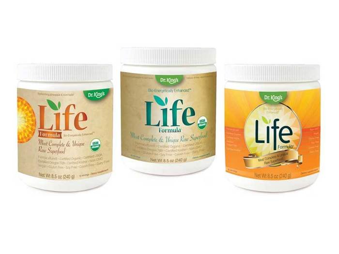
Client: Dr. King's.
Project: Bring to "llfe" a new whole foods supplement with unique properties including fermented probiotics (life). Concept: In the left and middle comp, I enveloped a feeling of natural, sophistication, and warmth to embody the quality of the product. In the comp to the right, I used lively, bright, warm colors and energetic motion to demonstrate not only the life that exists inside the container, but the vitality that one feels as a result of using the product.
Role: Graphic Design and art direction.
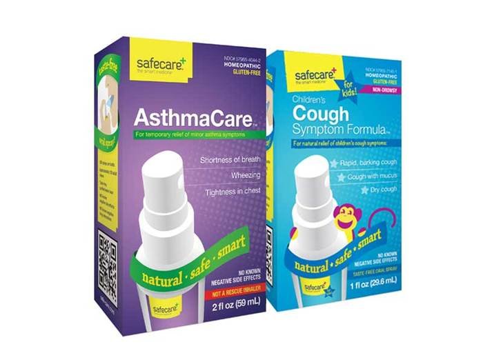
Client: Safecare.
Project: Develop a homeopathic brand specific to the Food-Drug-Mass Market, which sells to a mainstream audience that is not a typical buyer of homeopathic remedies.
Concept: Use bold colors and graphical elements to attract a buyer to a condition-specific need.
Role: Creative direction for brand, graphic design for children's packaging (to the right)
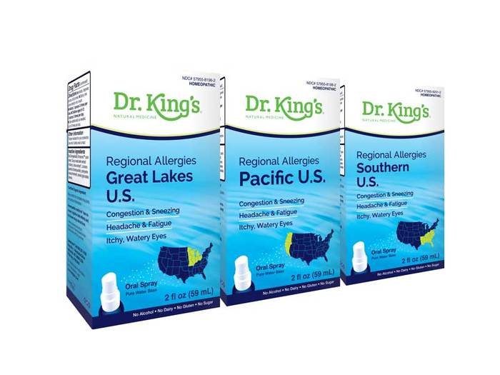
Client: Dr. King's.
Project: Dr. King's natural medicines went through a formula change, which focused on a pure water base as the carrier for delivery of the medicine through a spray bottle (oral spray). This was an innovative system that needed to be communicated as safe, calm, and energizing. We used the blues and water to convey this feeling.
Role: Creative direction.
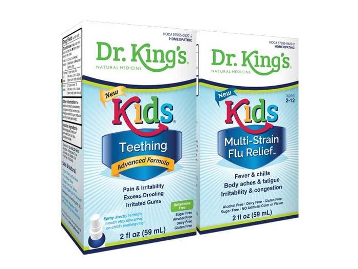
Client: Dr. King's.
Project: Dr. King's natural medicines children's product category. Since kids don't typically like to take medicine, we designed the kids products to portray energy and excitement, with a superhero connotation. Role: Creative direction.
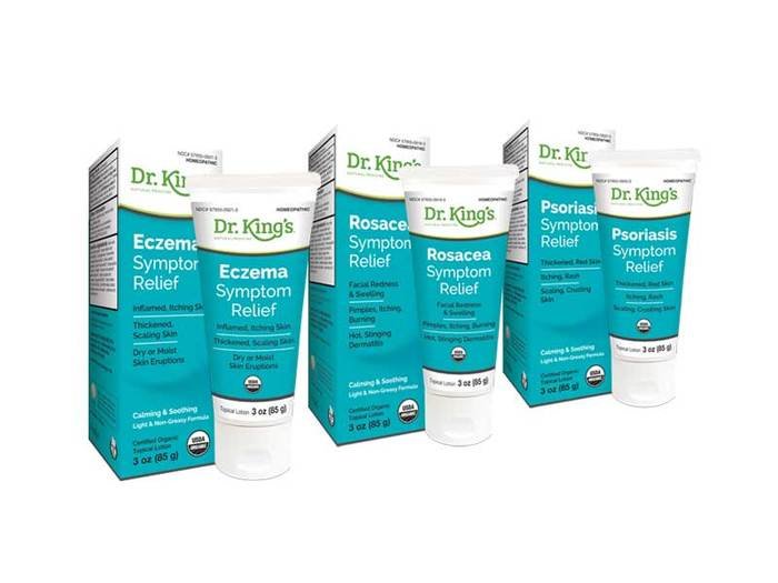
Client: Dr. King's.
Project: These creams were developed for skin conditions that are proven to often cause the sufferer much emotional trauma due to unsightly breakouts. The concept for this design was simple and clean with subtle, undulating shape and non-specific imagery to discourage any threatening feelings for the consumer. Role: Creative direction.
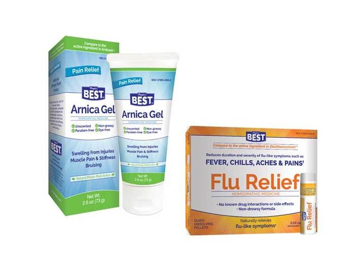
Client: The People's Best.
Project: This brand was created as a National Brand Equivalent with the same quality and ingredients as the competitors but with significantly lower pricing. To appeal to the right audience, we created packaging that was dynamic, yet simple in it's visual appeal and messaging. Role: Graphic design.
gLike