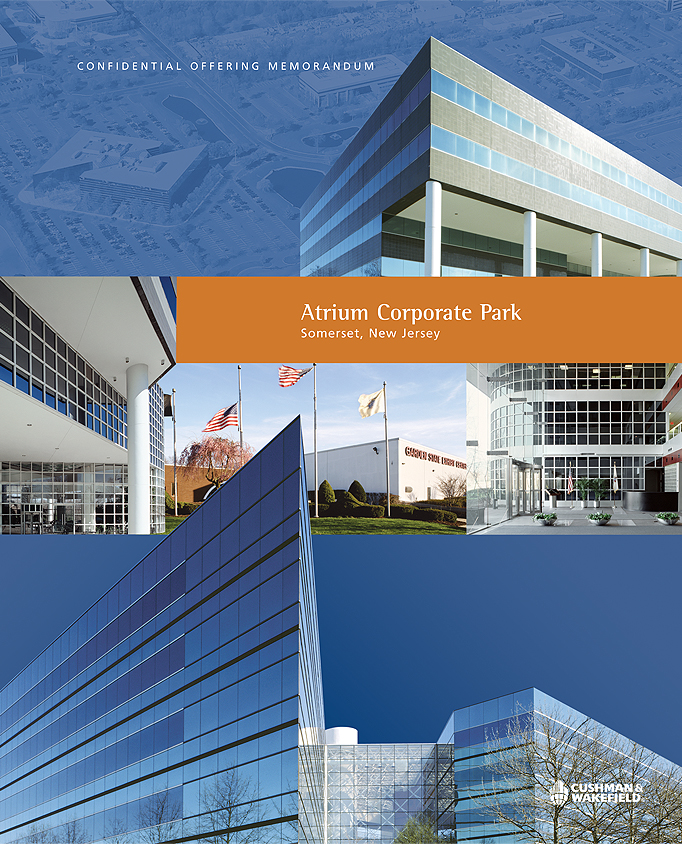
Atrium Corporate Park Cover - Four color printing offering memorandum brochure for Atrium Corporate Park includes five different buildings. The photo collage of the building was used on the cover. The tabs emphasize each building detail.

Atrium Corporate Park Tab Series (1) - Four color printing offering memorandum brochure for Atrium Corporate Park includes five different buildings. The photo collage of the building was used on the cover. The tabs emphasize each building detail.

Atrium Corporate Park Tab Series (2) - Four color printing offering memorandum brochure for Atrium Corporate Park includes five different buildings. The photo collage of the building was used on the cover. The tabs emphasize each building detail.

Pitney Bowes Leaflet - Cover - To accentuate the extensive transportation infrastructure of this property, an innovative dye-cut was used to emphasize the building’s easy access to Manhattan. Printed on pearilized paper, the piece is unusual and visually beautiful. This piece was awarded a silver certificate of excellence from The Long Island Advertising Club for excellence in creativity.

Pitney Bowes Leaflet - Inside - To accentuate the extensive transportation infrastructure of this property, an innovative dye-cut was used to emphasize the building’s easy access to Manhattan. Printed on pearilized paper, the piece is unusual and visually beautiful. This piece was awarded a silver certificate of excellence from The Long Island Advertising Club for excellence in creativity.

10 Windsor Terrace Brochure - Cover - The challenger of this design was to use only one image of the building to design the whole brochure. An outline of the building and typography were used as the design elements.

10 Windsor Terrace - The challenger of this design was to use only one image of the building to design the whole brochure. An outline of the building and typography were used as the design elements.

10 Windsor Terrace Brochure - Inside Page - The challenger of this design was to use only one image of the building to design the whole brochure. An outline of the building and typography were used as the design elements.

333 River Street Brochure - Cover - The concept of this design was to use the river as a element to emphasize that the building has a waterfront view.

333 River Street Brochure - Spreading (1) - The concept of this design was to use the river as a element to emphasize that the building has a waterfront view.

333 River Street Brochure - Spreading (2) - The concept of this design was to use the river as a element to emphasize that the building has a waterfront view.

550 West Adams Brochure - Cover and Back - Four color printing offering memorandum brochure for 550 West Adams. A simple and elegant design was used for the brochure, and the front and back covers fold out to form the continued collage of the building.

550 West Adams Brochure - Spreading (1) - Four color printing offering memorandum brochure for 550 West Adams. A simple and elegant design was used for the brochure, and the front and back covers fold out to form the continued collage of the building.

550 West Adams Brochure - Spreading (2) - Four color printing offering memorandum brochure for 550 West Adams. A simple and elegant design was used for the brochure, and the front and back covers fold out to form the continued collage of the building.

New York City Real Estate Portfolio - Cover (1) - Four color printing with three round die-cuts on the cover of this offering memorandum brochure, one for each property, and housed them in an elegant box. It maintains visual consistency for each property brochure while distinguishing and highlighting the unique attributes of the four separate hotels. A different main color was picked as the visual theme for each property,

New York City Real Estate Portfolio Cover (2) - Four color printing with three round die-cuts on the cover of this offering memorandum brochure, one for each property, and housed them in an elegant box. It maintains visual consistency for each property brochure while distinguishing and highlighting the unique attributes of the four separate hotels. A different main color was picked as the visual theme for each property,
gLike