
Beyond Green's exhibition space: Station Blue - Branding system designed for the Amsterdam Fashion Institute's international symposium on sustainable fashion.
The logo needed to avoid metro station cliche imagery while still connoting mobility. Most jeans have pockets and brand tags, so these were solid visual hooks. They wanted something edgy, hard and fashion forward. We used Agenda for the type and chose black as the primary color with blue accents. Overall, they were very pleased with the result.

Beyond Green's exhibition space: Station Blue - Branding system designed for the Amsterdam Fashion Institute's international symposium on sustainable fashion.
The logo easily translates to its international audience as a wayfinding system conveying the jean theme, and the different ‘stations’ of the exhibition space.

Beyond Green's exhibition space: Station Blue - Branding system designed for the Amsterdam Fashion Institute's international symposium on sustainable fashion.

Beyond Green's exhibition space: Station Blue - Branding system designed for the Amsterdam Fashion Institute's international symposium on sustainable fashion.

La Belle Epoque - designed for the Art of Fashion

Early Bird Tutoring Service - an old school project revived and realized.

New Internal branding: Graham Library: Trinity College - The Graham Library at Trinity College in Toronto desired a new logo to use internally around the library for promotional items to be used on/around campus. The objective was to create something more informal, youthful, abstract and accessible that characterized the 'feel' of the library.
In this final solution, the lines reference books on a shelf in a more abstract way. The shape of the icon is a nod to the shape of the great Arts & Crafts wooden entrance door.

New Internal branding: Graham Library: Trinity College - Second version:
The logo will be used on computer desktop backgrounds, travel mugs, book bags, posters, flyers and in the future, stationery.
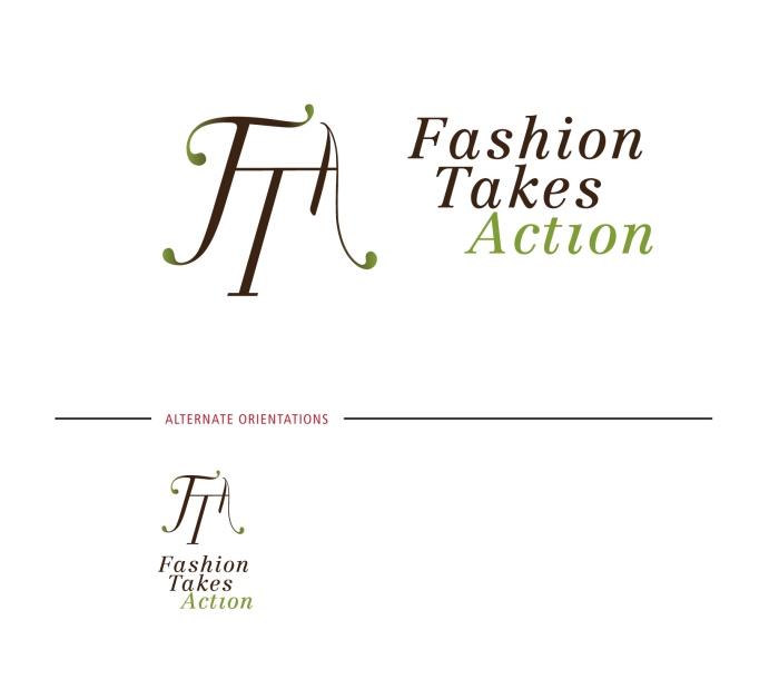
Fashion Takes Action - + script signifies elegance, a form that is familiar to the fashion audience
+ Serif type echoes the form of the image
+ Rich chocolate brown warms logo and give rich, classy undertone
+ Green is familiar color for 'eco-conscious' audience, signifies moving in a sustainable direction
+ Custom type treatment that mixes parts of many typefaces reflecting different strategies in sustainable fashion movement
+ playful rounded serifs/ornamentation make script more approachable, less formal
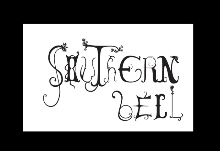
Southern Bell: Wordmark Exploration - The objective was to remix at least two typefaces in
representing a phrase, in this case, Southern Bell. Each unique letterform is hand rendered and loosely references “southern” charm and ritz such as floral embellished hats, delicate waistlines and Western typefaces.
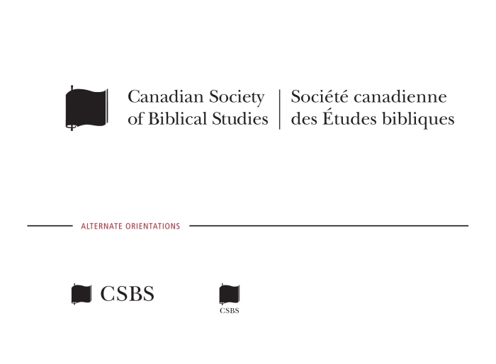
Redesign: Canadian Society of Biblical Studies - Each word is charged with meaning so the full name is used in the primary signature. I retained the scroll/book image and simplified the single graphic. The one color graphic retains academic integrity and allows the logo to be clear on all mediums used by the society: namely b/w printers, faxes, emails, website.
gLike
Logo