
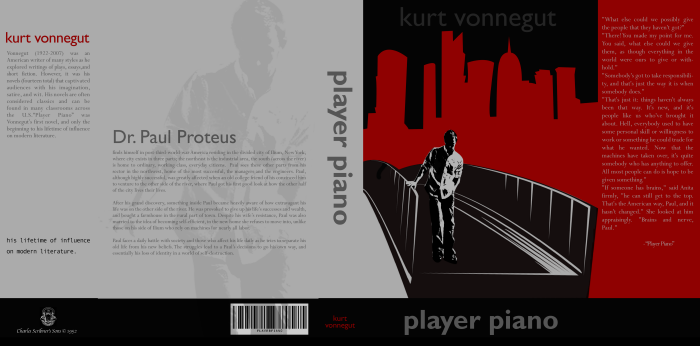
We were assigned to read "Player Piano" by Kurt Vonnegut in an entry level design class, and upon finishing the novel were also assigned to design a book jacket for the book itself.
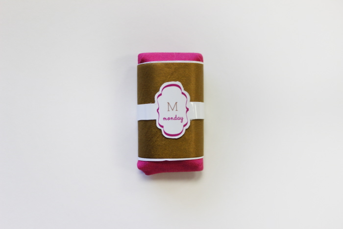
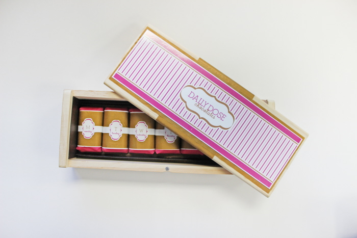
This is the product of an assignment of a collegiate packaging class. I was challenged to create my own product. I decided on a product marketed toward women, with individual chocolates that correspond to each day of the week. They are displayed in a wooden box to mimic the display of medicine in a day-of-the-week canister.
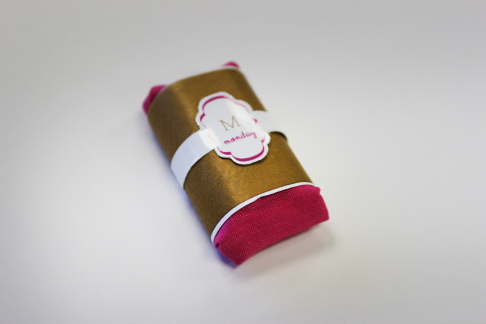
This is the product of an assignment of a collegiate packaging class. I was challenged to create my own product. I decided on a product marketed toward women, with individual chocolates that correspond to each day of the week. They are displayed in a wooden box to mimic the display of medicine in a day-of-the-week canister.
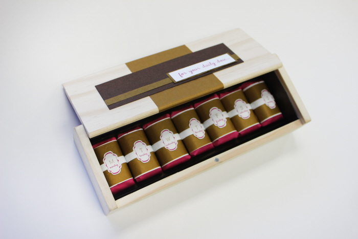
This is the product of an assignment of a collegiate packaging class. I was challenged to create my own product. I decided on a product marketed toward women, with individual chocolates that correspond to each day of the week. They are displayed in a wooden box to mimic the display of medicine in a day-of-the-week canister.
This is the product of an assignment of a collegiate packaging class. I was challenged to create my own product. I decided on a product marketed toward women, with individual chocolates that correspond to each day of the week. They are displayed in a wooden box to mimic the display of medicine in a day-of-the-week canister.
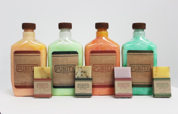
Purity Soap was a product of a collaboration with another student, Tara Leisure, in a collegiate packaging course. We were required to create a product that must be called "Purity Soap" and marketed with organic ingredients with scents derived from fruits and vegetables. My partner and I decided to challenge ourselves and market the product toward men and create a line of body washes and bar soaps.
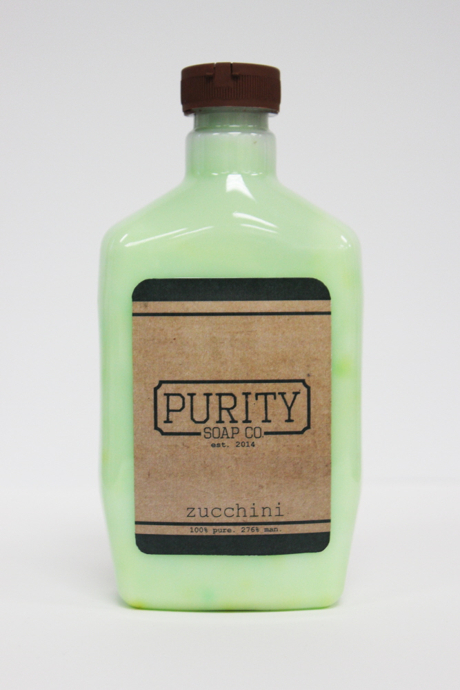
Purity Soap was a product of a collaboration with another student, Tara Leisure, in a collegiate packaging course. We were required to create a product that must be called "Purity Soap" and marketed with organic ingredients with scents derived from fruits and vegetables. My partner and I decided to challenge ourselves and market the product toward men and create a line of body washes and bar soaps.
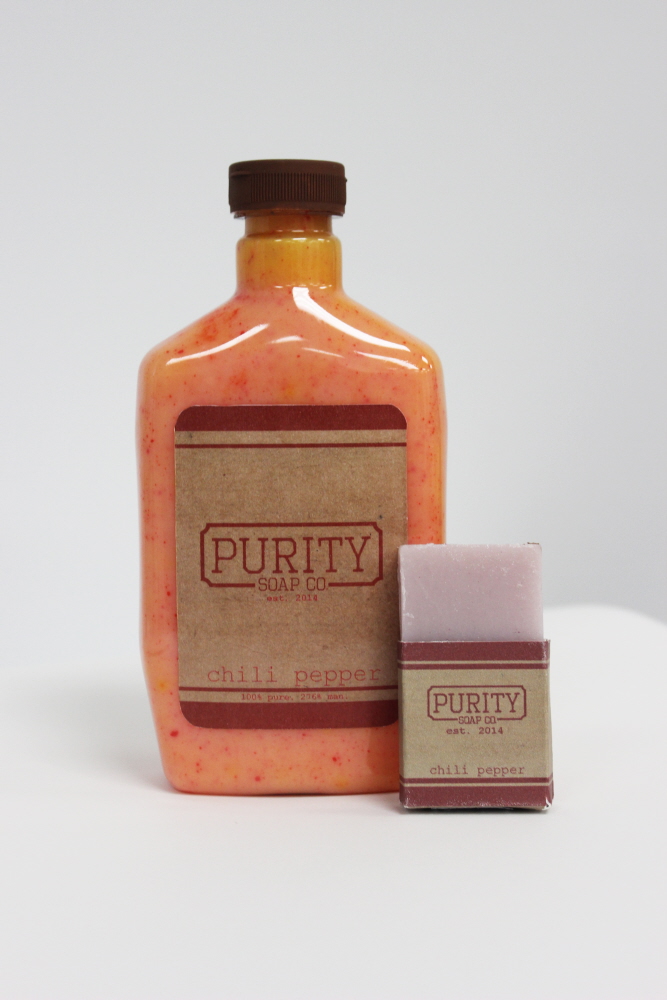
Purity Soap was a product of a collaboration with another student, Tara Leisure, in a collegiate packaging course. We were required to create a product that must be called "Purity Soap" and marketed with organic ingredients with scents derived from fruits and vegetables. My partner and I decided to challenge ourselves and market the product toward men and create a line of body washes and bar soaps.
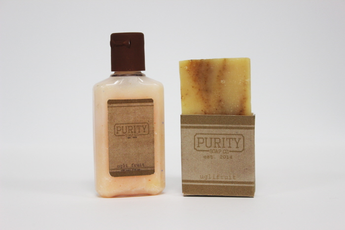
Purity Soap was a product of a collaboration with another student, Tara Leisure, in a collegiate packaging course. We were required to create a product that must be called "Purity Soap" and marketed with organic ingredients with scents derived from fruits and vegetables. My partner and I decided to challenge ourselves and market the product toward men and create a line of body washes and bar soaps.
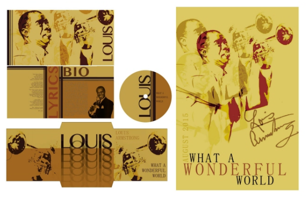
In a branding and packaging class, I was challenged to create a visual system that would be used as a re-launch for Louis Armstrong's "What A Wonderful World." I wanted to reflect the vintage colors and style of the music and time period of its origin, and bring those together with modern overlays and clean lines. I wanted to portray a sense of the time periods coming together, and the timelessness of the music itself.
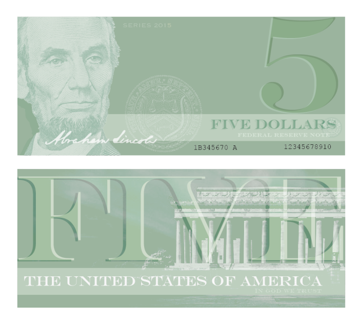
This exploration was a collegiate assignment in which I was challenged to redesign U.S. currency. I chose to keep traditional elements while using a more simplistic layout. Amongst printing, there were textured lines added over the bottom of the front of the bills that corresponded to the amount in order to create ease of use for the visually impaired.
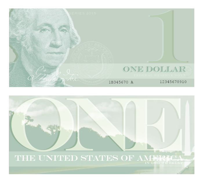
This exploration was a collegiate assignment in which I was challenged to redesign U.S. currency. I chose to keep traditional elements while using a more simplistic layout. Amongst printing, there were textured lines added over the bottom of the front of the bills that corresponded to the amount in order to create ease of use for the visually impaired.
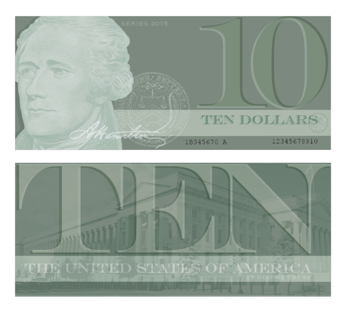
This exploration was a collegiate assignment in which I was challenged to redesign U.S. currency. I chose to keep traditional elements while using a more simplistic layout. Amongst printing, there were textured lines added over the bottom of the front of the bills that corresponded to the amount in order to create ease of use for the visually impaired.
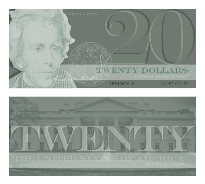
This exploration was a collegiate assignment in which I was challenged to redesign U.S. currency. I chose to keep traditional elements while using a more simplistic layout. Amongst printing, there were textured lines added over the bottom of the front of the bills that corresponded to the amount in order to create ease of use for the visually impaired.
gLike
Packaging Design