
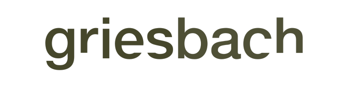
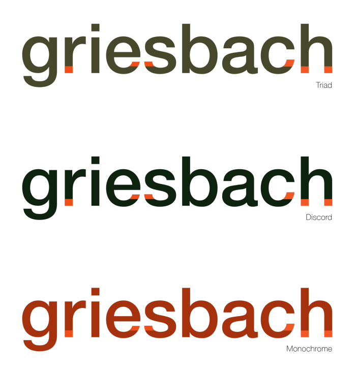
Griesbach word mark. Dark khaki green and deep orange colours were inspired by the military history of Griesbach, Edmonton, Alberta, Canada as well as the Black Forest foliage and red tile roofs of Bad Griesbach, Bavaria, Germany.
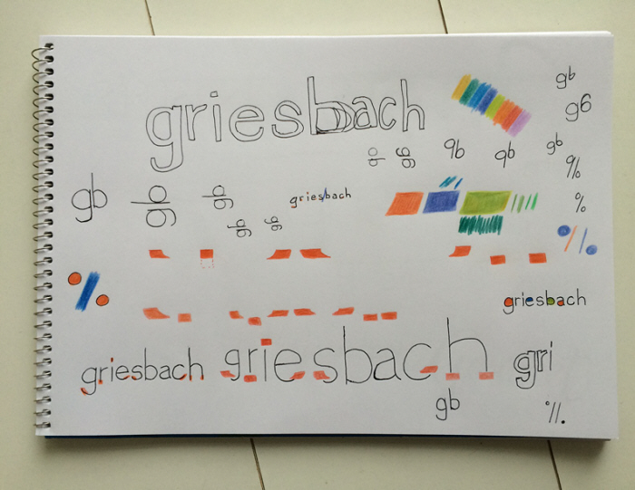
Associative sketching to experiment with colour and form.
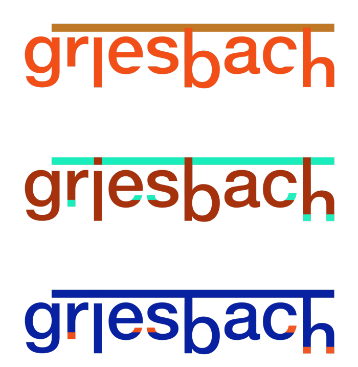
Concealing and revealing. Where should the rule be drawn?
Concealing and revealing. Where should the rule be drawn?
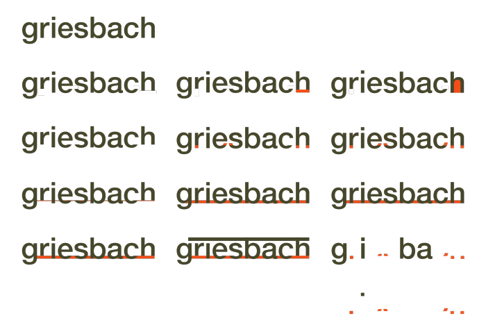
Experiments in form extrapolating on the concept of an underline.
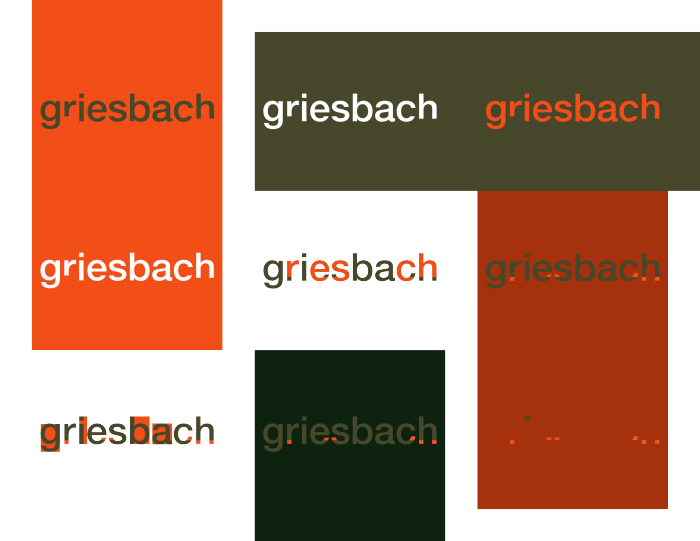
Changing out the main fill to explore colour relationships.
Experiments in discordant and triadic colour alluding to neighbourhood history and landmarks.
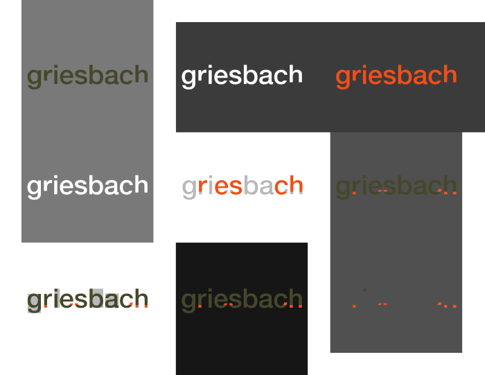
Desaturating background colours.
Further experimentation with colour.
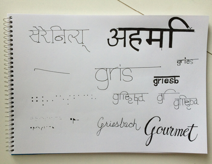
Exploring alphabets and different ways of connecting letters (overline, cursive) through sketching.

Moving the underline up to an overline position to see how it changes the word shape. This is how the Devanagari alphabet groups letters into words.
Further experiments with fill colour.
gLike
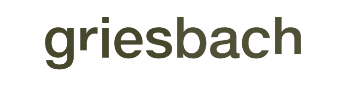
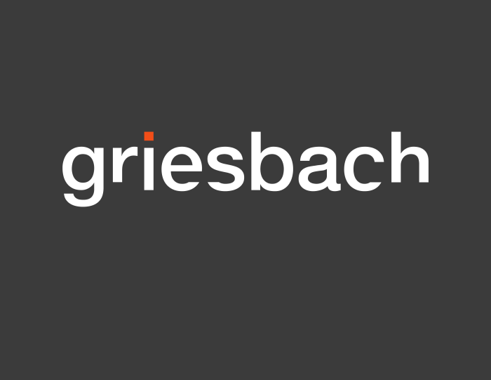
Word mark for Griesbach
Concept and design of a word mark for 'Griesbach', the name of both a neighbourhood in Edmonton, Alberta, Canada and a town in Bavarian Germany. As part of a class assignment, I was tasked with creating a word mark using Helvetica Neue as a departure point from which to explore type anatomy and colour theory.
I completed this project as a student at Emily Carr University of Art and Design.