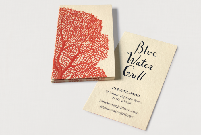
BUSINESS CARDS: Printed on Italian cotton paper, with a heavy texture that evokes printmaking or watercolor paper. Coral graphic on the back of the card is cropped to a modern shape and printed as a duotone.
Updated the color palette using rich ultramarine blue paired with bright coral.
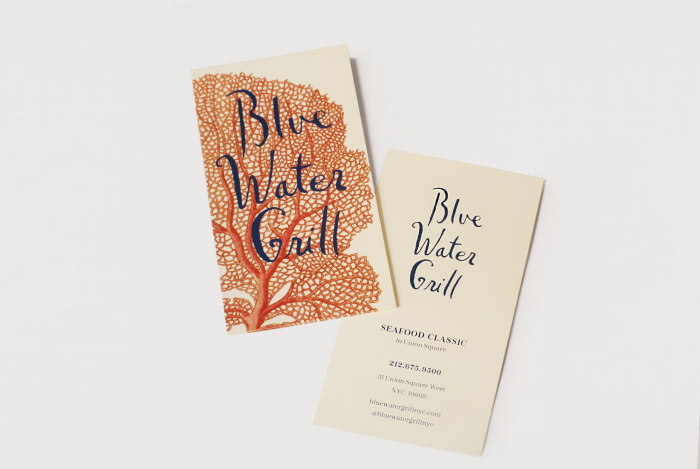
BRAND CARD: a larger card for guests to take with them after their meal. Printed on heavyweight vellum paper with contact information on the back of the card.
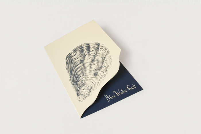
CHECK PRESENTER:
A die-cut folded card with 17th century engraving of an oyster, printed in a duotone.
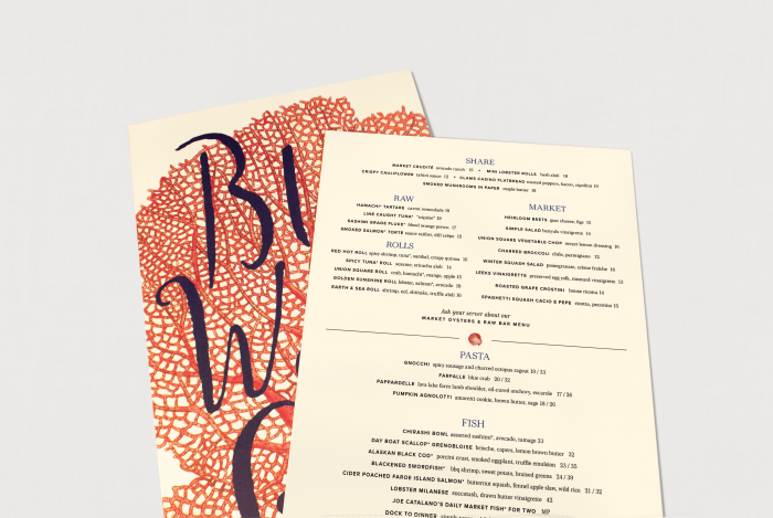
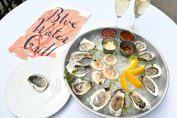
MENUS
Oversized menu printed on double-thick card stock. Bold coral graphic and stacked logo on the reverse added a splash of color to the neutral tones used throughout the restaurant interior. The menu was completely redesigned to align with the vision of the new chef, focusing on market-driven produce and seafood. Typography needed to be legible in low lighting, and the sections are neatly organized to help guests navigate the content.
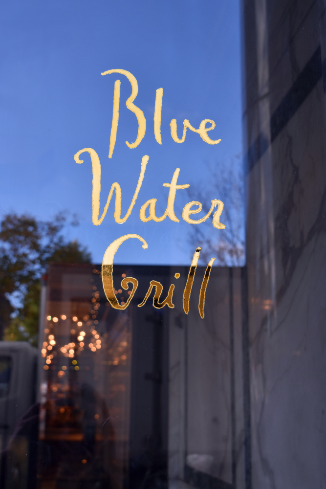
ENTRYWAY GRAPHICS:
24K gold leaf, hand-applied to the doors.
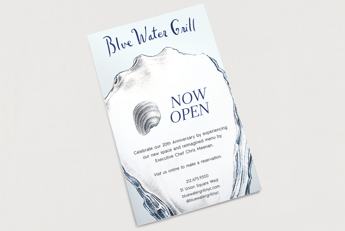
ANNOUNCEMENT CARD
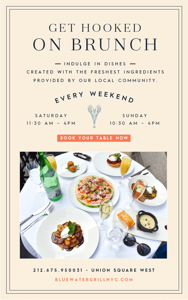
EBLAST: Promoting brunch service.
gLike
BLUE WATER GRILL
Refresh the brand identity of Blue Water Grill, a classic seafood restaurant in Union Square. Updated typography, chose a new color palette, and worked with an outside agency to refine a series of images from 17th Century botanical prints for use in a more modern way.