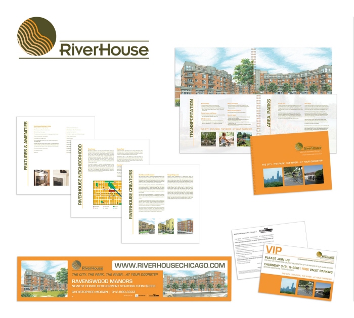
Centry 21 S&R - RH Identity System - Organic, tranquil and stylish are the words that best describe the identity of RiverHouse. A palette of neutral and warm colors provided dynamism, san-serif typography strengthened the well-formed and simple grid of the layout and neighborhood photographs provided an urban feel. All these elements reflect on its location by the river, its active community and the structure of the building.
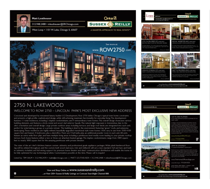
Century 21 S&R Ad Campaign - As a top real estate service provider in the city, this elegant advertising campaign showcases the company's most luxurious properties. Clean use of typography, geometric graphic elements and tasteful photography conveys this sensation.
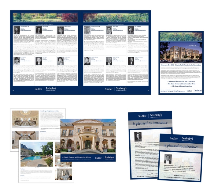
Sudler Sotheby's International Realty - Corporate Collateral Materials - Sudler Sotheby's represents real estate sophistication and luxury. Stunning photography display finesse, a mixture of serif and san-serif fonts show simplicity, and distinguished artwork by artists like Monet and Van Gogh convey the sensation of luxury in these smart advertising campaigns, signage and other collateral materials.
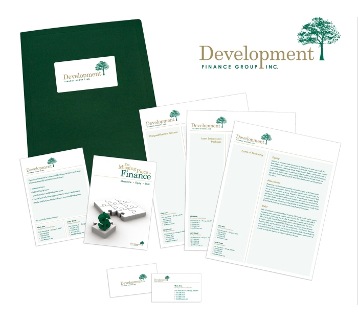
Development Finance Group, Inc. - Identity System - This identity system highlights the group's core philosophies of assurance, growth and refinement. The tree icon, clean use of space and solid typography impress these ideals on the reader within each piece; postcard, flyer, business card and folder.
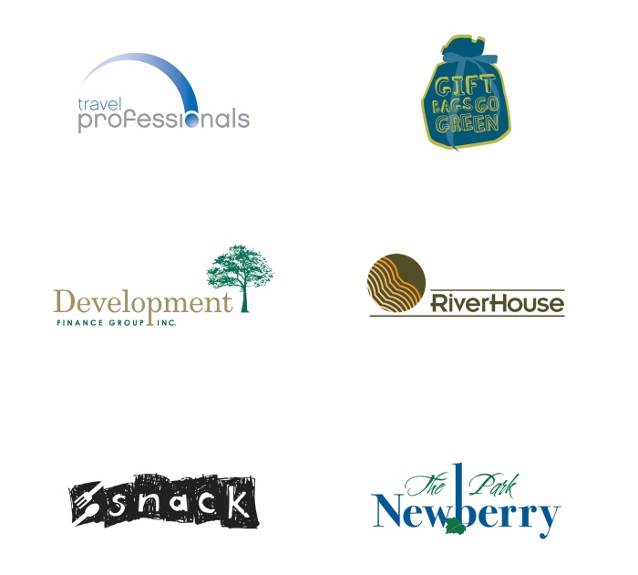
Identity Design - Travel Professionals
Soothing / Precise / Agile
Development Finance Group, Inc.
Assurance / Growth / Refinement
Snack
Artsy / Fresh / Carved
Gift Bags Go Green
Merry / Youthful / Home-made
Riverhouse
Organic / Tranquil / Stylish
The Park Newberry
Ecological / Serene / Homey
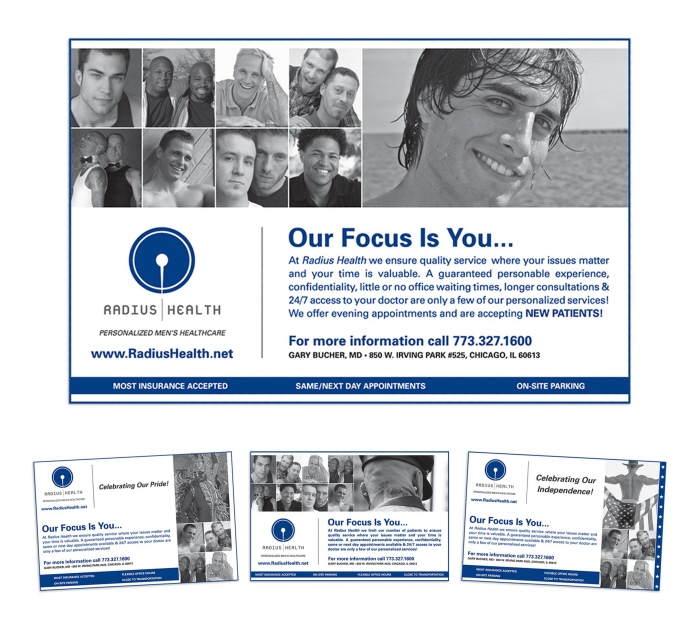
Radius Health - Advertising Campaign - Quality men's health care makes Radius Health stand out from its competitors. This advertising campaign demonstrates its quality of services and wide target market through the use of urban photography, balanced typography and clean layout.
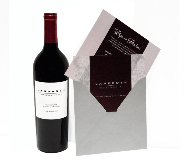
Landrosh Development LLC - Announcent Invite & Bottle Label - To announce new ventures and projects, Landrosh requested an invite and wine bottle label with a sophisticated look. Minimalism and simple uses of color and graphics communicate this strong, elegant sensibility.
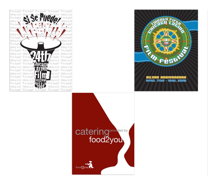
Poster Design - Chicago Latino Film Festival Entries
2008 poster - Politically driven. Elements such a megaphone, fractured-looking type and repetition were used to connect contemporary immigration rallies, political activism and the election year with the festival and the latino community.
2009 entry - Aztec symbolism, radiant colors & city silhouettes characterize a fusion of heritage & celebration.
Food2You
This poster represents the company's ability to combine simplicity with superior quality.
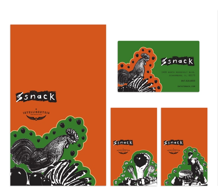
Snack - Signage and Gift Card - A cafe and catering company located in Roosevelt University, Schaumburg with over 3,000 students. The signs' collage-like images, with their vibrant colors and home-made appeal, target the fresh and active student body and exemplify the rustic appeal Snack brings to the campus.
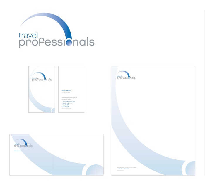
Travel Professionals - Corporate Identity - Effortless and enjoyable are key components of Travel Professionals.
The precise, agile and soothing finish of the logo and the fundamental base in the layout and typography reenforce these benefits of the company.
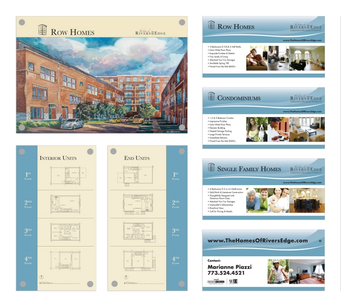
Walsh Development Inc. - Interior / Exterior Signage - The Homes of Rivers Edge development target a wide range of buyers and is located in one of Chicago's popular areas; Logan Square. By incorporating lifestyle images, soothing colors and great use of space, these designs engage a diverse group of viewers.
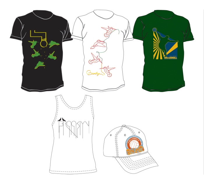
Apparel Design - Thirsty Hummingbirds
retro / radiant
CMYK Hummingbirds
playful / sketch-like
Spike It Volleyball
geometric / vibrant
Love Birds
linear / urban
Windy City Volleyball
whimsical / organic
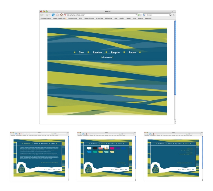
Gift Bags Go Green - Website Design - Ribbon-like elements as background create a dynamic feel to the website and emphasize the merry, youthful, and homemade quality of the company. The information and the navigation was kept as minimal and simple as possible to emphasize the products made out of reusable and recyclable materials.
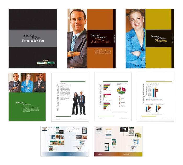
Century 21 Sussex & Reilly - Recruitment Book - This listing book – consisting of covers, tabs, informative pages and fold-out spreads – played a major role when recruiting new agents to the company. Bold color tabs labeled each section in a contemporary layout; appealing graphics and photography depicting confident professionals combine to create a strong presence to the ambitious real estate community.
gLike
Portfolio