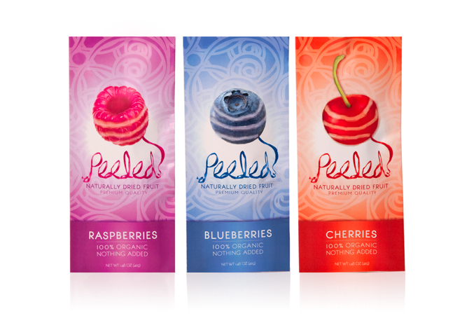
Peeled - DRIED FRUIT SNACKS
Bold, enlarged imagery creates appetite appeal while showcasing each fruit. The playful logo, capturing the literal use of the term, combines with a bold color scheme and charming graphics to entice consumers of all ages.
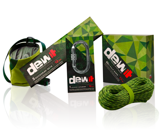
Dew It - MOUNTAIN DEW ROCK CLIMBING GEAR
Capturing the extreme essence of Mtn Dew is necessary in extending the brand into other potential categories. The angular graphics and structures reference mountains and suggest an abstract rendering of their existing packaging.
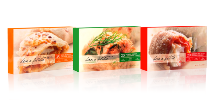
Bon A Petite - FROZEN GOURMET APPETIZERS
Vivid, enlarged photography paired with eye- catching color gives the impression that although these hors d’oeuvres may be petite in size, their quality is anything but.

Tiny Tummy - CHILDREN’S ORGANIC FRUIT SNACKS
Organic ingredients ensure the best quality
snack for your little one to enjoy. Original
illustrations and adorable characters easily
attract both moms and kids alike.

Rendezvous - SAKE KIT INSPIRED BY THE HIGH LINE
The spirit of reuse and reinvention, epitomized by NYC’s High Line Park, lives on in this sustainable spin on after dinner drinks for two. The Japanese liquor is fittingly encased in bamboo, while a subtle variation in the logo’s color highlights the romantic
sentiment.
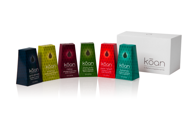
Koan - HOMEOPATHIC DIETARY SUPPLEMENTS
Six natural remedies to center your body and emotions.The droplet motif highlights the actual shape of the product as it forms when used, as well as its instrinsic healing properties.
gLike
Package Design