
Empathy Logo - The Directing Manager wanted a logo and identity system that would fit with the name and the goals of the facility.
The solution was to develop a ying and yang feel with both sides reaching towards the other. This was to respresent the definition of the word empathy. Both the text and the subtle touch of color have a welcoming feel, while still giving a professional presentation.

Empathy Business Cards - Empathy is a comprehensive outpatient rehabilitation facility. It features million-dollar medical equipment and one of the top physical therapists in the state of Illinois.
The owner wanted a logo and identity system that would fit with the name and the goals of the facility.
1.5in x 3.5in.
Neenah Classic Crest
Recycled Natural White
120C

Empathy Letterhead - The letterhead was done on the same paper at 24lb text weight.
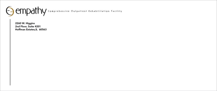
Empathy Envelope - The envelope was done on the same paper stock. The design is only on the front side. The seal flap is a solid pantone color that is used in the logo.

Empathy Doctors Referral - This design is for the doctors referral that is given to patients in hospitals.
The referrals are bound together in a tear-off booklet. Each referral is written on and then given to the doctors patient.
It is printed on the same paper and weight as the letterhead.
gLike
Empathy Rehabilitation Center