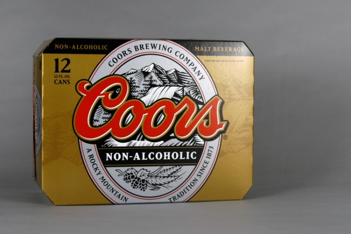
Coors Non-Alcoholic
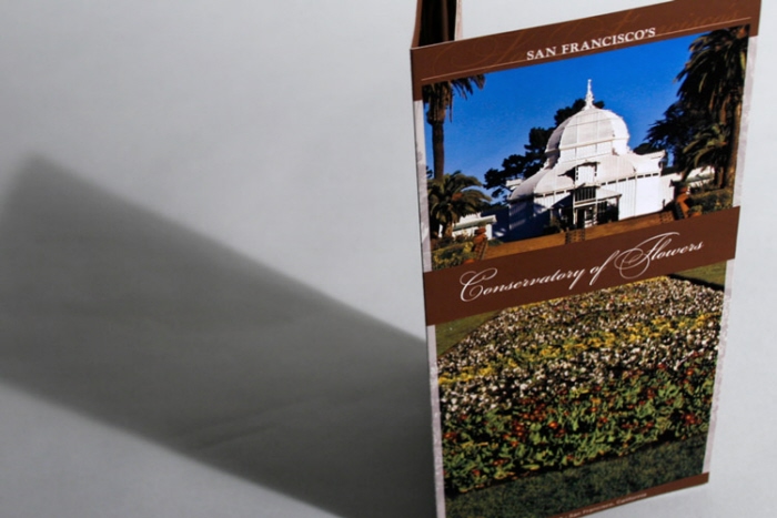
Conservatory of Flowers - Organization of the information was key. The layout of the gallery information emulates the layout of the building. The rich brown colors represent earth, symbolizing the beginning: of plants, of the tour. It also contrasts the green surroundings, becoming a more visible piece.
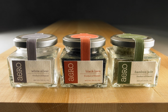
Aero Retail Line - The concept was to allude to true ambiance. Each category of products were given an ambient look. The tying element was the usage of the brand and its banding. There were some differences in these, but guidelines were devised to carry throughout to maintain them as a family of products.
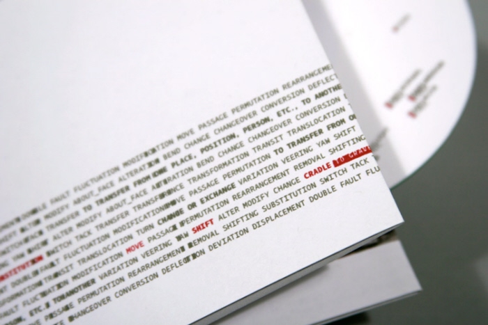
Fedra Typeface Promotional - The typeface family chosen was Fedra. Its story of change lent itself to a strong concept. In research and development, I chose shift as the driving theme. This influenced the subject matter and the 'shifting' type usage throughout the deliverables.
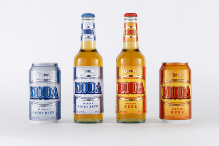
Cerveza Moda - I created a new line and called it Moda, loosely translated as 'attitude/style.' The design choices were made to represent the warmth and vibrancy of the Mexican Style / Attitude.
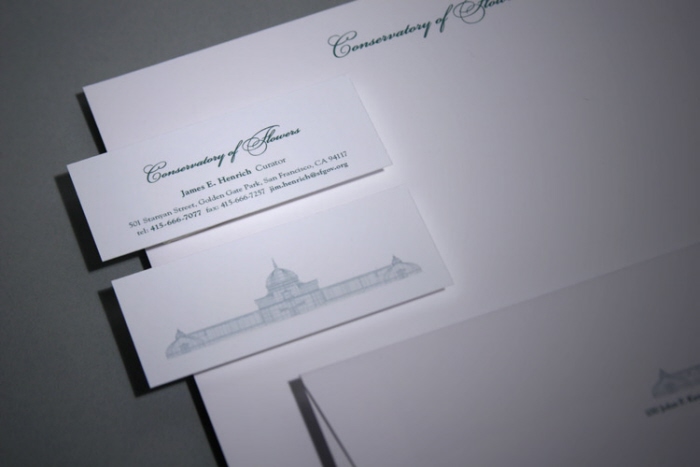
Conservatory of Flowers - Driving ideas: Victorian, Nature, Sophistication. The business card was designed around the building, the symbol of its function. Although asked only for cards, I developed the rest of the system which was later implemented from the card's success.
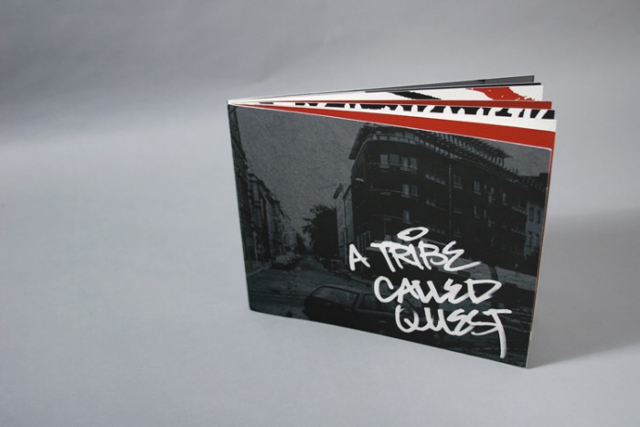
Concert Promotional - The group, poetic/political hip-hop, was fresh versus the loud and crude gangster rap that was mainstream. I kept the look and feel to the streets. This was conveyed through handwritten type usage with visuals grunged sparingly to further the idea and in keeping of the style in music and lyrics the group brings.

Wal-Mart Redesign
Wendy's Redesign
gLike
Selected Work