
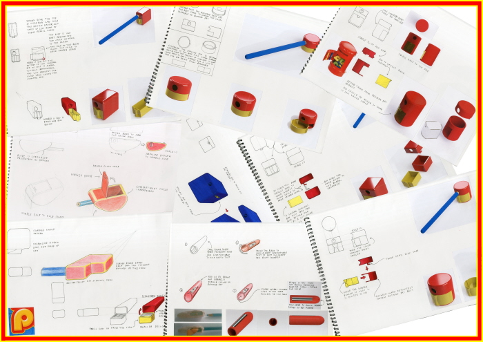

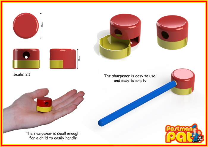
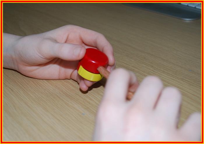
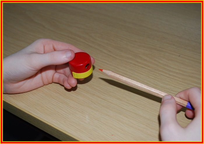
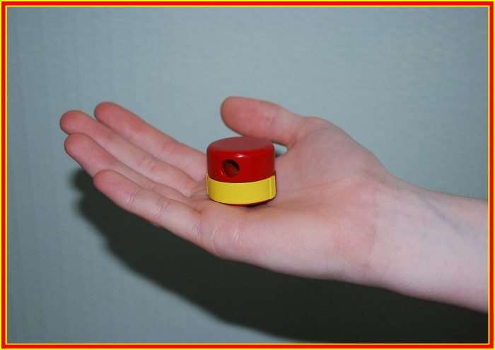
This is a project that I did during my time at college; the aim of the project was to produce a design for a pencil sharpener, aimed towards children, which semantically communicated the themes of the children’s TV show Postman Pat.
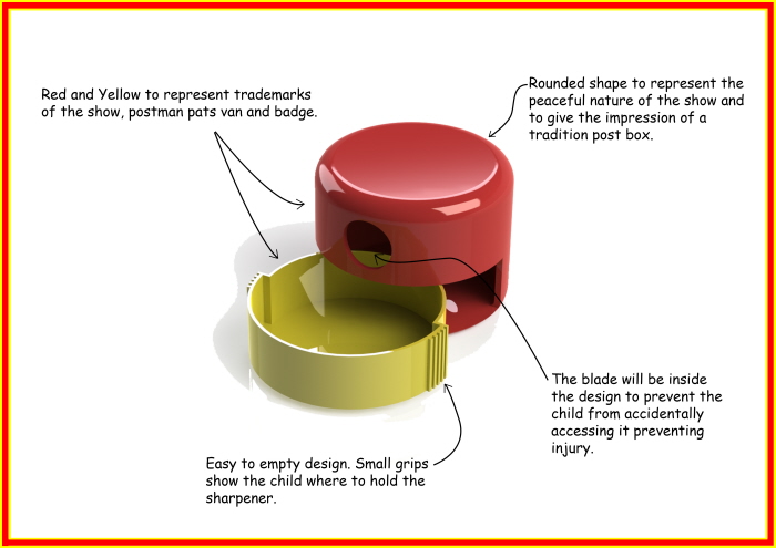
The final design was to be prototyped using a 3D printed from CAD files created on Solid Works. The main focus of the project was to research into what gave postman pat its identity and how this could be expressed in a design for a pencil sharpener. I focused primarily on shapes and colours on the tv show to create a shape that I felt expressed the friendly and inviting nature of the show. I took the red colour, commonly associated with postman pats van, and the bright yellow from his badge and used them for the colour scheme as they were the most dominant colours of the show and applied them to a concept based on a British mail box. I felt these combinations created a design that aptly represented the themes from the show.