
community cores - This diagram was the impetus for the whole project. From this diagram, one can see that while there are many elements that hold Washington Park together, the community is missing an indoor core for the whole community.
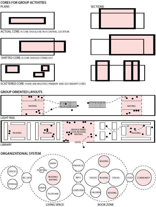
core concepts - diagrams expressing how to create cores in a light rail and library.
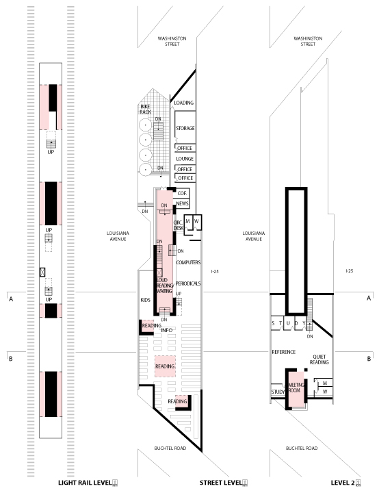
floor plans - plans for the library + light rail station, incorporating the core diagrams from previous file. The cores have become the various areas where groups of people can come together, including the waiting areas for the light rail, the reading areas, and the community meeting room.
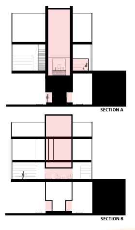
sections
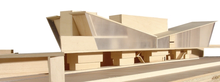
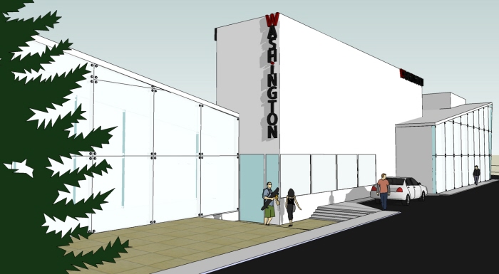
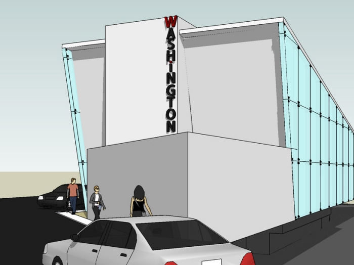
east elevation [view from Buchtel] - the parts sticking out represent the cores.
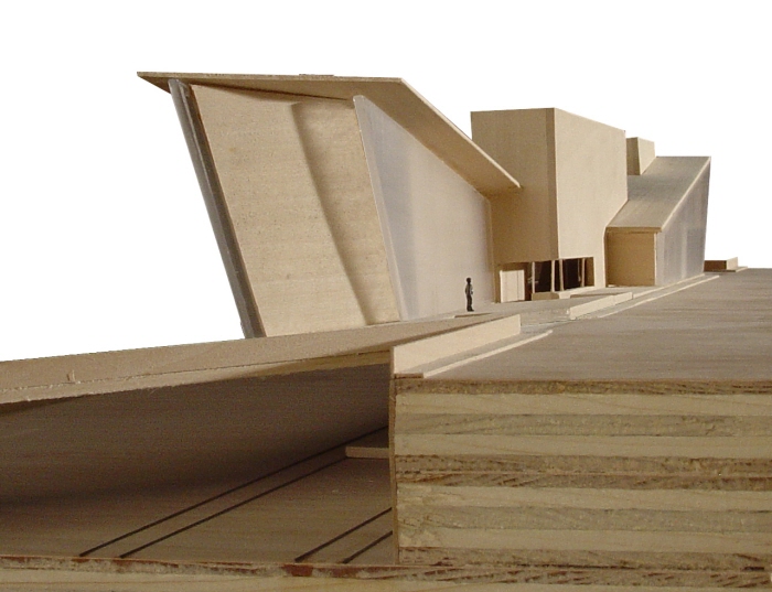
west view [from I-25]
south elevation [view from Washington]
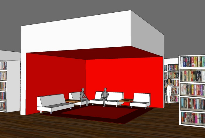
reading cores, interior - model of a 'reading core' from inside the library.
The ceiling is lowered in all of the cores to create a more intimate space.
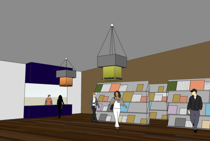
interior sign system - View of sign system that is in place throughout the library and light rail station. Mimics the core idea.
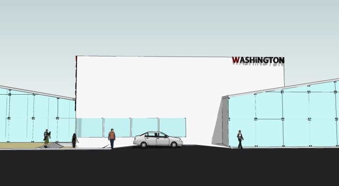
east elevation - Washington sign on the outside. I designed the signs to be bold because the building is located right off a major interstate. The signs simply say 'Washington' because that is how the residents of the area identify where they live. I thought that would be fitting to put as an obvious identifier for the 'core' of the community.
washington sign
washington sign from the north

logo - Washington Read and Ride was the proper name I chose for the building.
gLike
Library & Light Rail