
Armin Hofmann is one of the founders of the Swiss International Style. The basic idea of my cubes are to follow international typographic style which is marked by: the usage of sans serif typefaces, the usage of black and white photography, and the usage of grid to provide an overall orderly and unified structure.
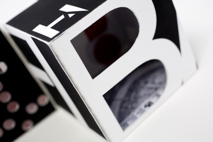
For contribution cube, I emphasize his important contribution for Basel School of Design, because he was the one who can be most credited with first establishing the international reputation of the school. The die-cut were used to engage the viewers in looking inside to find more knowledge about the designer.

In biography cube, I includes some of his experience in his early life as a designer, the placement of cross shape and red color inside the cut-out to emphasize his Switzerland background.
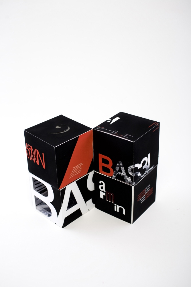
Armin Hofmann is one of the founders of the Swiss International Style. The basic idea of my cubes are to follow international typographic style which is marked by: the usage of sans serif typefaces, the usage of black and white photography, and the usage of grid to provide an overall orderly and unified structure.

In the principles of design, I emphasized in his graphic design manual book. In this book, he examines line, dot, letters and signs and confrontation between them.
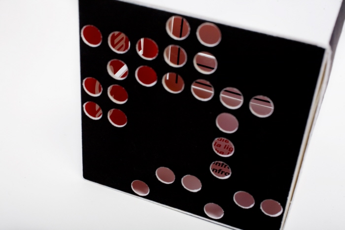
In the principles of design, I emphasized in his graphic design manual book. In this book, he examines line, dot, letters and signs and confrontation between them. The cubes simply depicted his book, where dots encounter with lines, where A encounter with H. The seeing through part was to show the confrontation of the design elements used for this cube.

gLike
swiss designer cubes
swiss designer's cubes: ARMIN HOFMANN +