
The University of Minnesota is a RESEARCH university. This means that any given moment, there are psychology studies going on on the West Bank, medical trials happening over in Moos tower, and countless courses and graduate labs, all looking for willing participants to help with their research. However, there is currently no single place to find studies like this; they’re scattered across various websites, email listservs, flyers on bulletin boards, and even word-of-mouth. To solve this problem, I worked on a team to develop a way to connect researchers and participants in a single, trusted environment. The result is ReSEARCH.
ReSEARCH is an app that allows its users to browse a personalized stream of studies, and is piggy-backing on a growing trend of using research studies as a way to earn extra income. This trend has been featured in stories from Business Insider and Finance Daily, but what makes our app unique is that we have tailored it to fit the needs of college communities.

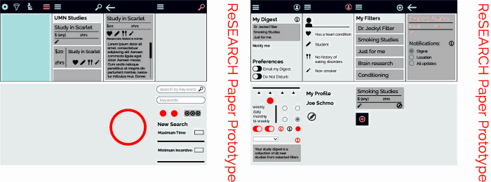
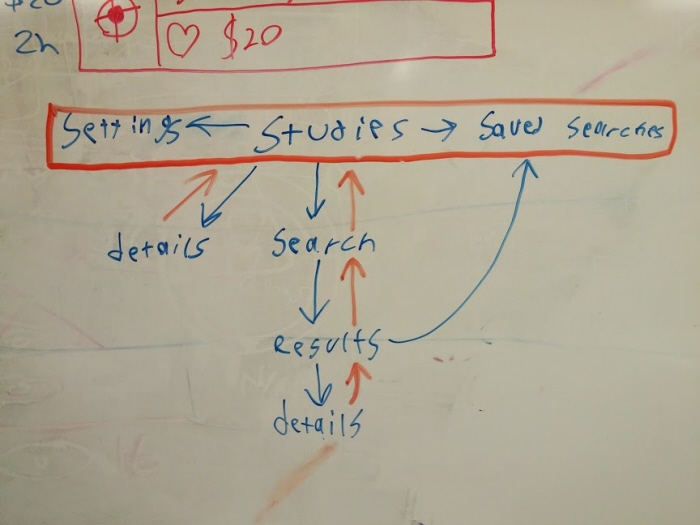
Our first prototype included wireframes with numerous paper cut-outs to fake the interactiveness of an app (pictured below the screens). This app strived to use minimal text, instead using icons to describe things like study eligibility requirements and different screens within the app (e.g. "settings" was a gear, and "view studies" was a microscope). While our intentions were good, the result relied too much on the user remember what icons meant, which was something we couldn't even manage to do ourselves.
Another key design goal of our app was to create an innovative and intuitive way to select what criteria to use in a search--such as only showing studies looking for smokers with a heart condition. Our solution was a circular, swipe-based "criteria picker" where users scrolled through a series of icons, and swiped up criteria to include in the search (e.g. "heart condition" and "smoker"). While innovative, it most certainly wasn't intuitive. We needed another solution.
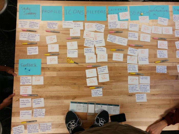
We evaluated this first prototype extensively. First, we performed a heuristic evaluation (where each app screen is evaluated on a variety of criteria) and then a cognitive walkthrough (where we evaluated how the app as a whole handled representative tasks). The number of problems with this first prototype was astounding! To get a better handle on the sheer amount of data, we put all of our findings on notecards, and organized them into categories for improvement. Once we'd done that, we prioritized the importance of issues within these categories as must-fix, should-fix, and might-fix. This allowed us to be sure we incorporated our most significant problems into our next design iteration.

The user evaluation sessions went smoothly. We filmed 3 participants interacting with the app and navigating through tasks we had designed to test the interface. Since this was still in the early phases of development, our app wasn’t fully developed and consistent across devices, so we used 2 phones and our final paper prototype to test the various aspects of the interface (such as overall layout, functionality, and overall flow). The most helpful activities assessed how the search feature worked and the overall navigation of the app. These tasks helped us to test some of our assumptions about user activity, providing insight into which features are the most helpful, and which ones were least intuitive. It was especially interesting to see how users responded differently to things we thought were perfectly clear, such as filling out all fields in the search screen when we only wanted them to use 2 or 3.
This was one of the high points of our semester.
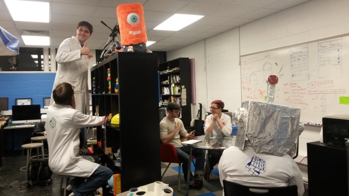
Our research setup consisted of 2 notetakers, a facilitator, and a camera man to film the participant's interactions with the screen. We ended up with over 2 hours of footage to go through.
By virtue of being so involved with this project, we’d become blind to a surprising number of holes and usability hurdles within our app. Most notably, we realized the hierarchy of our app was far too complex. What's more, the incredible amount of feedback we received gave us a lot of ideas for how to simplify and improve this hierarchy as well as other problem areas in our interface. Ultimately, user testing brought more clarity for future directions of our design.

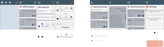
After processing all of our user feedback, we created a final, functioning interface, shown in the screenshots below.
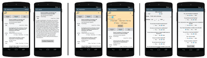
We found there were 3 main types of interactions users had with our app:
1. Scrolling through and selecting studies to view more information about them.
2. Narrowing displayed studies based on criteria in the search dropdown.
3. Creating a user profile that automatically filters out studies where they're ineligible.
The screen shots show the screenflow for each of these use cases, respectively.
Our app was developed for Android using Google's material design principles.
gLike
ReSEARCH
An exploration of user interface design for the Android platform, ReSEARCH creates a personalized stream of active research studies available on college campuses. This app's interface was designed on a team as part of the User Interface Design, Implementation, and Evaluation course at the University of Minnesota.