gLike
Verbling - Infograph
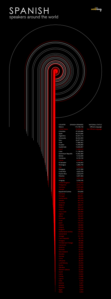
This is a data visualization of the population of Spanish speakers around the world. Each country is abstracted as a circle with an area proportional to its Spanish-speaking population. The circumference of each circle completes 270 degrees then continues straight down to the y value of its corresponding country, which is displayed in a long list. The endpoints of these lines create a graph themselves, which is proportional to the square root of the population divided by pi. I think it’s delightful how simple elements can lead to complex and related visualizations.