
INK's former logo

INK's new logo. I decided to normalize the colors but keep the design, so it's still recognizable on campus but looks a cleaner.

We were in need of a clever way to call attention to submissions; and because Rose-Hulman is a technical school, Twitterature was an avenue for tapping into the tech side of campus. I was looking to promote how easy it was to submit to Twitterature for those who didn't have Twitter, and provide a familiar background for those who were already familiar with Twitter's interface.

I designed some post cards for distribution in the local TH coffee shops. This is promoting the Halcyon launch party, an annual shindig for the launch of the local university literary & arts magazines. I wanted a simple way for locals to be able to locate the gallery, so I included a crude map on the back with the address for non-locals.

I wanted to create a theme for advertising on campus. Most campus-run organizations don't put together campaigns and I wanted to push for INK to formalize it's advertising. I aimed for a self-defining theme: "What do you think of when you think of ink?" I made this piece by doing my own stencil street art of the logo and my own photography.
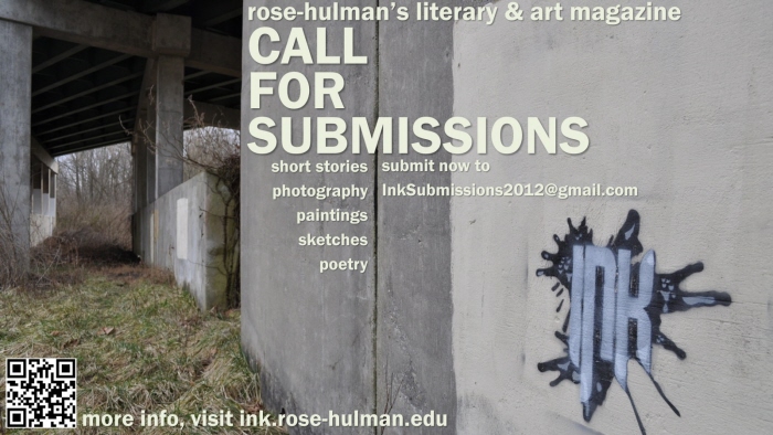
Another piece from the same stencil art.
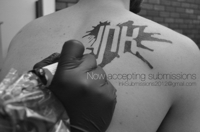
This piece is a collaboration of the team. I talked to some local tattoo artists and we staged a tattoo, needle and all. The ink on my back is just the transfer. My friends Adam Esch (Rose '12) took the photos and Veer Nairyani (Rose '14) did the editing.

gLike
INK literary + arts magazine
Rose-Hulman releases a yearly literary and arts magazine every year called INK. For 2011/2012, I worked with a small team to support marketing and advertising: on-campus, to solicit art and literature from students and professors to be published; and in Terre Haute, to promote the annual launch party for INK and several other magazines, held at the Halcyon Contemporary Art Gallery.
View Website