
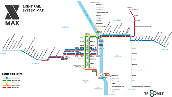
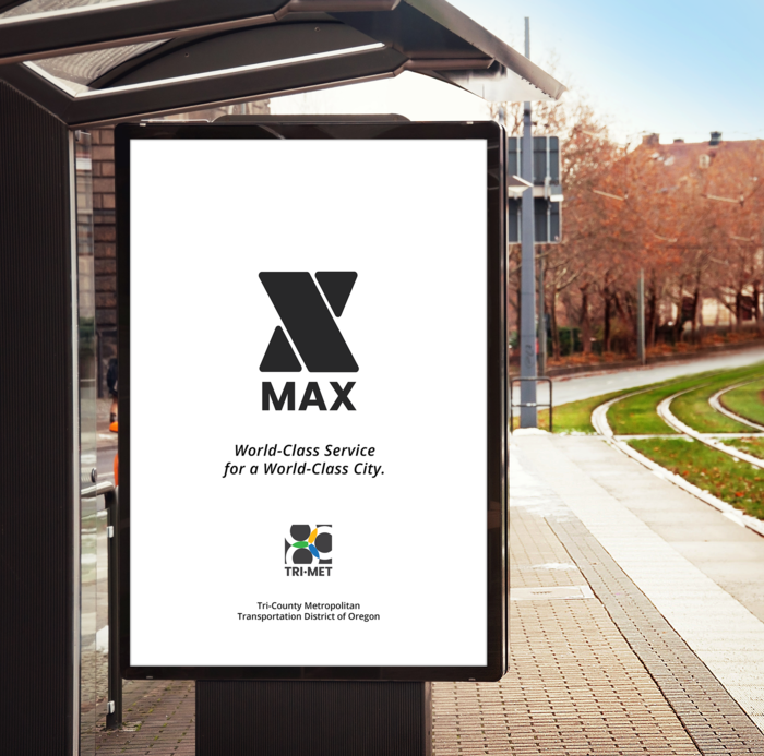
Tri-Met wants to ensure that they offer world-class public transportation services to a population with a broad range of capabilities. Looking toward the future, Tri-Met recognizes that the Portland Tri-County area is growing rapidly in population size and diversity, and must stay ahead of the curve in scaling to maintain their world-class service. As a case study, I looked into how Tri-Met might rebrand the MAX Light Rail to make it more accessible to the public-- specifically looking at environmental signage and wayfinding, and targeting these systems to work for honored citizens and tourists. This case study mainly involved a logo redesign, a style guide, and a design of wayfinding systems that are accessible to a population with a wide range of abilities.